Evolution of the Coca-Cola Bottle

THE COCA-COLA BOTTLE DESIGN HISTORY

© History Oasis
"What's great about this country is that America started the tradition where the richest consumers buy essentially the same things as the poorest. You can be watching TV and see Coca-Cola, and you know that the President drinks Coke, Liz Taylor drinks Coke, and just think, you can drink Coke, too. A Coke is a Coke and no amount of money can get you a better Coke than the one the bum on the corner is drinking. All the Cokes are the same and all the Cokes are good. Liz Taylor knows it, the President knows it, the bum knows it, and you know it."

—Andy Warhol

In the pantheon of global brands, few can claim the same instant recognizability as Coca-Cola.

Its signature bottle, with a history as effervescent as the drink it contains, has evolved through the decades, mirroring shifts in society, technology, and consumer preference.

This exploration of the Coca-Cola bottle's design history uncovers not only the story of an iconic brand but also a unique perspective on the past century and beyond.

THE STRAIGHT-SIDED BOTTLE (1899-1906)

Straight sided bottle
Source: Wikipedia

In 1899, Coca-Cola embarked on its bottling journey, taking the first steps towards becoming the ubiquitous beverage we know today.

The bottle, as simple in design as the drink was multifaceted in taste, was straight-sided, uncomplicated, and unassuming. This straightforwardness was a reflection of the era—a time when frills were unnecessary and functionality took precedence.

A Spectrum of Colors

The straight-sided bottles were not uniform in color.

Instead, they came in a variety of hues, from clear to amber to even blue and green.

This was not a deliberate branding decision, but rather a result of the manufacturing processes of the time. Nevertheless, this inadvertent splash of color turned out to be a stroke of branding genius, lending an air of uniqueness and diversity to each bottle of Coca-Cola.

The Emergence of an Identity

The simple, straight-sided design, combined with the array of colors, started to shape the identity of Coca-Cola.

These bottles, holding the secret, bubbling syrup, possessed a certain charm that was hard to ignore.

They didn't just contain a drink—they housed an experience. And this experience would come to define the Coca-Cola brand in its early years.

As people opened each bottle, they weren't just quenching their thirst—they were becoming part of a story—a story of a brand that was starting to carve out its distinct identity in the hearts and minds of consumers.

THE HUTCHINSON BOTTLE (1906-1915)

the Hutchinson Bottle
Source: The Coca-Cola Company

In 1906, Coca-Cola took a bold step forward.

The company embraced a design as innovative as it was utilitarian: the Hutchinson bottle.

This new bottle wasn't just a vessel for the beverage—it was an instrument of engagement, an example of tactile marketing long before the term was coined.

The bottle with its metal stopper was not just a container, but a mechanism, introducing an interactive element to the simple act of consuming a beverage.

The Pop Heard Around the World

The Hutchinson bottle, with its distinctive metal stopper, did more than just seal in the effervescence of Coca-Cola.

It created a sonic signature.

When opened, the stopper produced a satisfying 'pop'---a sound that quickly became synonymous with the refreshing experience of enjoying a Coca-Cola.

This auditory branding was inadvertent, yet it was as powerful as it was distinctive. So powerful, in fact, that it led to the coining of the term "soda pop", forever embedding Coca-Cola in the vernacular of the beverage world.

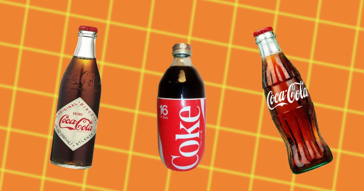
THE ROOT BOTTLE (1915) & CONTOUR BOTTLE (1916-PRESENT)

the contour Coca-Cola bottle
Source: The Coca-Cola Bottle

The year 1915 marked a pivotal moment in Coca-Cola's design history.

The creation of the Root bottle introduced a form that was as voluptuous as it was unforgettable.

This design, with its curves and distinctive contour, was a departure from the previous straight-sided and Hutchinson bottles, marking a bold new direction for the brand.

It was a design daring enough to stand out from the crowd, yet familiar enough to feel like an old friend.

A Shape that Stands Out

The brilliance of the Root bottle design lay in its uniqueness. Its shape was so distinctive, so memorable, that it could be recognized even in the dark or when shattered into pieces.

This was a design that wasn't just seen—it was felt.

It was a physical manifestation of the brand's identity that could be identified purely through touch. This tactile quality added a new dimension to the brand experience, making Coca-Cola not just a beverage, but a sensory adventure.

The Birth of the Contour Bottle

In 1916, the Root bottle evolved into what we now know as the Contour bottle.

This iconic design, largely unchanged for over a century, has become synonymous with Coca-Cola.

Its silhouette is immediately recognizable, transcending language and cultural barriers to become a universal symbol of refreshment.

It is a story of the power of design, serving as a constant in a world of change, a symbol of continuity in a brand that never stops evolving.

PAINTED LABEL BOTTLE (1955)

Coca-Cola 1950s ad
Source: The Coca-Cola Company

In 1955, Coca-Cola's design palette was infused with a burst of color.

With the introduction of the Painted Label Bottle, or the Applied Color Label (ACL) bottle, the previously monochrome label was replaced with a vibrant and colorful design.

This was a shift from the understated elegance of the past, towards a more playful and eye-catching aesthetic, reflecting the changing tastes of the mid-20th century.

More than a Label

The colorful design of the ACL bottle wasn't just about aesthetics—it was a strategic move designed to captivate the consumer's eye.

By enhancing the allure of the bottle, Coca-Cola was increasing its shelf appeal, making its product stand out among a sea of competitors.

The colorful label was a siren call to consumers, an invitation to pick up the bottle and quench their thirst with the tantalizingly effervescent beverage within.

Coca-Cola in Technicolor

The Painted Label Bottle marked a new chapter in Coca-Cola's branding story.

This was a brand that was evolving with the times, embracing new technologies and aesthetic trends to stay relevant.

The vibrant colors of the ACL bottle reflected the optimistic spirit of the post-war era, resonating with consumers' desire for a brighter, more colorful world.

This design change underscored Coca-Cola's knack for capturing the zeitgeist, further cementing its place as a brand that was inextricably woven into the fabric of American culture.

KING SIZE & FAMILY SIZE BOTTLES (1955)

King size bottle
Source: The Coca-Cola Company

In 1955, the same year that brought color to the Coca-Cola world, another significant design development was on the horizon.

Responding to the consumers' unquenchable thirst for more, Coca-Cola unveiled the King Size (10- and 12-ounce) and Family Size (26-ounce) bottles.

This move was more than just about meeting demand–it was about understanding and responding to changing consumption patterns and societal trends.

Coca-Cola at the Heart of Gatherings

These larger bottles did more than just quench thirst—they helped transform Coca-Cola into a social beverage.

The King Size and Family Size bottles were perfect for gatherings, ensuring that there was always enough Coca-Cola to go around.

The presence of these bottles at social events and family functions solidified Coca-Cola's status as a drink that brought people together. It was no longer just a beverage—it was an integral part of the social fabric, a catalyst for shared experiences and communal bonding.

DIAMOND LABEL BOTTLE (1960)

Diamond Label Bottle
Source: The Coca-Cola Company

As the 1960s dawned, Coca-Cola was poised for another design evolution.

The decade would see the introduction of the diamond label bottle, a design that brought a newfound sophistication to the brand.

This was a bottle that sparkled with the promise of the future while echoing the elegance of the past.

A Design of Its Time

The diamond label design was as much a product of its time as it was a harbinger of things to come.

The 1960s were a period of rapid change and social upheaval, a time of shifting tastes and rising aspirations.

The diamond design, with its clean lines and understated elegance, reflected the mood of the era. It was a symbol of the upward mobility and sophistication that defined the decade.

A Beacon of Things to Come

The diamond label design was more than just a response to the zeitgeist—it was a signpost pointing the way to the future.

The shift towards a more refined aesthetic signaled Coca-Cola's intention to continue evolving and adapting, to stay ahead of the curve.

This willingness to innovate, to explore new design territories, was a clear indication of the brand's commitment to staying relevant and resonating with its ever-evolving consumer base.

NO DEPOSIT, NO RETURN BOTTLE (1964)

Coca-Cola 1960s Ad
Source: The Coca-Cola Company

In 1964, in a move that underscored the brand's customer-centric approach, Coca-Cola unveiled the "No Deposit, No Return" bottle.

This was not just a design change; it was a pivotal shift in the company's customer service strategy. The introduction of this bottle marked an important step towards streamlining the customer experience and underlined Coca-Cola's commitment to convenience.

A Shift in Strategy

The "No Deposit, No Return" bottle was more than a new offering—it was a clear signal of Coca-Cola's focus on simplifying the customer journey.

By eliminating the need for bottle deposits and returns, Coca-Cola removed a potential friction point in the customer experience.

This shift demonstrated the company's understanding that in the fast-paced modern world, convenience was not just appreciated, it was expected.

A Ripple Effect

The impact of the "No Deposit, No Return" bottle extended beyond just sales.

It signaled a shift in the beverage industry, pushing other companies to consider customer convenience in their packaging designs and sales strategies.

The introduction of this bottle was a testament to Coca-Cola's influence and its ability to shape industry trends.

The Customer at the Core

The "No Deposit, No Return" bottle underscored Coca-Cola's ongoing commitment to its customers.

It was a reminder that, while the company was a global giant, it was still dedicated to meeting the needs of individual consumers.

This unwavering focus on customer convenience and satisfaction has been a cornerstone of Coca-Cola's enduring success and popularity.

THE METRIC REVOLUTION (1970)

Coca-Cola 1970s Ad
Source: The Coca-Cola Company

The 1970s, a decade marked by an explosion of progress and innovation, saw a subtle yet significant shift in Coca-Cola's design approach.

The company embraced the global trend of metrication, integrating metric measurements into its bottle labeling.

This was more than a simple change of units—it was a nod to a world growing ever closer, a world embracing standardization and international unity.

The Adoption of Metric Measurements

The incorporation of metric measurements was an acknowledgment of a global language.

By adapting to this universal system of measurement, Coca-Cola was acknowledging the world's increasing interconnectivity and the need for a common language. This change was not just practical—it was symbolic, echoing the brand's global reach and its ability to speak to consumers in a language they understood.

Bottling Unity

Coca-Cola's transition to metric measurements was a clear sign of the company's commitment to international unity.

It was a recognition that, in an increasingly globalized world, shared standards were more than just a convenience—they were a necessity.

The company's adaptation to metric measurements embodied its commitment to breaking down barriers and fostering a sense of global unity.

2-LITER PLASTIC BOTTLE (1977)

2L Coke
Source: The Coca-Cola Company

1977 marked a milestone in Coca-Cola's history with the introduction of the plastic 2-liter bottle.

It was a move that was both practical and prescient, reflecting Coca-Cola's willingness to embrace new materials and manufacturing technologies.

This shift to plastic signaled the dawn of a new era, one defined by flexibility, convenience, and adaptability.

The Impact of the 2-Liter Bottle

The debut of the 2-liter plastic bottle was nothing short of a game-changer.

It offered consumers a new level of convenience—lightweight, unbreakable, and with a sizeable capacity, it was perfect for sharing at gatherings or simply stocking up the fridge.

This shift not only addressed changing consumer preferences, but it also represented Coca-Cola's ability to leverage evolving manufacturing technologies to its advantage.

ALUMINUM BOTTLE (2005) & PLANTBOTTLE (2009)

Coca-Cola Plantbottle
Source: The Coca-Cola Company

The dawn of the 21st century heralded yet another innovation in Coca-Cola's design journey.

The year 2005 saw the debut of the sleek, modern aluminum bottle.

This bold, shiny embodiment of the brand was more than just a style statement—it was a testament to Coca-Cola's continual reinvigoration, to its ceaseless pursuit of progress.

Aluminum Ascendant

The aluminum bottle wasn't just visually striking—it was also practical. Lightweight yet robust, it was ideal for on-the-go consumers.

It was a design that took into account the evolving lifestyle of its customers, seamlessly merging style, functionality, and portability.

The Birth of the PlantBottle

Coca-Cola's innovation didn't stop with the aluminum bottle. In 2009, it unveiled another groundbreaking design—the PlantBottle.

This environmentally friendly container, made partly from plant-based materials, underscored Coca-Cola's commitment to sustainable practices. It was a clear statement that the brand was aware of its environmental footprint and was taking steps to minimize it.

Green and Iconic

Despite this move towards sustainability, Coca-Cola managed to maintain its iconic branding.

The PlantBottle, while innovative in its materials, still bore the familiar contour shape and logo, reassuring consumers of the quality and taste they had come to expect.

This ability to balance innovation with tradition is a testament to Coca-Cola's enduring design legacy.

SLEEK CAN (2016) & ONE BRAND STRATEGY (2016)

Coca-Cola's Sleek Can
Source: The Coca-Cola Company

In the year 2016, Coca-Cola showcased its knack for reinvention yet again.

The brand introduced a taller, slimmer can design, aptly named the Sleek Can.

This new silhouette presented a modern, streamlined aesthetic, offering a refreshing contrast to the traditional curvaceous bottle.

It was an evolution that respected the past but wasn't afraid to forge its own path.

Embracing Modern Aesthetics

The Sleek Can was more than just a new look—it was a response to a world that was increasingly valuing minimalism and simplicity.

With its clean lines and refined design, the Sleek Can fit seamlessly into the hands of consumers who appreciated modern aesthetics.

It was a design that spoke the language of the present while carrying the echoes of Coca-Cola's rich history.

The One Brand Strategy

Simultaneously with the launch of the Sleek Can, Coca-Cola rolled out its "One Brand Strategy."

This strategic shift saw the design unification of Coca-Cola, Diet Coke, Coke Zero, and Coca-Cola Life.

It was a move that underscored the brand's commitment to its diverse product range, bringing them together under one cohesive visual identity.

COCA-COLA’S DESIGN HISTORY IS THE FUTURE

© History Oasis

The evolution of Coca-Cola's bottle design is a journey through history.

It is a testament to Coca-Cola's knack for combining practicality with aesthetics, tradition with innovation, and individuality with universal appeal.

Each design change reflects not only the brand's growth, but also societal shifts, advances in technology, and changing consumer preferences.

As we look forward, one can only wonder what new designs will grace the iconic Coca-Cola bottles.

If history is any indication, we can expect to see a continued blend of nostalgia and innovation, practicality and aesthetics, tradition and reinvention.

One thing, however, is certain: Coca-Cola will continue to evolve, and its bottle designs will continue to reflect its enduring place in our global culture.

Collection

Next