Dr Pepper Can History

DR PEPPER CAN HISTORY THROUGH TIME

© History Oasis

LIST OF DR PEPPER CAN DESIGNS

  • The Original (1958-1963)
  • The White Cream (1963-1971)
  • The 12 Fl Oz (1971-1984)
  • The Retro Diagonal (1984-1997)
  • The New Era (1997-2011)
  • The Vintage (2011-2015)
  • The Modern (2015-present)
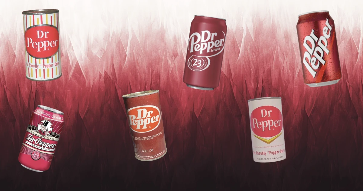
THE ORIGINAL

Source: Dr Pepper

The introduction of the first Dr Pepper can in 1958 marked a significant milestone in the company's history, as it embraced the emerging trend of aluminum cans in the beverage industry.

The design of "The Original" showcased the bold and eye-catching aesthetics of the era, with its vibrant red and yellow horizontal stripes that embodied the optimism and energy of post-war America.

The minimalistic yet bright oval-shaped logo in the center, along with the friendly slogan "the friendly Pepper-Upper," encapsulated Dr Pepper's brand identity and positioned it as a beloved and approachable soft drink that aimed to uplift and refresh consumers during a time of cultural change and prosperity.

THE WHITE CREAM

Source: Dr Pepper

In 1963, Dr Pepper introduced "The White Cream" can design, which signaled a shift towards a cleaner and more sophisticated aesthetic that aligned with the evolving tastes and sensibilities of the 1960s.

The solid cream white background provided a subtle and elegant canvas that allowed the iconic oval-shaped red logo to take center stage, while the addition of the yellowish-gold arrow shape beneath the logo added a touch of visual interest and dynamism.

By retaining the slogan "the friendly Pepper-upper," Dr Pepper maintained its brand identity as a welcoming and uplifting beverage choice, even as the design adapted to the changing cultural landscape of the decade.

THE 12 FL OZ

Source: Dr Pepper

The introduction of "The 12 Fl Oz" can design in 1971 marked a bold departure from the previous designs, as Dr Pepper embraced a more assertive and confident aesthetic that reflected the cultural shifts of the early 1970s.

The solid brick red color of the can conveyed a sense of boldness and energy, while the updated oval shape featuring the new logo and typeface in large, white boldface letters exuded a sense of modernity and strength.

The replacement of the long-standing slogan with the straightforward "12 FL OZ" designation signaled a move towards a more direct and functional approach to packaging design, aligning with the no-nonsense attitudes and preferences of consumers in the era.

THE RETRO DIAGONAL

Source: Dr Pepper

The introduction of "The 12 Fl Oz" can design in 1971 marked a bold departure from the previous designs, as Dr Pepper embraced a more assertive and confident aesthetic that reflected the cultural shifts of the early 1970s.

The solid brick red color of the can conveyed a sense of boldness and energy, while the updated oval shape featuring the new logo and typeface in large, white boldface letters exuded a sense of modernity and strength.

The replacement of the long-standing slogan with the straightforward "12 FL OZ" designation signaled a move towards a more direct and functional approach to packaging design, aligning with the no-nonsense attitudes and preferences of consumers in the era.

THE NEW ERA

Source: Dr Pepper

The arrival of "The New Era" can design in 1997 signaled Dr Pepper's embrace of a sleek, contemporary aesthetic that resonated with the bold and dynamic culture of the late 1990s and early 2000s.

The continued use of the solid brick red color provided a strong visual connection to the brand's heritage, while the decision to replace the iconic oval shape with a diagonally placed logo and a lighter, faded red stripe beneath the lettering injected a sense of movement and energy into the design.

This modern and streamlined approach to the can's appearance not only captured the spirit of the times but also established itself as the definitive Dr Pepper look for the better part of two decades, cementing the brand's position as a classic yet continually relevant beverage choice.

THE VINTAGE

Source: Dr Pepper

The introduction of "The Vintage" can design in 2011 marked a nostalgic and celebratory moment in Dr Pepper's history, as the company commemorated its 125th anniversary by paying homage to its rich heritage and the enduring appeal of its classic formula.

The design featured a charming and retro-inspired aesthetic, showcasing the brand's vintage logo from the 1930s and the beloved slogan "At 10-2 and 4 o'clock," which evoked a sense of timelessness and tradition.

The inclusion of whimsical art deco elements, such as the cartoon character of Dr Pepper's founder, Mr. Alderton, and the prominent "made with real sugar" seal, further emphasized the brand's commitment to authenticity and its connection to a bygone era, tapping into the growing consumer interest in nostalgia and artisanal, craft-style beverages that defined the cultural landscape of the early 2010s.

THE MODERN

Source: Dr Pepper

The introduction of "The Modern" can design in 2015 showcases Dr Pepper's ability to adapt and evolve with the changing times while still maintaining a strong connection to its brand identity and heritage.

The dark red solid color of the can provides a sleek and bold backdrop for the updated, curvy, and contemporary white typeface of the Dr Pepper logo, reflecting the brand's ongoing commitment to staying relevant and appealing to a new generation of consumers.

The inclusion of the "Est. 1885" text beneath the logo serves as a subtle nod to the company's long-standing history and enduring presence.

While the prominent display of the number 23 in an oval shape, accompanied by the original slogan "Authentic Blend of 23 Flavors," reinforces Dr Pepper's unique selling proposition and its status as a beloved and distinctive beverage choice, striking a balance between modernity and tradition that aligns with the cultural values and preferences of the mid-2010s.

Collection

Next