.webp)
© History Oasis
You might be wondering where that mermaid-like character on your cup comes from as you sip your Starbucks coffee. Well, you are in luck. This is the story of the famous Starbucks mascot and logo that evolved from a bare-breasted brown mermaid to the simplified iconic design we all know today.
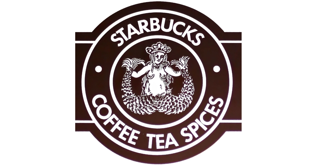
1971
Terry Heckler creates the original Starbucks logo for founders Jerry Baldwin, Gordon Bowker, and Zev Siegl. This proto-design features a bare-breasted two-tailed mermaid in brown. It’s covered by a circle with the words “Starbucks Coffee, Tea, and Spices.” Where did Heckler find his inspiration? Apparently, it comes from 16th-century Norse woodcuts that were found in old marine books. Heckler chose the mythological siren to represent coffee’s seductive pull on customers in Seattle’s maritime culture. The early siren appears on simple signage and packaging at the first Pike Place Market store.
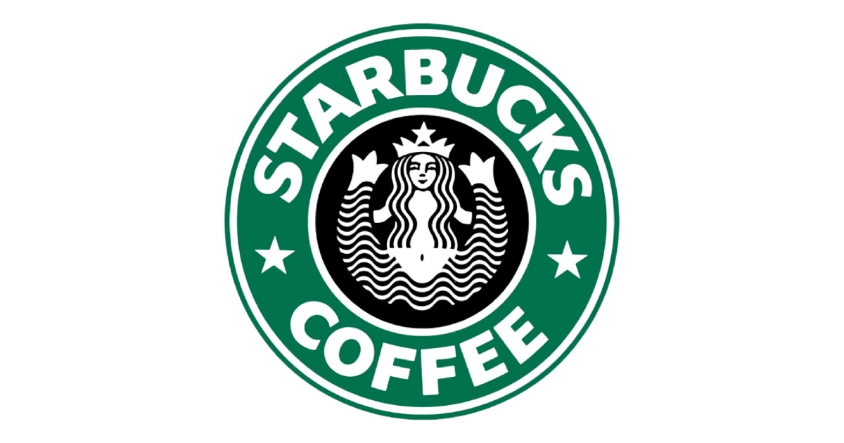
1987
Howard Schultz’s Il Giornale company acquires Starbucks for $3.8 million with help from Bill Gates Sr. Schultz tasks Terry Heckler to redesign the siren logo. He modernizes the food mascot by replacing brown with green. He also covers the figure’s torso with flowing hair. Hecker also simplifies the text with “Starbucks Coffee”. He adds a final touch with flecks of stars. The new green siren begins appearing on the first espresso-based beverage cups as Schultz introduces Italian coffee culture to America.
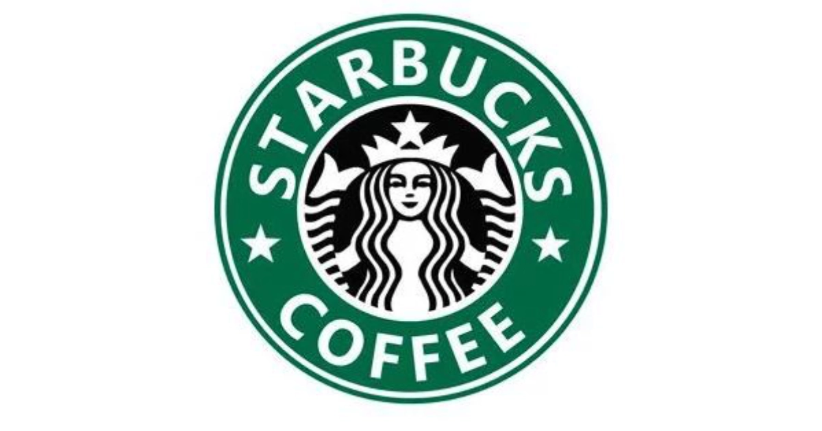
1992
Starbucks refines the siren design again by cropping the image to focus on her face and twin tails. They completely remove the lower body. The green background deepens while the circular frame remains. The new simplified logo helps to make the brand more recognizable. The company goes public this same year, expanding the store nationwide. The simplified siren logo becomes a status symbol, with customers flaunting their cups of coffee.
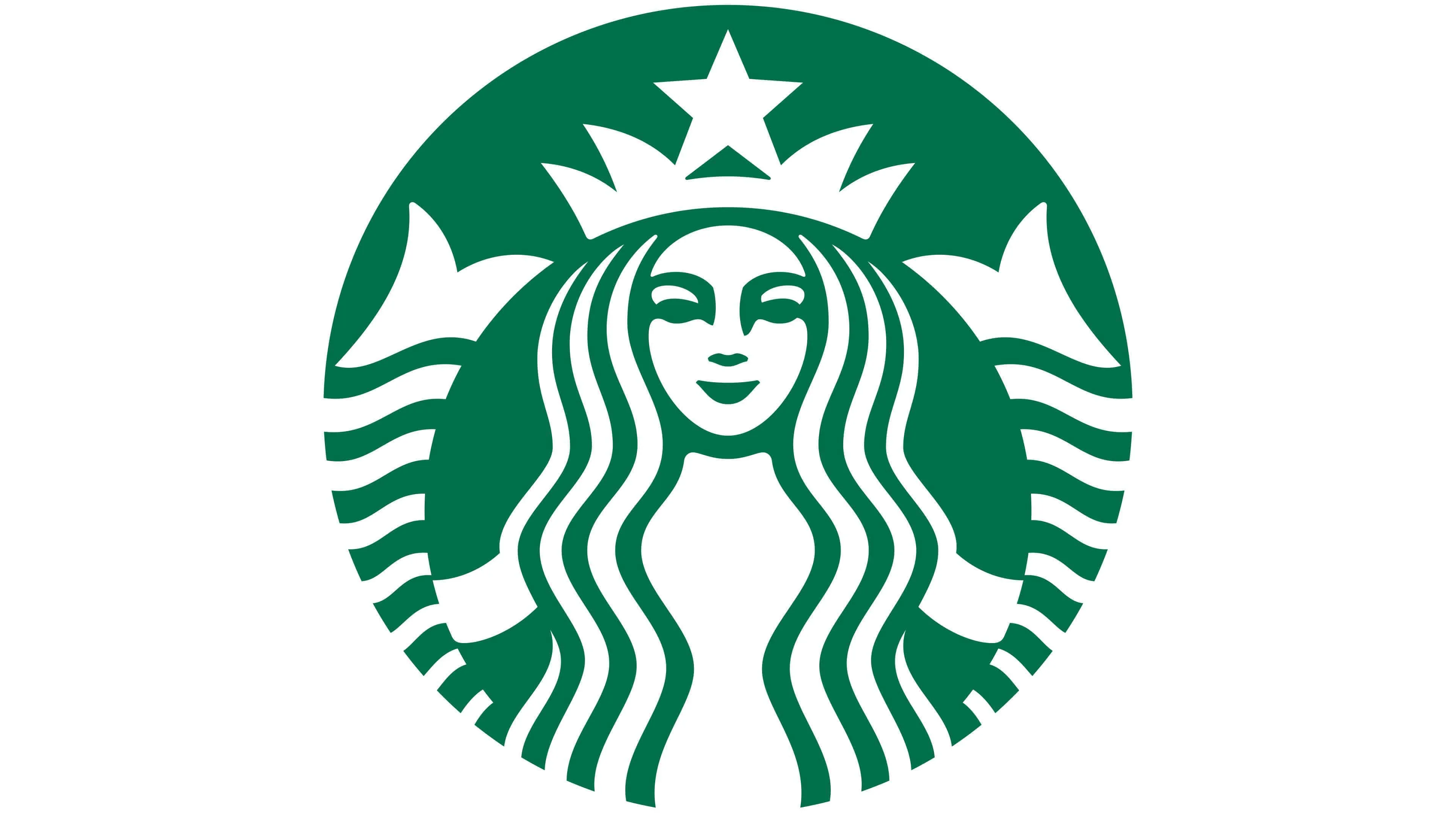
2011
For Starbucks’ 40th anniversary, designers remove all text and the outer circle. This is the first time the siren mascot stands alone. It’s so recognizable at this point that it doesn’t need text. The green brightens while the mermaid’s face becomes perfectly centered. The company launches creative campaigns like “The Dot Collection,” where designers create 100 artistic variations of the siren logo. It treats her as an abstract dot that can be reimagined across different artistic styles and mediums.
1997
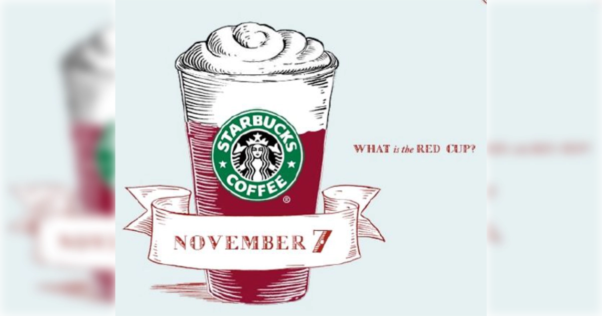
The magenta cup is launched, featuring holly leaves. Starbucks transforms its annual holiday cups into cultural events.The red cups become holiday marketing icons, with customers eagerly awaiting each year’s design reveal and sharing photos across social media. Recent campaigns incorporate “siren waves” — design elements directly inspired by the logo’s flowing hair. It creates holiday trim features that appear on signs, packaging, and gift tags. The siren becomes central to these seasonal transformations.
2014
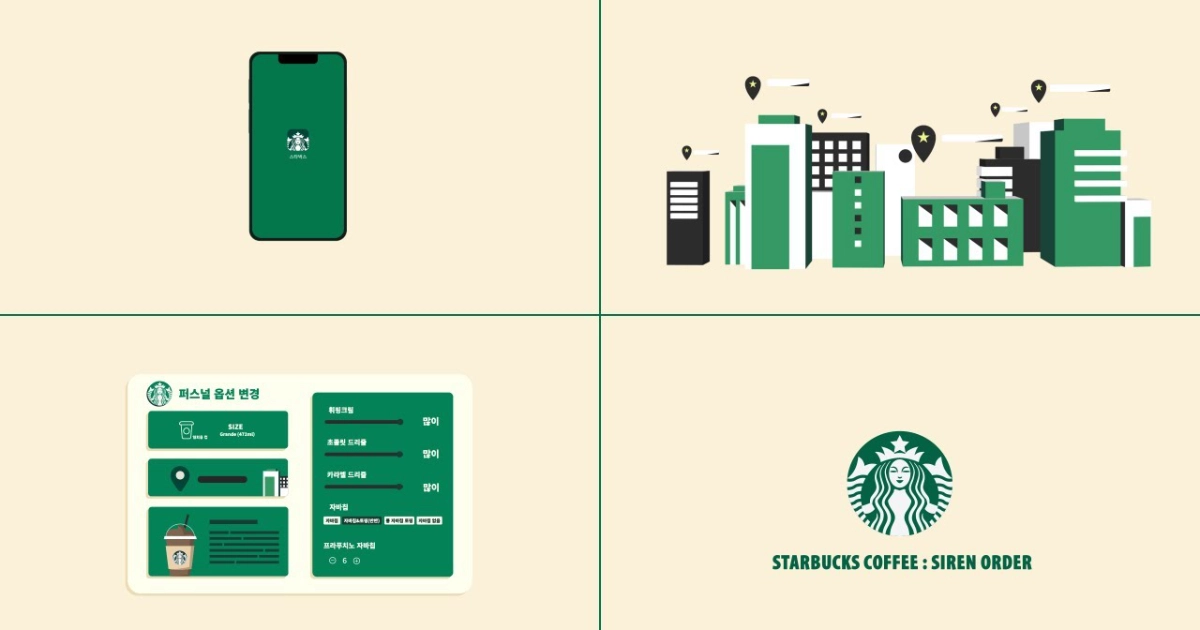
Starbucks Korea launches “Siren Order,” the world’s first mobile ordering system. The new system is named after the logo. This O2O service allows customers to order through QR codes and pre-payment systems. The app uses big data to analyze customer preferences, generating personalized recommendations that account for 37% of mobile orders. By 2018, voice ordering through Samsung’s Bixby integrates with Siren Order, making Starbucks the first retailer to offer end-to-end voice commerce. The siren’s name becomes synonymous with technological innovation in coffee retail.

Present
Most recently, the siren logo achieves recognition rates of 70% globally, appearing on an estimated four million cups daily. The logo transforms into a lifestyle symbol, with appearances in films and television shows. Modern advertising campaigns feature hidden siren appearances throughout commercials, turning logo spotting into interactive marketing experiences.