4 min read
The Coca-Cola logo, with its flowing white script on red, has remained essentially unchanged since its 1886 creation.
While designers have refined its curves and proportions over decades, the core design endures as one of the world’s most recognized corporate symbols.
THE BIRTH OF A LOGO (1886)

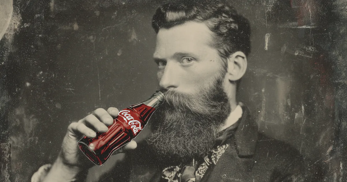
In 1886, pharmacist John S. Pemberton mixed sugar, carbonated water, and his secret blend of ingredients to create Coca-Cola.
First selling it as patent medicine.
Pemberton’s bookkeeper, Frank M. Robinson was tasked with branding this new beverage.
He rolled the potential names on his tongue, testing their sound and rhythm.
The crisp consonants of “Coca-Cola” caught his attention.
Robinson picked up his steel-nibbed pen and began sketching.
He crafted letters in Spencerian script—the same elegant style that teachers drilled into American schoolchildren’s copybooks.
Each loop and curve took shape: the tall “C”s, the connecting “o”s, the graceful “l.”
The final design flowed across the page like black ink in water.
The logo’s swirls mirrored the drink’s dark syrup as it twisted through carbonated water, creating a visual signature as distinctive as the beverage’s taste.
SIMPLIFYING DESIGN (1890)

In 1890, Coca-Cola replaced its streamlined script logo with an ornate design that proved to be a critical misstep.
The new version added copper-colored flourishes around each letter, a thick rectangular border, and red accents that interrupted the logo’s traditional flow.
Customers struggled to read the complicated lettering, especially from a distance.
Store owners reported that the busy design blended into their crowded shelf displays, making the product harder to spot.
Within six months, Coca-Cola scrapped this elaborate redesign and returned to their original clean script—saving them $3,200 in planned marketing materials.
A RETURN TO ROOTS, WITH A DASH OF MODERNITY (1941)

In 1941, The Coca-Cola company added the white curved stripe—called the dynamic ribbon—which resembles a flowing liquid.
This stripe set Coca-Cola’s visual identity apart from competitors while preserving the cursive script that customers recognized.
POP CULTURE & THE BOTTLE DESIGN (1950S-1960S)

In 1955, Coca-Cola incorporated the curved glass bottle shape into its logo design.
By then, consumers could identify a Coke by touch alone in pitch dark.
The bottle’s contour shape, with its curved waist and fluted glass panels, had become more than a container.
When Coca-Cola added this shape to their visual branding, they acknowledged what millions already knew: the bottle itself told the story of their product.
EMBRACING GLOBALIZATION (1985)

In April 1985, Coca-Cola replaced its century-old formula with “New Coke.”
The company redesigned its logo, replacing the classic cursive script with bold, modern letters.
The new drink contained more high-fructose corn syrup and less phosphoric acid, creating a sweeter taste that matched Pepsi’s flavor profile.
Customers revolted.
They flooded Coca-Cola’s Atlanta headquarters with 8,000 angry calls a day. Some stockpiled cases of the original formula, while others formed protest groups like “Old Cola Drinkers of America.”
A Seattle businessman filed a lawsuit to force the company to provide the original recipe.
Seventy-nine days later, Coca-Cola admitted defeat.
The company reintroduced the original formula as “Coca-Cola Classic” with its original logo design.
TURNING BACK TIME (PRESENT DAY)

The current logo design strips away the decorative flourishes that cluttered earlier versions.
The letters stand bold and clear, instantly recognizable whether on a billboard or a bottle cap.
Frank M. Robinson’s original hand-drawn script from 1886 anchors every version of the logo.
Even as designers refined and simplified the mark through decades of updates, they preserved his distinctive letterforms.
This continuity links each Coca-Cola sold today to the first glass poured at Jacobs’ Pharmacy in Atlanta.
The design’s lasting power stems from this ability to represent both the beverage itself and the historical/cultural moments it accompanies.