10 min read
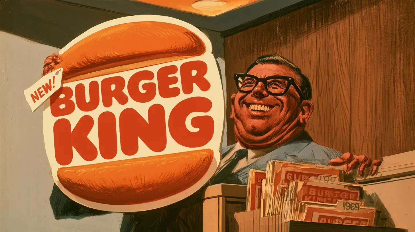
Burger King’s current logo is legally a mark from 1969. When the company registered the redesign in 2020, it did not file it as a new design. It told the U.S. Patent and Trademark Office that it had first used the mark in commerce on June 1, 1969 — and that date already appeared on an older registration the company has renewed three times and never allowed to lapse.
The 2021 redesign usually gets written up as nostalgia, a brand raiding its own attic. The filings describe something stranger. On paper, the old mark never left.
| Era | The mark | What changed |
|---|---|---|
| 1953 | ”BURGER-KING” wordmark | Hyphenated, hand-lettered, no burger |
| 1969 | Bun halves | Name stacked between two buns |
| 1994 | Bun halves redrawn | Same structure, new drawing |
| 1999 | Blue crescent | Buns tilted, ring added |
| 2021 | Bun halves again | Blue dropped, flat color |
THE FIRST BURGER KING MARK WAS A HYPHENATED WORDMARK
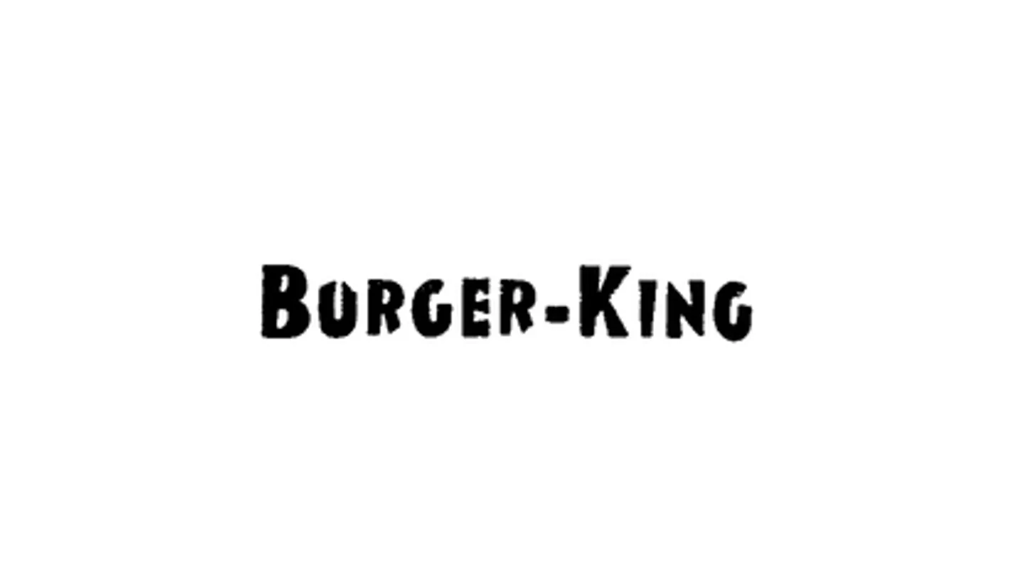
The earliest Burger King logo on the federal record has no burger in it at all. It reads BURGER-KING, hyphenated, in rough hand-lettered capitals, and the company swore first use of it on July 28, 1953 — the Jacksonville, Florida period, when the chain was still called Insta-Burger King and sold itself on a broiler rather than a crown. The application covered “Drive-In Restaurant Services” and was filed in 1958, registering in October 1961.
Search the phrase today and you will be told the 1953 logo was a rising sun with triangular rays. That description appears almost exclusively on logo-generator marketing blogs, which disagree with each other on whether it was gray, black, or black and white, and none of them cite a source. What the company itself put on file for July 1953 was the wordmark. A registration is evidence of what a company claimed, not proof of every sign it ever hung — but it is the only primary document in the argument, and the sunburst has none.
That registration is dead now. It was cancelled for failure to file an acceptable declaration under Section 8, the same maintenance paperwork that killed McDonald’s original arches trademark.
THE BUN HALVES ARRIVED IN 1969, AND NOBODY SIGNED THEM
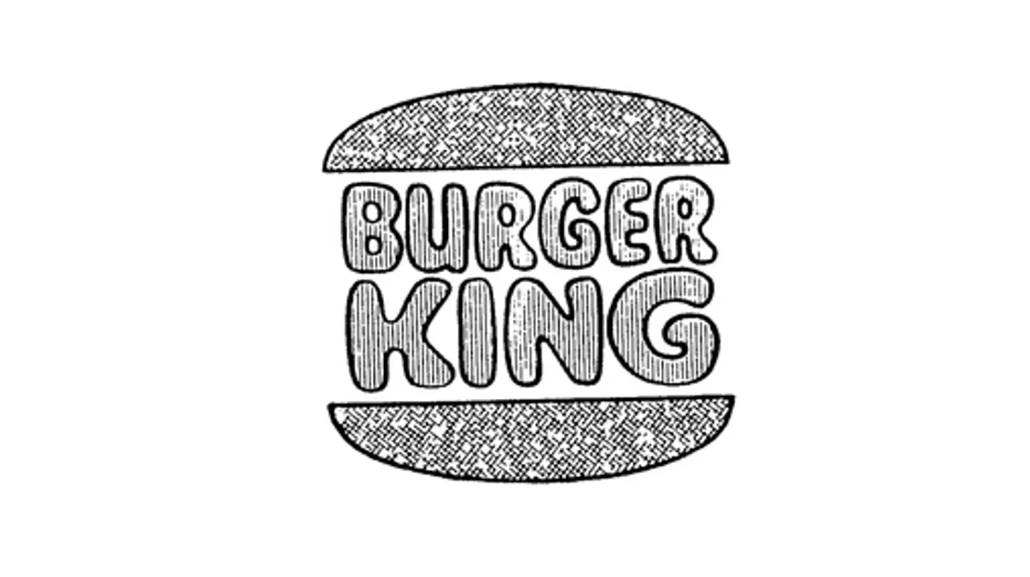
The design Burger King still uses was in commerce by the end of 1968. One registration records first use on December 6, 1968; the one that matters records June 1, 1969. Filed in 1976 and registered the following January, it describes the mark plainly — the stacked words BURGER KING held between two hamburger buns, with the drawing lined for the colors red and orange. It is classified under design search code 08.05.01, “Hamburger sandwiches.” The company also disclaimed any exclusive rights to the word “burger” on its own.
No designer is credited anywhere. Not in the filings, not on the company’s own site, and not on any of the pages currently ranking for this topic — several of which credit no designer for any era of the logo. It is a strange gap for a mark this widely reproduced, and it stays a gap here rather than getting filled with a guess.
THE 1999 LOGO PUT A BLUE RING AROUND THE FOOD
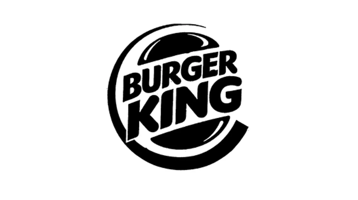
Burger King put a blue crescent around its burger on April 16, 1999. The trademark office describes the result without flattery: red lettering set between yellow hamburger buns, with a blue crescent design. The buns tilted off their horizontal axis and shrank inside the composition, and a swoosh closed around them — the house style of turn-of-the-millennium corporate identity, applied to a sandwich.
The work came from Sterling Brands, whose president later confirmed the agency’s role firsthand. Blue was the first color in the logo’s history that referred to nothing on the menu, and it stayed there for 22 years.
WHAT BURGER KING TOLD THE TRADEMARK OFFICE IN 2021
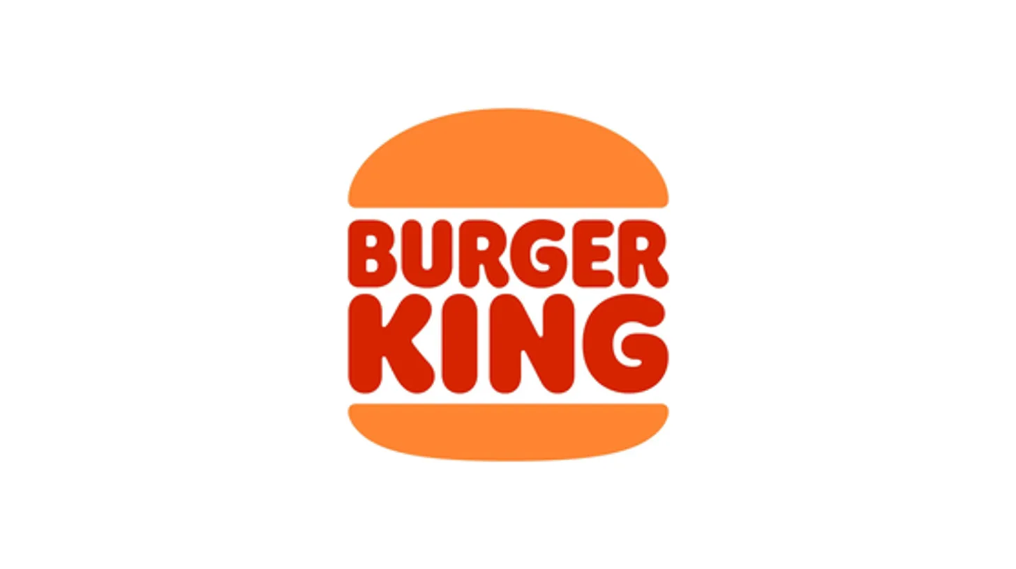
Here the paperwork stops matching the press coverage. The company filed its “new” logo on May 1, 2020, and it registered on June 22, 2021 as number 6397841. The description reads: the stacked, stylized words BURGER KING in red between two orange hamburger buns, with red and orange claimed as features of the mark. Those are the same two elements and the same two colors the 1976 drawing had been lined for.
The first-use date on the 2020 application is June 1, 1969.
And the 1969 registration was never abandoned. The company renewed it in 1996, again in March 2007, and again in September 2017 — twice while the blue logo was the chain’s public face. It kept paying to defend a mark it had taken off its own buildings. When it wanted the design back, there was nothing to revive.
The reverse is also true, which settles a question the top search results get wrong in both directions. Some pages list the blue logo as current; others date it 1999–2021 and call it gone. Neither is right. The 1999 registration is live and renewed — retired from the signage, still defended on the register. The company is maintaining both logos at once, and has been for years.
THE 2021 REBRAND IN ITS DESIGNERS’ OWN WORDS
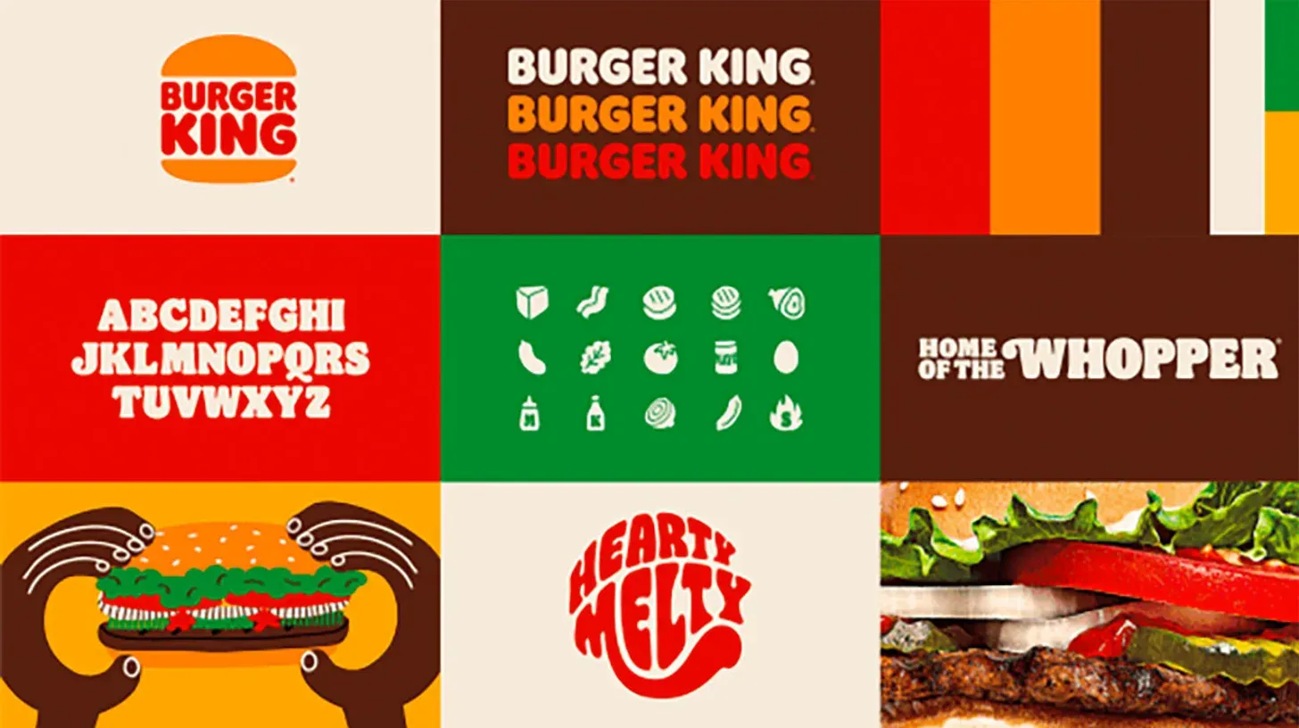
Burger King announced the redesign in January 2021, its first identity overhaul in more than twenty years, executed by the agency Jones Knowles Ritchie. Raphael Abreu, global head of design at parent company Restaurant Brands International, described the brief without hedging:
“We redesigned our logo intentionally inspired by our identities from 1969 to 1998, which were authentic, confident, simple, genuinely Burger King.”
The blue went entirely, from the logo and from everything else. The replacement palette was drawn from flame-grilling and ingredients, with colors named Fiery Red, Flaming Orange, and BBQ Brown. A custom typeface called Flame, cut by Colophon Foundry, went onto the packaging. The agency’s own case study is blunter about the problem it was hired to solve, describing what the brand had looked like beforehand as “the same gas station plastic 2000s look.”
THE DESIGNER OF THE 1999 LOGO ON ITS REPLACEMENT
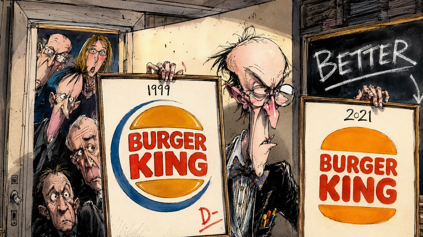
The person who ran the agency that made the deleted logo reviewed its deletion in public. Debbie Millman was president of Sterling Brands when it took on the 1999 identity, and by 2021 was editorial director of PRINT, which meant the rebrand landed on a desk belonging to the one person least likely to be neutral about it.
“I’m afraid that a lot of the general public won’t understand the logo redesign; quite a few people have written me and asked why Burger King went back to their old logo. The new monogram is bold and brilliant, and I truly think it should be the new identity! It is much better than the logo I worked on with my beloved Sterling Brands.”
The praise was aimed at the inset BK monogram rather than the primary lockup — “absolute genius” in Millman’s words, and the identity they thought the company should have picked. The reaction is worth more than any agency case study, and it is a rarer thing than a rebrand: a designer marking down their own work in public, by name.
Brands reverse themselves more often than the design press admits. Pepsi went back to a version of its 1987 globe in 2023. Cracker Barrel discovered the opposite lesson in August 2025, when stripping its heritage mark dropped the share price 7.2% in a single day and erased $94 million.
THE MARK SURVIVED THE CHARACTER
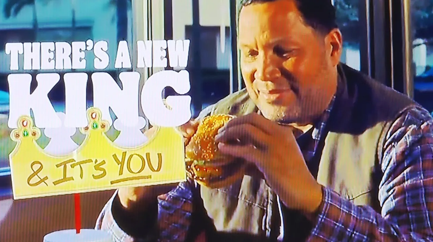
Burger King’s logo and its King are two different things, and only one of them was retired. On March 15, 2026, the chain used a 90-second Academy Awards spot to fire its own mascot and hand the crown to customers, ending a 71-year run for a character whose full history sits with the rest of the Burger King mascots.
The bun halves did not move. No filing was amended, no color claim withdrawn, no new mark registered. The company has changed owners and chief executives repeatedly since 1969 — Pillsbury, Grand Metropolitan, Diageo, 3G Capital, Restaurant Brands International — and every one of them kept paying to renew the same drawing. It outlasted all of them, and the character too.
BURGER KING LOGO HISTORY FAQ
Why did Burger King bring back their old logo?
Burger King’s design leadership said the 1969–1998 identity was the brand at its most confident and simple, and the 2021 redesign was built deliberately from it. The trademark record supports a stronger version of that claim: the 2020 application listed a first-use date of June 1, 1969, so the mark was legally continuous rather than revived.
What is the story behind the Burger King logo?
The logo began in 1953 as a hyphenated BURGER-KING wordmark with no burger in it. The bun halves arrived by 1969, went unchanged in structure for three decades, were wrapped in a blue crescent by Sterling Brands in 1999, and returned in 2021 when Jones Knowles Ritchie dropped the blue and flattened the color.
Why did Burger King get rid of the King logo?
The King is a mascot, not the logo, and the two were retired on completely different schedules. The chain retired the character on March 15, 2026, in an Academy Awards commercial. The bun-halves logo was untouched by that decision and remains the company’s registered mark.
What does the Burger King logo mean?
It means a hamburger, and the trademark office agrees — the 1976 registration is classified under design code 08.05.01, “Hamburger sandwiches.” The two shapes are bun halves with the company name stacked between them. Burger King disclaimed exclusive rights to the word “burger” by itself when it registered the design.