9 min read
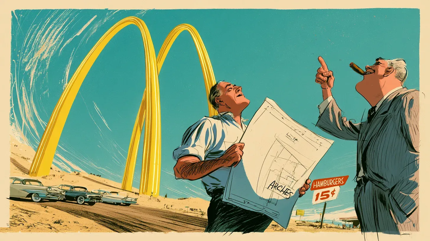
The Golden Arches were structural steel before they were graphic design. In late 1952 an architect named Stanley Clark Meston drew a hamburger stand with two 25-foot yellow sheet-metal arches trimmed in neon, sized to be read from a moving car. They held up nothing. They were there to be seen.
That is the part the logo-history pages skip. The arches spent eight years as architecture — a thing you drove past, not a thing you printed — before the company filed them at the trademark office.
The credit has been muddled ever since, and the surviving records contradict most of what gets written about it.
| Year | The mark | Status today |
|---|---|---|
| 1953 | Two structural arches | Building, never a trademark |
| 1961 | Stylized “M” | Cancelled in 2014 |
| 1968 | Simplified “M” | Still registered |
| 2003 | Arches with lowercase tagline | Current lockup |
THE ARCHES WERE BUILT BEFORE THEY WERE DRAWN
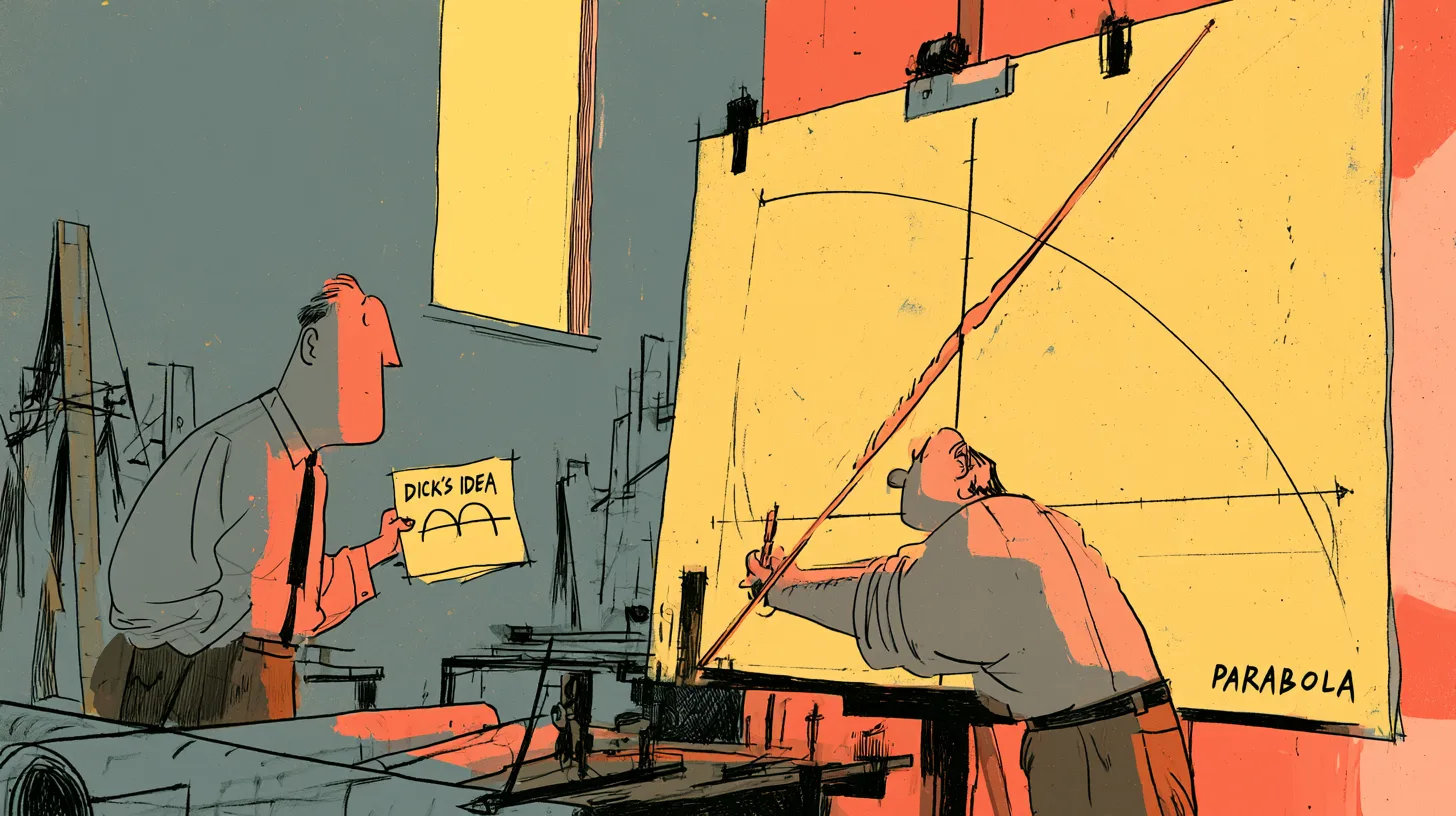
Richard McDonald sketched the arches first, and he was not a designer. Running a successful drive-in in San Bernardino with his brother Maurice, he wanted a building that announced itself from the road, and he drew two half-circles rising on either side of the stand. He then had to find someone willing to build it.
Not everyone was. The brothers approached the Los Angeles architect Douglas Honnold, who told them that if they intended to dictate the design they could draw it themselves.
Meston, working out of Fontana, took the job in late 1952. With his draftsman Charles Fish he turned the half-circles into tapered parabolas — leaning, springing shapes with far more tension in them than the original sketch had. The first restaurant built to that design opened in Phoenix in 1953, franchised to a man named Neil Fox. Sources split on whether the month was May or June.
WHO DESIGNED THE GOLDEN ARCHES?
Credit belongs to three people, which is why nobody agrees on one. Richard McDonald supplied the idea, Meston drew the building, and Fish worked out the parabola. The architectural historian Alan Hess, who reconstructed the sequence for the Journal of the Society of Architectural Historians in 1986, put the consequence plainly:
“Nationwide success and proliferation have obscured the origins and creators of [the arches] in Southern California. Its architect, Stanley Clark Meston, has virtually never been credited with his contribution to American architecture.”
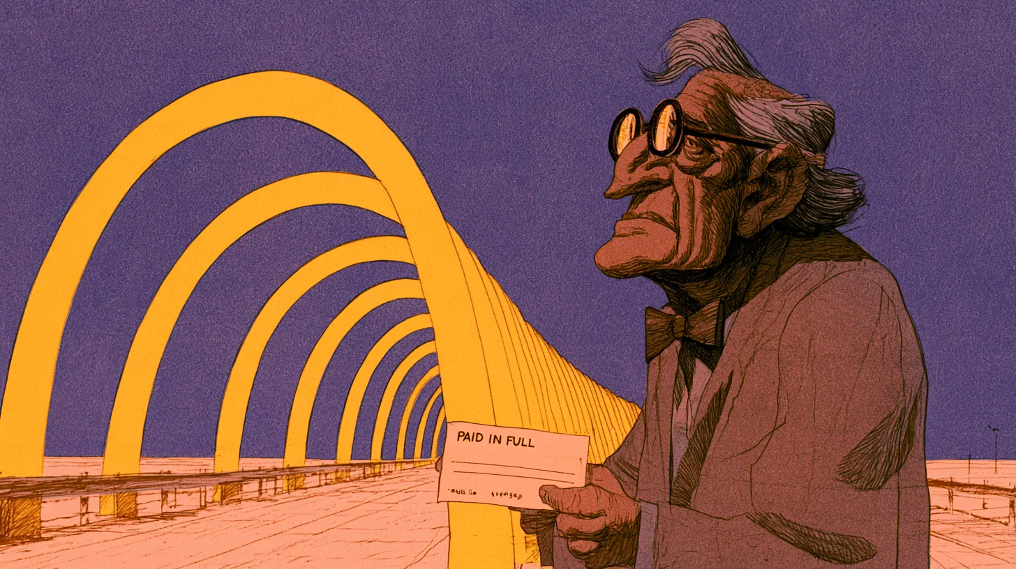
He was offered a stake, too. When the brothers hired him they gave him a choice: a flat fee, or a commission every time a new restaurant went up. He chose the fee. The Los Angeles Times reported it in 1989, three years before he died, by which point the company had built the thing tens of thousands of times.
Read the top search results today and you will find Meston credited with creating the emblem in 1961, the arches dated to 1940, and the design assigned to 1952 — three different answers, none of them right about what he actually made. He designed a building.
THE CHEF THE ARCHES REPLACED
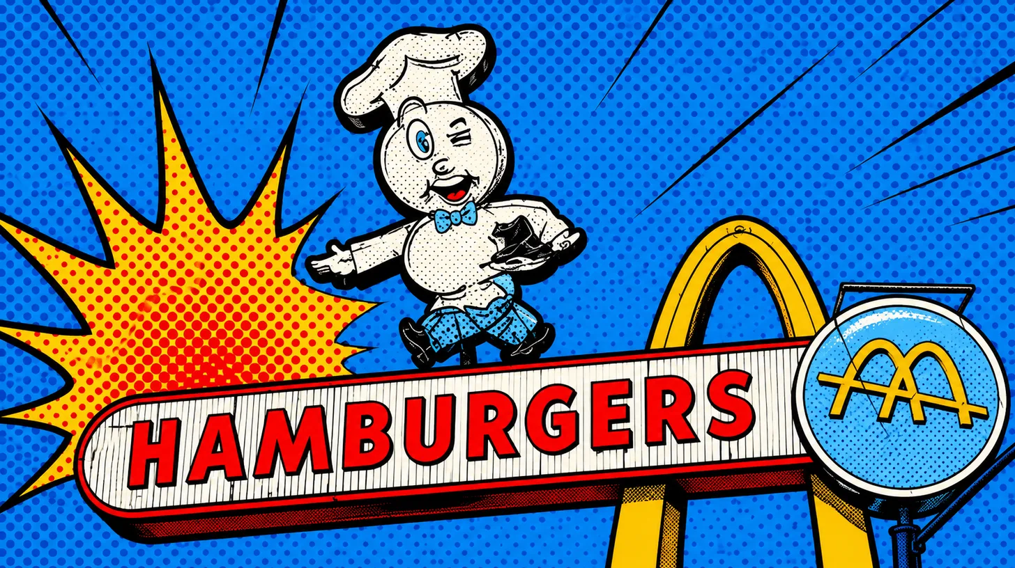
A winking chef, not an M, was the company’s first real mark. Speedee had a hamburger for a head and stood on the signage through the 1950s, promoting the brothers’ assembly-line kitchen rather than the building around it. He was gone before the arches were registered, and the full account of his run belongs with the rest of the McDonald’s mascots.
Two things get conflated here. The arches replaced Speedee; Ronald McDonald replaced nobody. The clown arrived afterward as a character, never as the corporate mark. Wendy’s went the other way, putting the founder’s pigtailed daughter in both roles at once.
1961: THE YEAR THE ARCHES BECAME A TRADEMARK
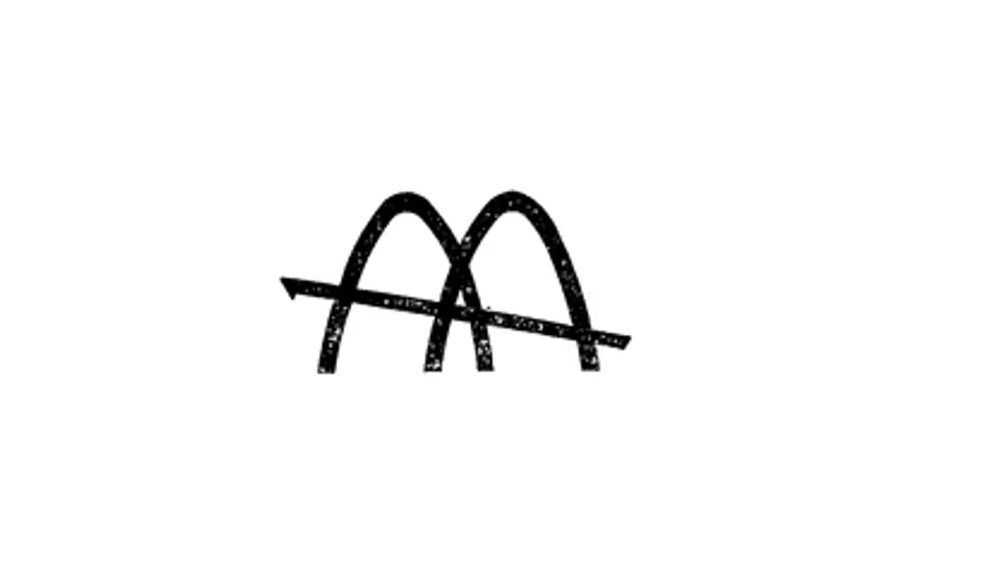
The trademark record dates the M to 1961, a year earlier than the standard account. McDonald’s filed a stylized “M” with the Patent Office on September 13, 1961, and swore first use in commerce on August 1, 1961. Registration followed on December 31, 1963, under serial number 72127781. Nearly every published history puts this logo in 1962.
The design came out of the company rather than an agency. Fred Turner — later chief executive, and the subject of our McDonald’s CEO history — sketched a stylized V. Jim Schindler, who ran engineering and design, pulled the V out into an M that read like one of the restaurants seen at an angle from the road, and ran a diagonal roofline through it.
The timing was not accidental. 1961 is also the year the chain started telling people to look for the Golden Arches, which only works as an instruction if the arches already mean something on the horizon.
THE 1968 MARK THAT IS STILL IN FORCE
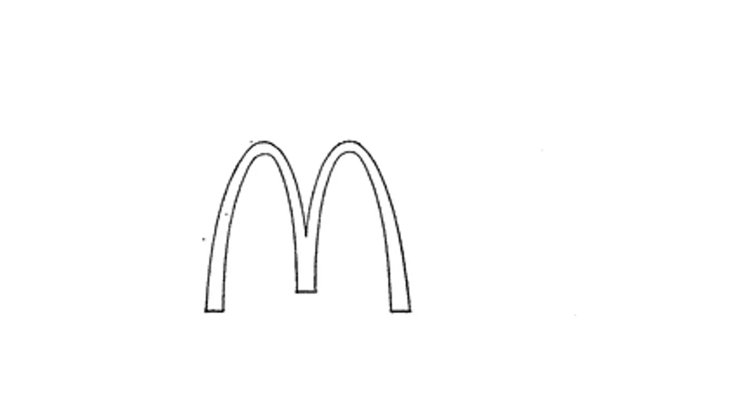
The M in use today was filed in 1968 and has never lapsed. The company recorded first use on October 21, 1968, filed on November 18, and took registration number 893440 on June 23, 1970. Put the two drawings side by side and the change is obvious: the 1961 mark is crossed by that diagonal roofline, and the 1968 one has lost it. What is left closes into a letter instead of a picture of a building, and it has outlived the restaurants that inspired it. It was renewed as recently as July 2019 and remains live. McDonald’s was not alone in making that move: within months, its closest rival settled on Burger King’s bun halves, a mark that likewise dropped any reference to a building and has stayed on the register ever since.
The 1961 mark did not fare as well. It was cancelled on November 10, 2014 — not abandoned, not sold, not challenged, but struck off because the registrant failed to file an acceptable declaration under Section 8. The original Golden Arches trademark died of paperwork.
THE FREUDIAN STORY, AND WHERE IT COMES FROM
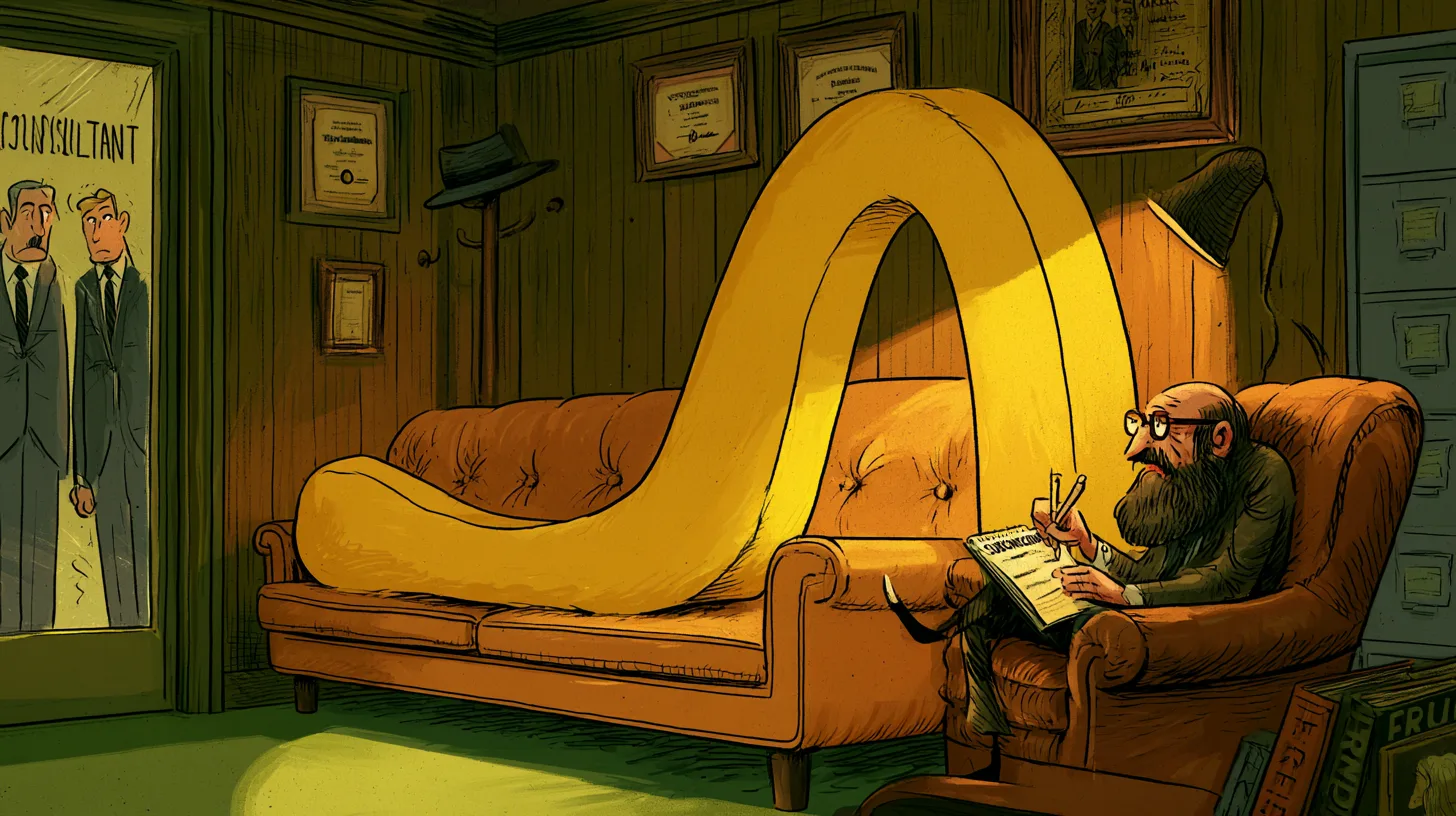
The most repeated claim about the arches rests on thin ground. The story goes that when the chain planned to drop the arches from its buildings in the 1960s, the design psychologist Louis Cheskin talked it out of the decision, arguing the shapes worked on customers as “mother McDonald’s breasts.”
The line is real enough as a quotation; the question is what it is evidence of. It traces to Eric Schlosser’s Fast Food Nation in 2001 and a trade-magazine article from 1999, not to Cheskin’s own published work or to the company’s records. Sites that present it as settled corporate history are citing a journalist citing a magazine.
THE LAST ORIGINAL ARCHES STILL STANDING
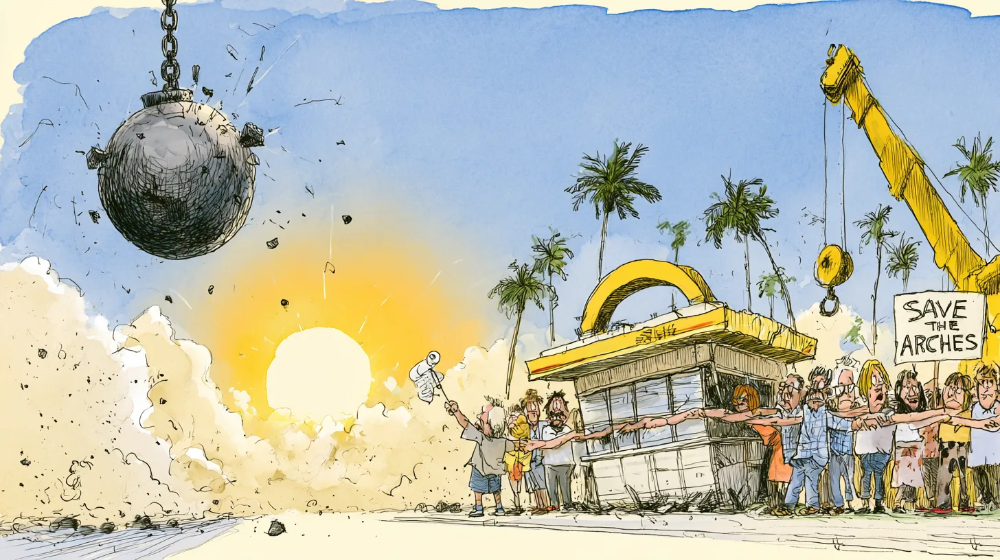
One building with Meston’s arches is still selling hamburgers, and it nearly wasn’t. The Downey, California restaurant opened on August 18, 1953, the third McDonald’s to open and the second the brothers franchised. When the Northridge earthquake damaged it in January 1994, the company closed it and moved to demolish.
Downey’s city council refused the permit. The National Trust for Historic Preservation put the building on its 11 Most Endangered Historic Places list that May, preservationists rallied, and Governor Pete Wilson urged the company to “preserve for posterity the home of the Golden Arches.” It reopened, restored, in December 1996.
It is not on the National Register of Historic Places, whatever the plaques and blog posts imply. Federal reviewers found it eligible in 1984 and it was never listed, because the owner objected.
MCDONALD’S LOGO HISTORY FAQ
What is the story behind the McDonald’s logo?
The logo started as a building. Richard McDonald sketched two arches for his drive-in, architect Stanley Meston and draftsman Charles Fish designed them as 25-foot neon-trimmed steel parabolas in late 1952, and the company only turned that architecture into a registered trademark in 1961, when Fred Turner and Jim Schindler shaped the arches into an M.
What did the McDonald’s logo look like in 1940?
There wasn’t one. The McDonald brothers opened their first stand in San Bernardino in 1940 as a barbecue drive-in with no arches, no M, and no mascot. The arches did not exist until Meston designed them twelve years later, and the letter M was not registered until 1961.
Why did McDonald’s turn the M upside down?
For International Women’s Day on March 8, 2018, the company flipped the M into a W across its social accounts, packaging, and crew uniforms. Almost none of that happened in the physical world: reporting at the time found a single restaurant, in Lynwood, California, that actually turned its sign over.
Why did McDonald’s change the logo?
Each change followed a change in the buildings. The 1961 mark copied the shape of a real restaurant seen from the road; the 1968 version simplified it into a clean letter as the chain moved to brick, mansard-roofed stores without structural arches; and the 2003 redesign paired the arches with a lowercase tagline. Starbucks carried the same simplifying instinct to its end point in 2011, when it took every word off its siren logo.