3 min read
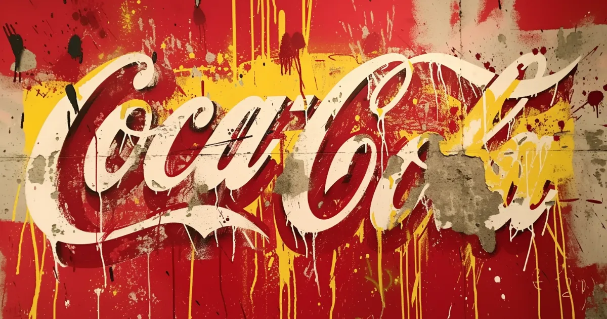
“The Coca-Cola script is the most valuable trademark in the world.”
—Forbes
For over a century, Coca-Cola has fought to protect its trademark assets—most notably its cursive logo and glass bottle’s contour shape.
The company has sued hundreds of competitors over the years, who copied its designs, names, or trade dress.
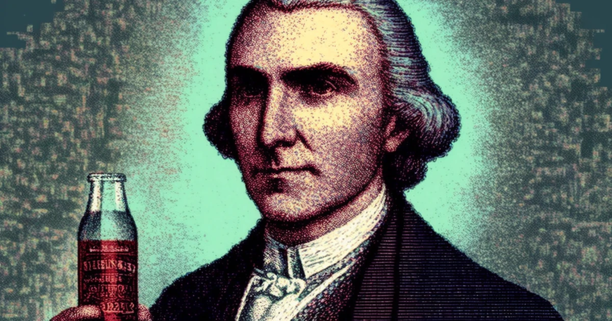
SCRIPT LOGO

Frank Mason Robinson designed Coca-Cola’s logo in 1886.
The logo’s flowing letters have remained virtually unchanged for over 135 years, while competitors routinely redesigned their logos over and over again.
This consistency has helped Coca-Cola build instant recognition across cultures and generations.
Today, the script is familiar to modern consumers as it was to their great-grandparents.
BOTTLE DESIGN

In 1915, Coca-Cola patented its contour bottle design, moving beyond the standard straight-sided bottles common at the time.
By 1960, the company registered the bottle’s shape itself as a trademark.
This decision was super unique for the time, when companies normally only protected their names and logos.
The bottle’s curved form became instantly recognizable worldwide, functioning as a three-dimensional brand signature that people could identify by sight or touch alone.
COCA-COLA’S TRADEMARK BATTLES

Coca-Cola has aggressively protected its brand since its founding.
The company launched multiple lawsuits against competitors who mimicked its trademarks, names, or designs.
In the early 1900s, Coca-Cola sued Koke Co. of America and Koca-Nola for using names that could confuse customers.
Coca-Cola has also had some major legal battles with Pepsi.
COCA-COLA VS. COKE

Coca-Cola’s brand name came from its original ingredients and became a symbol of American business.
Over time, people naturally shortened “Coca-Cola” to “Coke” in everyday speech.
Seeing how popular this nickname had become, the company trademarked “Coke” in 1945, right after World War II.
DEFENDING COCA-COLA’S TRADEMARK

In the 1900s, Coca-Cola launched a campaign to protect its trademark from becoming a generic term like “escalator” or “thermos.”
The company taught businesses to use “Coca-Cola” as a proper name, not a generic word for soda.
They specifically distinguished between “a Coca-Cola” (correct) and “a coke” (informal).
DYNAMIC RIBBON TRADMARK

In 1969, Coca-Cola introduced the Dynamic Ribbon—a white curved line against a red background that became central to its visual identity.
The ribbon’s flowing shape mirrors the drink’s effervescence while making the brand instantly recognizable worldwide.
CHALLENGING PARODIES

While artists and critics often transform the logo to make statements or parodies, Coca-Cola actively defends its trademark through legal action.
The law permits “fair use” of copyrighted material, but the boundaries between acceptable parody and trademark violation remain contested.
INTERNATIONAL TRADEMARK BATTLES

In 2012, Coca-Cola sued an Australian company over the name “Coca-Cola Amatil,” claiming it could confuse customers.
The Australian court rejected Coca-Cola’s argument.
Like many global brands, Coca-Cola regularly defends its trademark across different countries.
Each nation’s unique trademark laws force the company to adapt its legal strategy.
But not every challenge succeeds, as the Australian case shows.