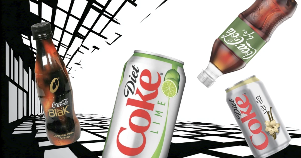
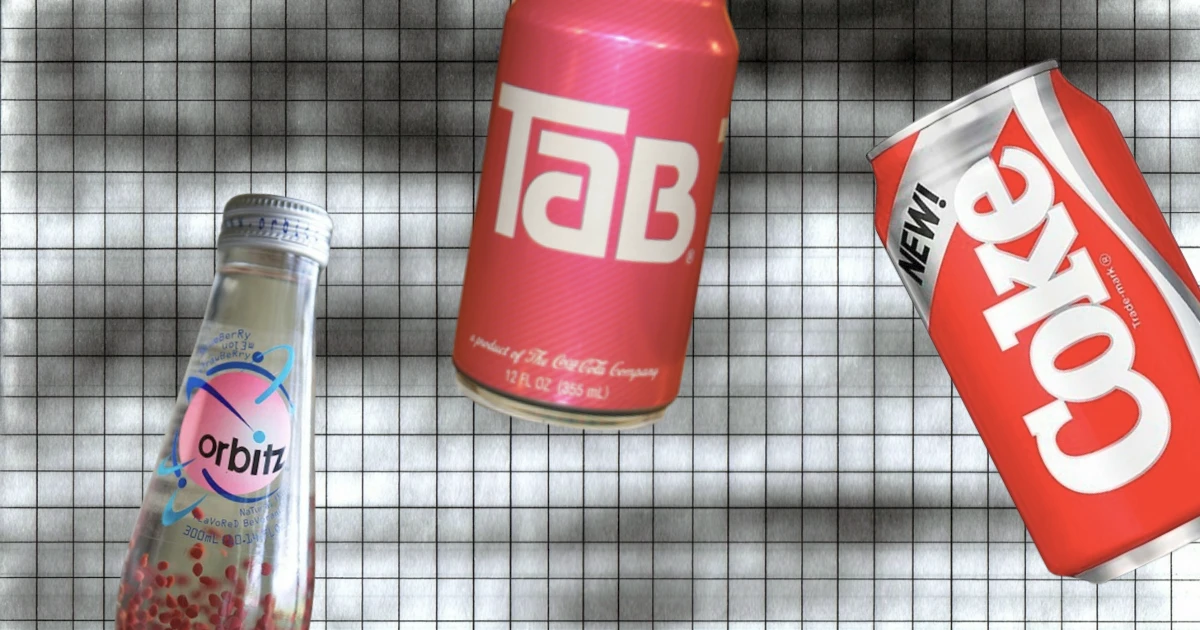
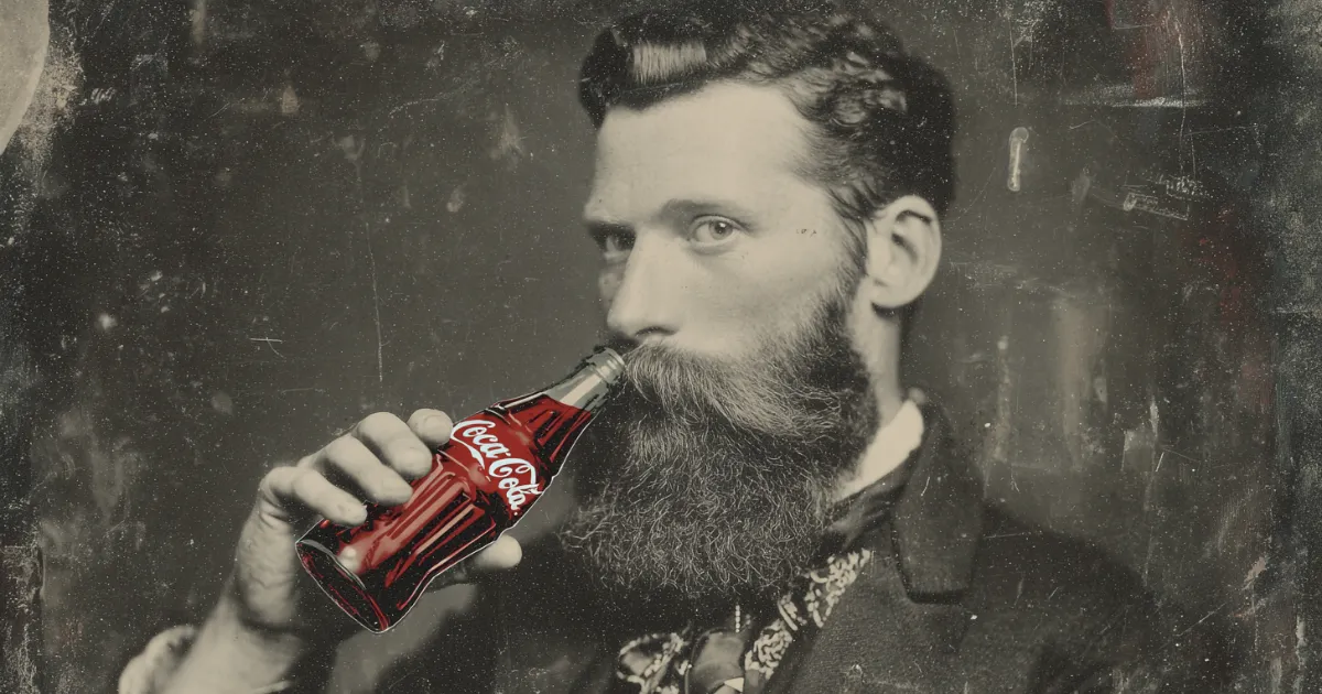
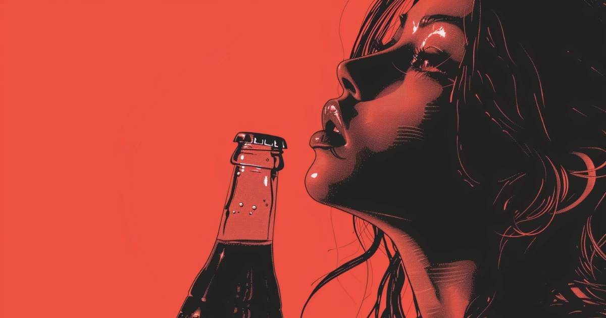
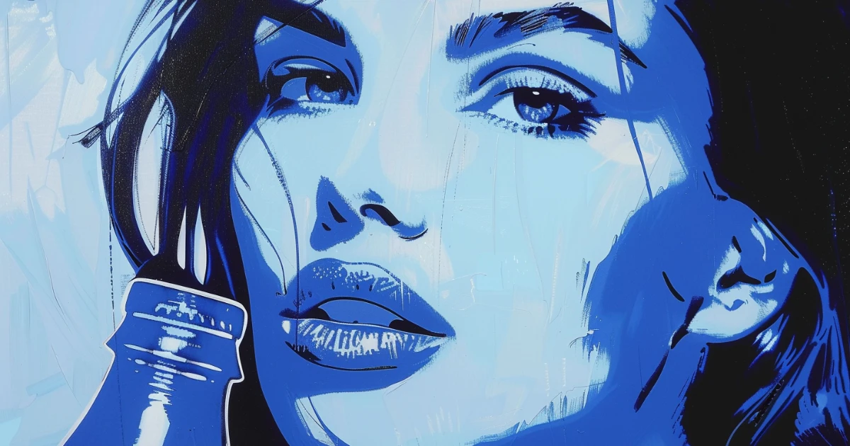
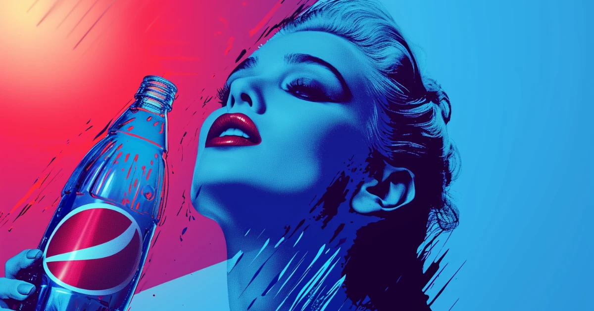
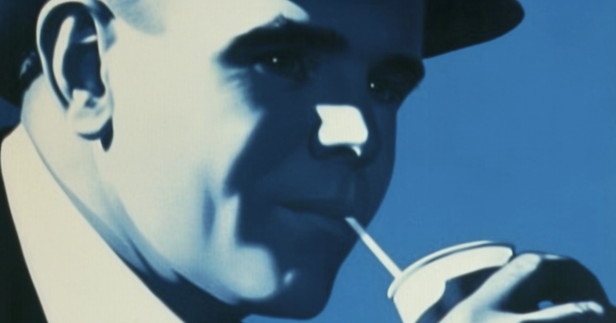
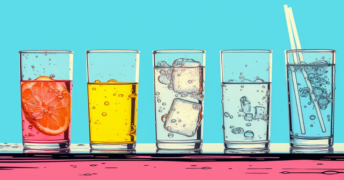
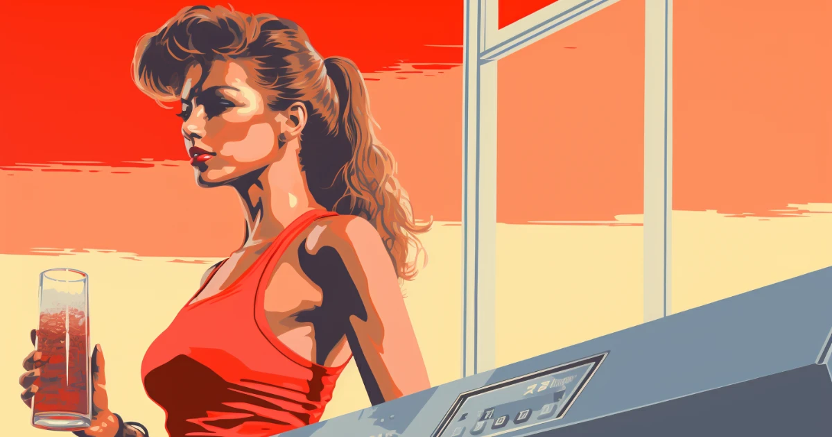
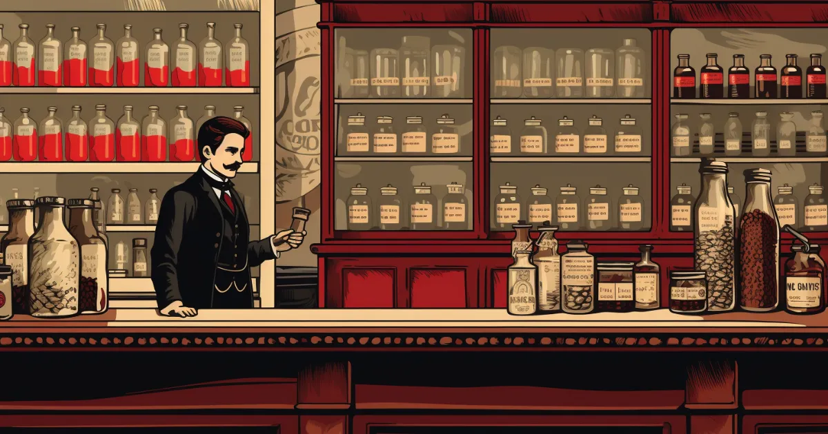
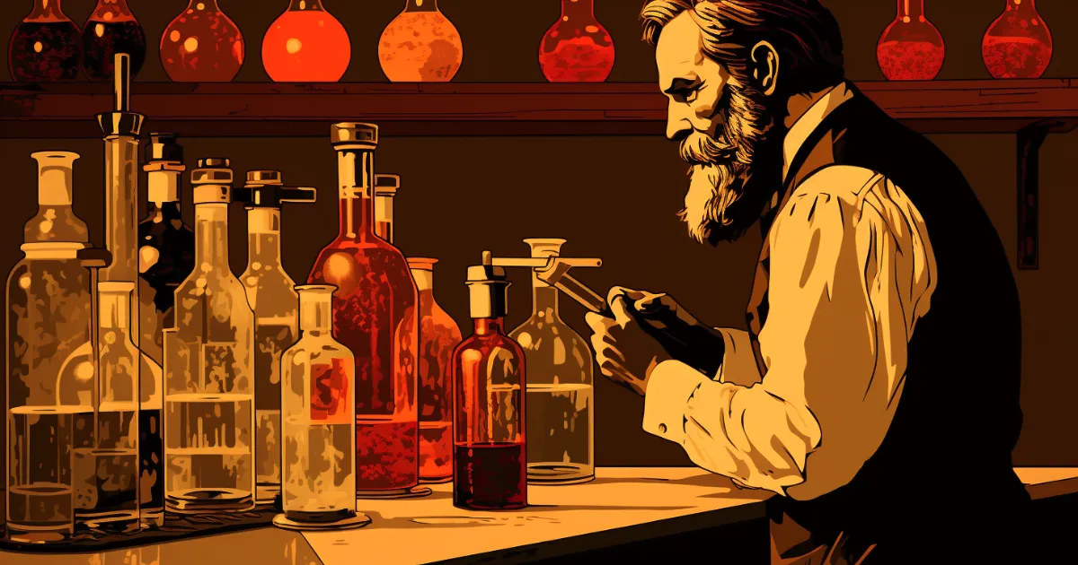
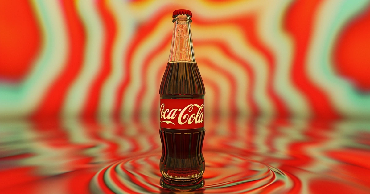
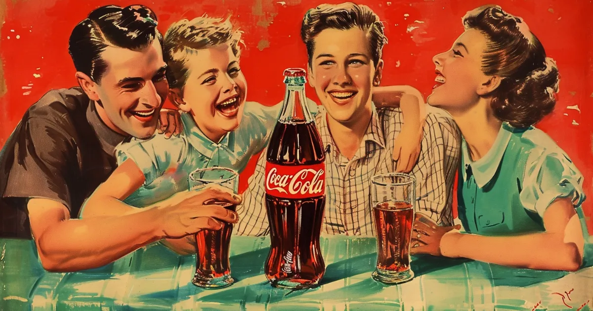
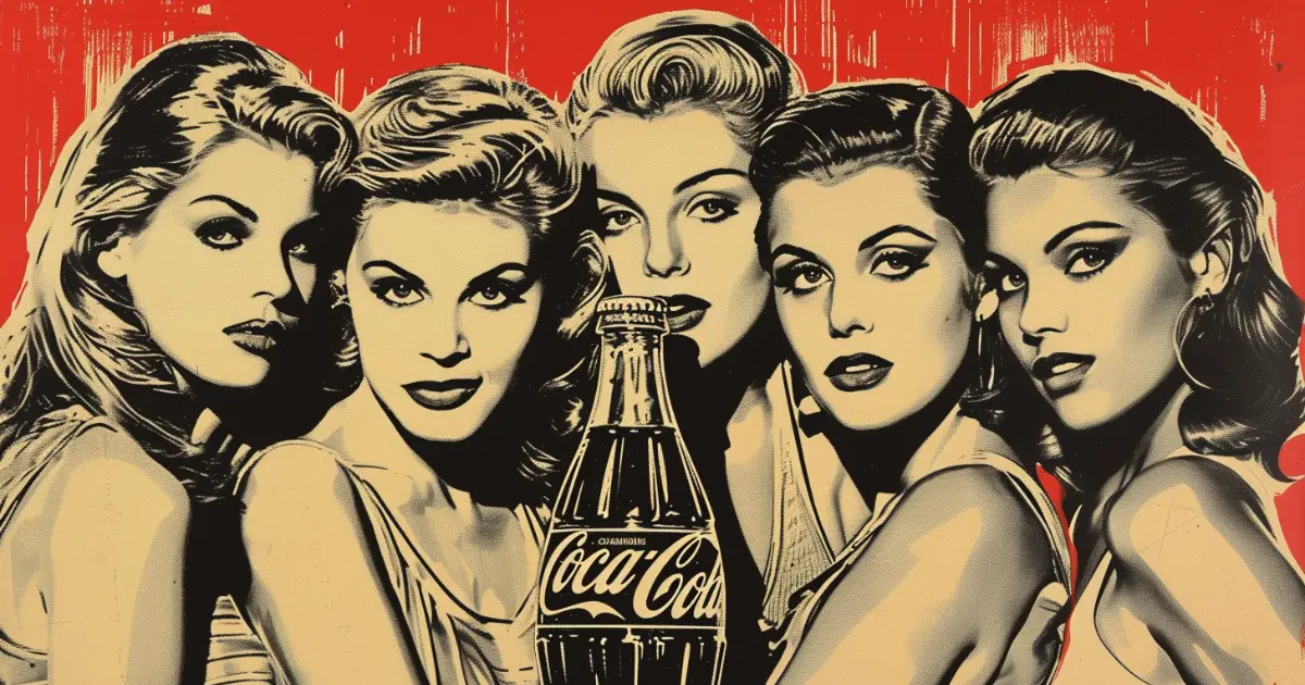
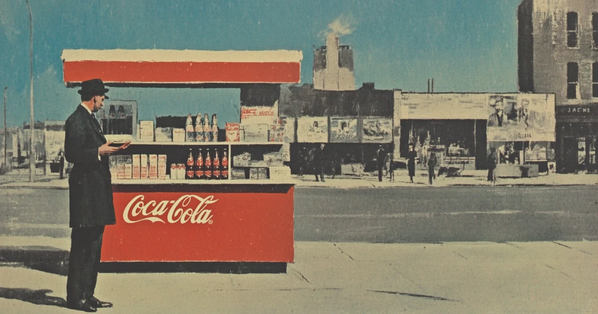
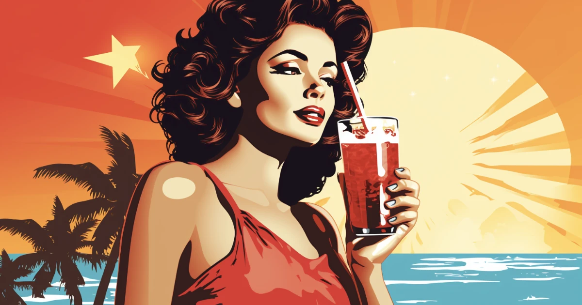
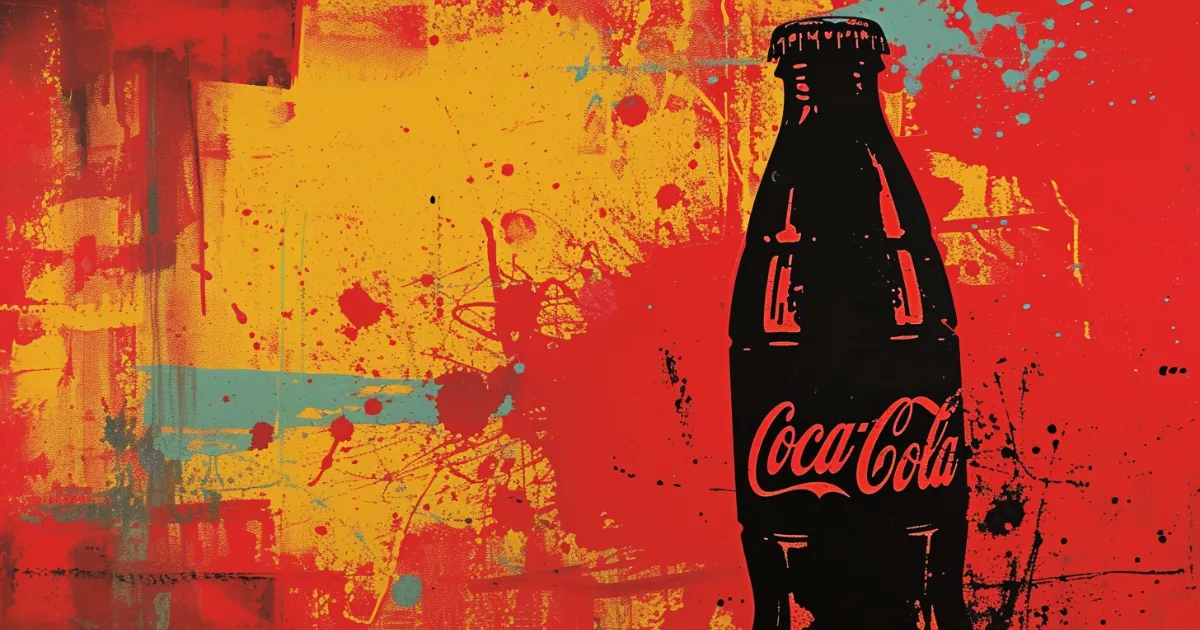
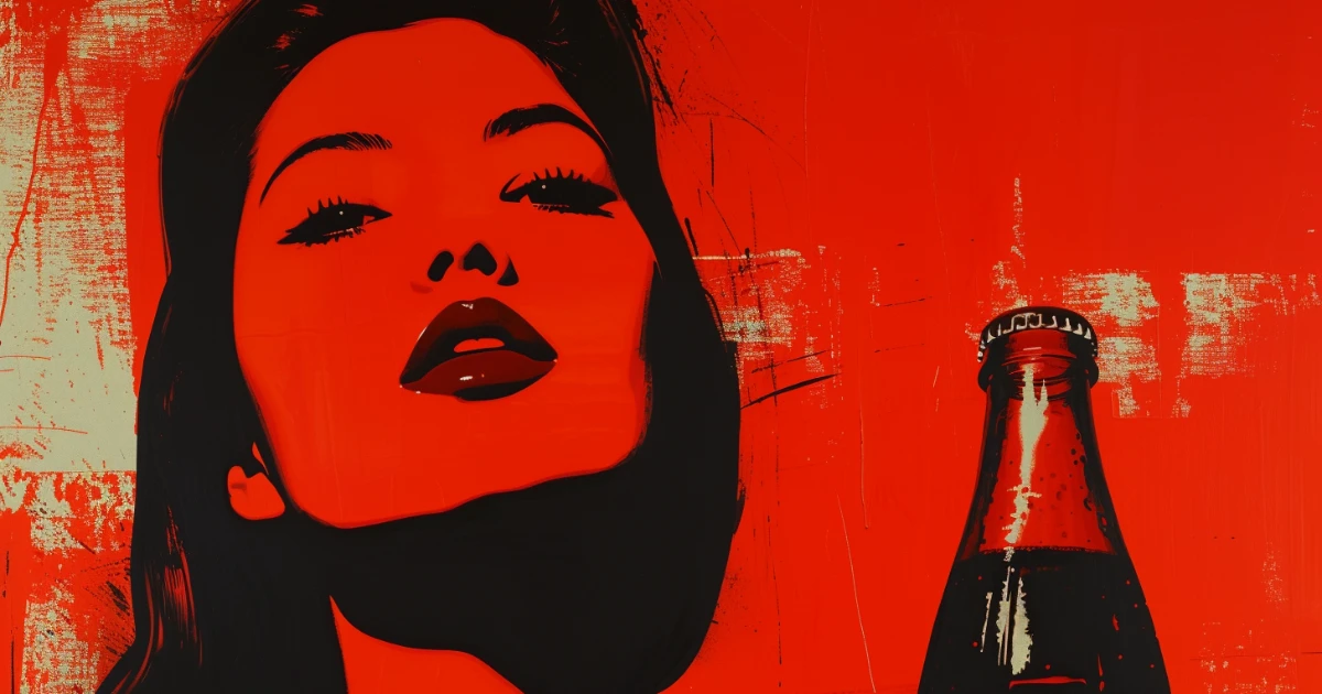
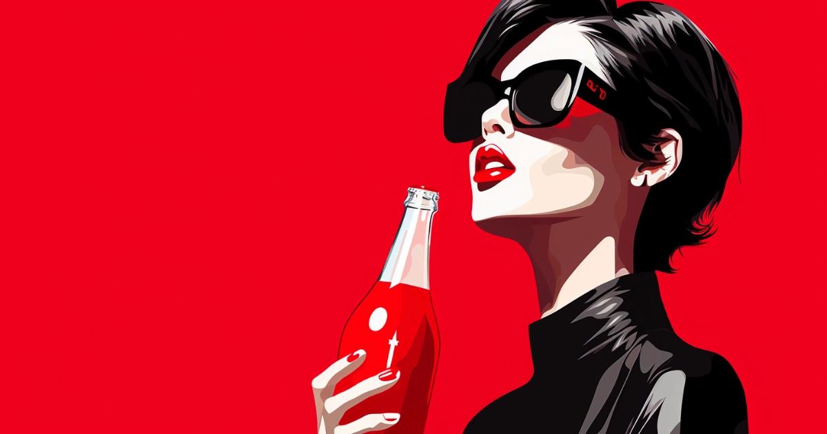
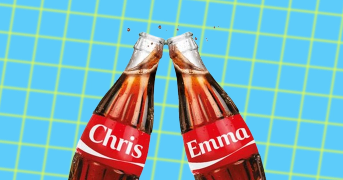
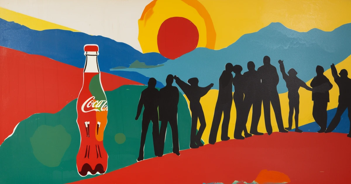
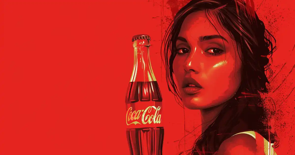
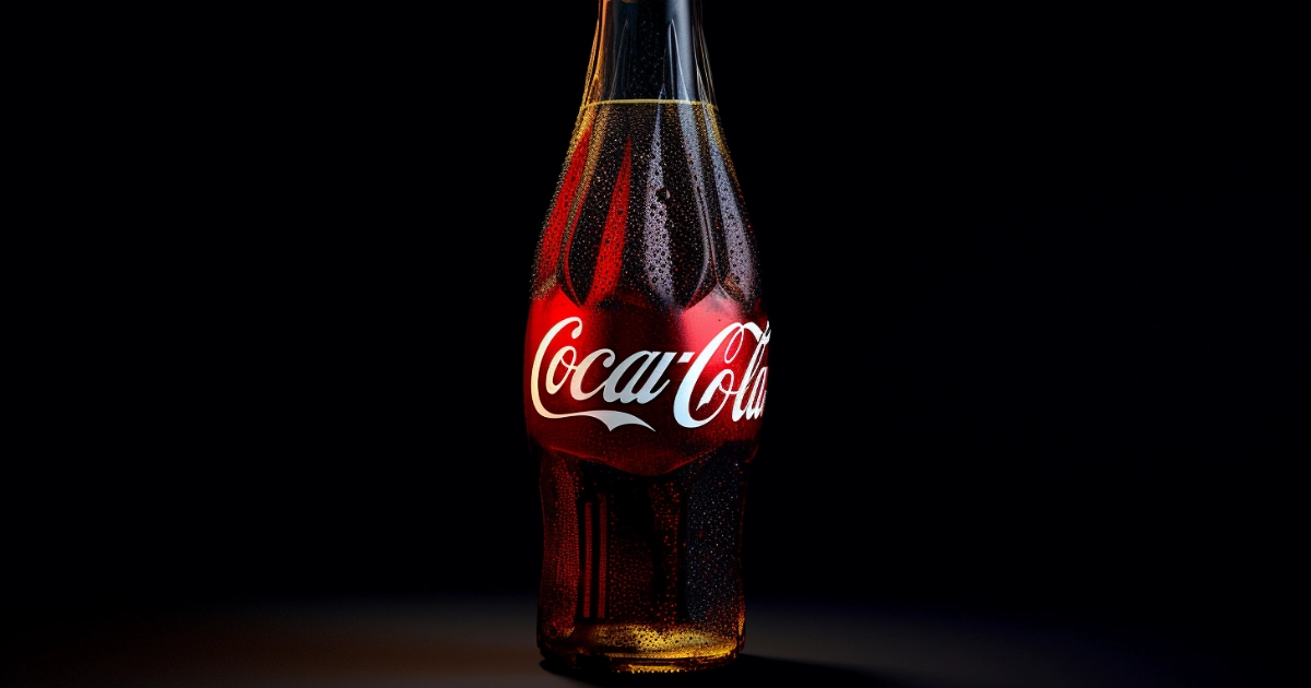
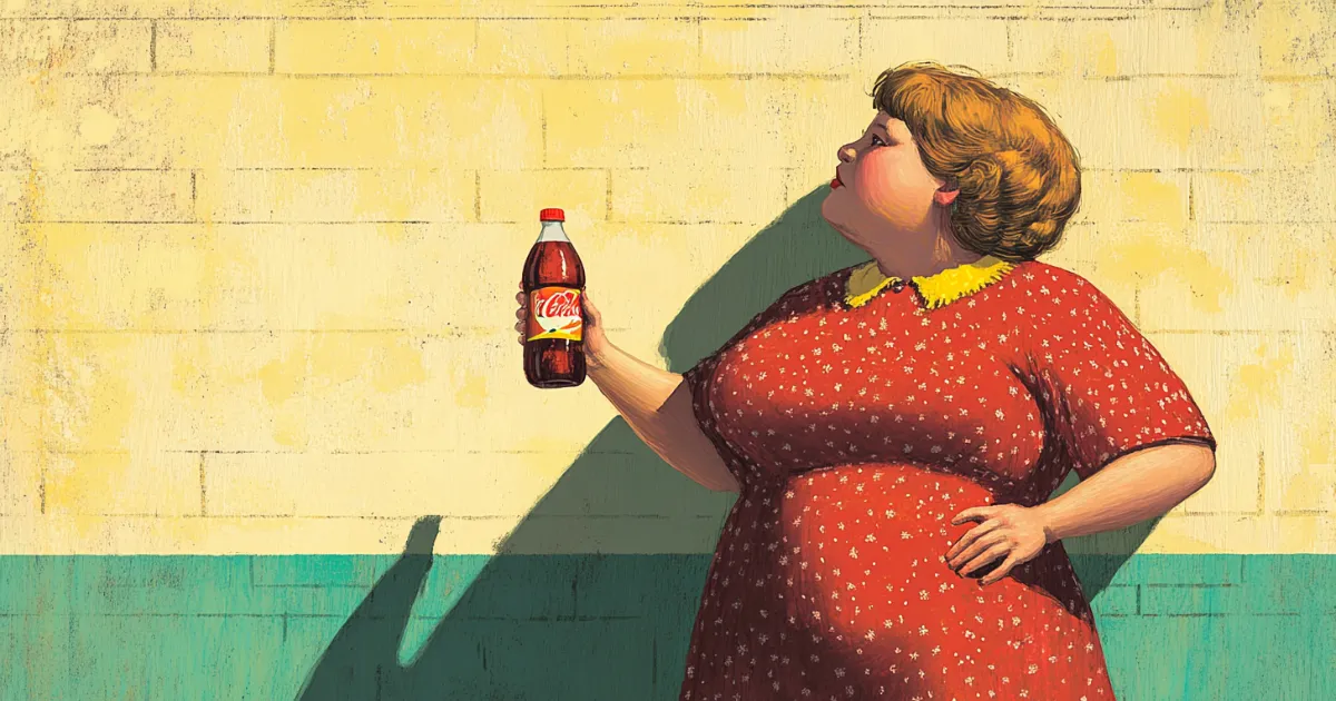
The Cola Wars represent one of America’s most enduring corporate rivalries, spanning decades of aggressive marketing campaigns, blind taste tests, and cultural positioning between Coca-Cola, Pepsi and other soda brands.
-
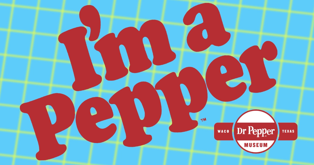
A VISUAL HISTORY OF HAWAIIAN PUNCH
-
A VISUAL HISTORY OF ARIZONA ICED TEA
-
DISCONTINUED CRYSTAL LIGHT FLAVORS OVER THE YEARS
-
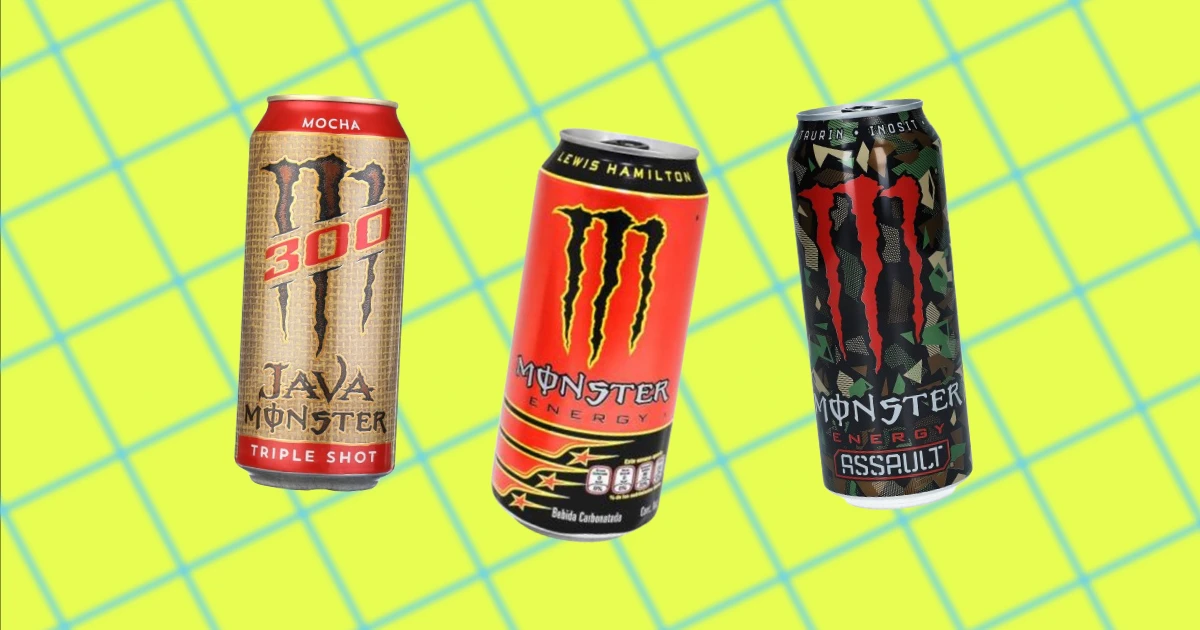
ICONIC ENERGY DRINK SLOGANS OVER THE YEARS
-
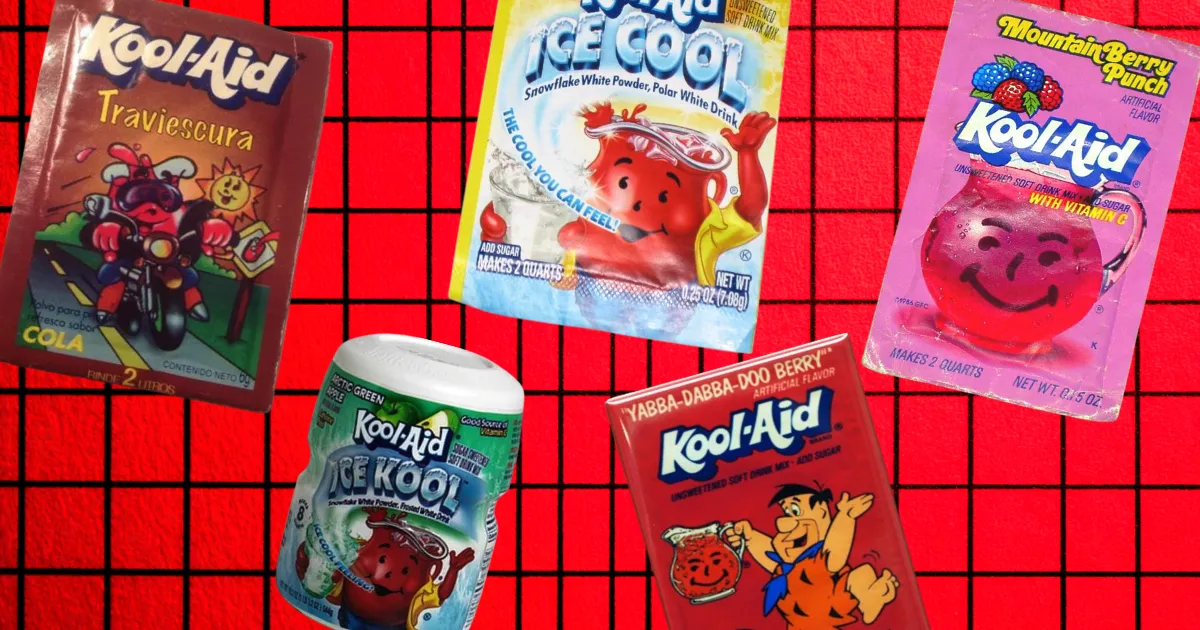
24 DISCONTINUED KOOL-AID FLAVORS THAT YOU FORGOT ABOUT
-
ENERGY DRINKS THAT GOT BANNED
-
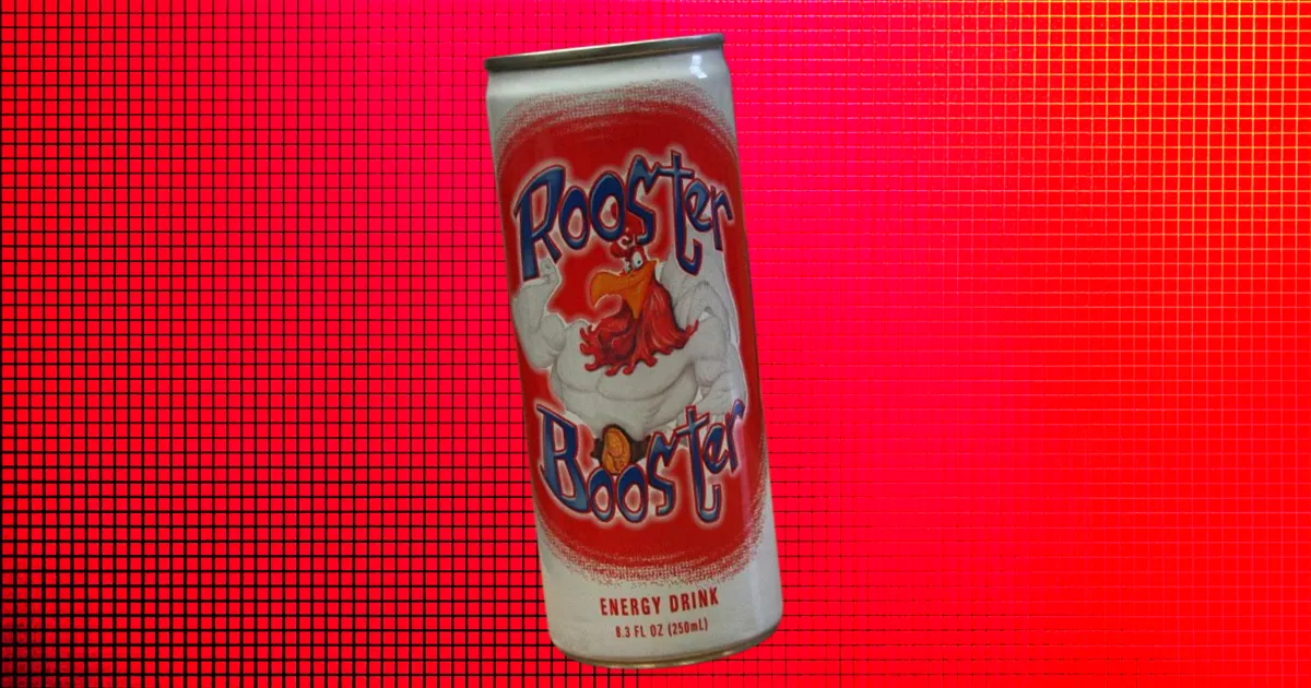
ROOSTER BOOSTER: THE ENERGY DRINK'S GAS STATION FAVORITE
-
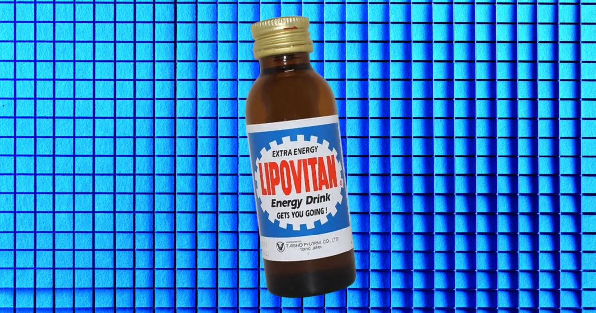
LIPOVITAN: THE FIRST ENERGY DRINK
-
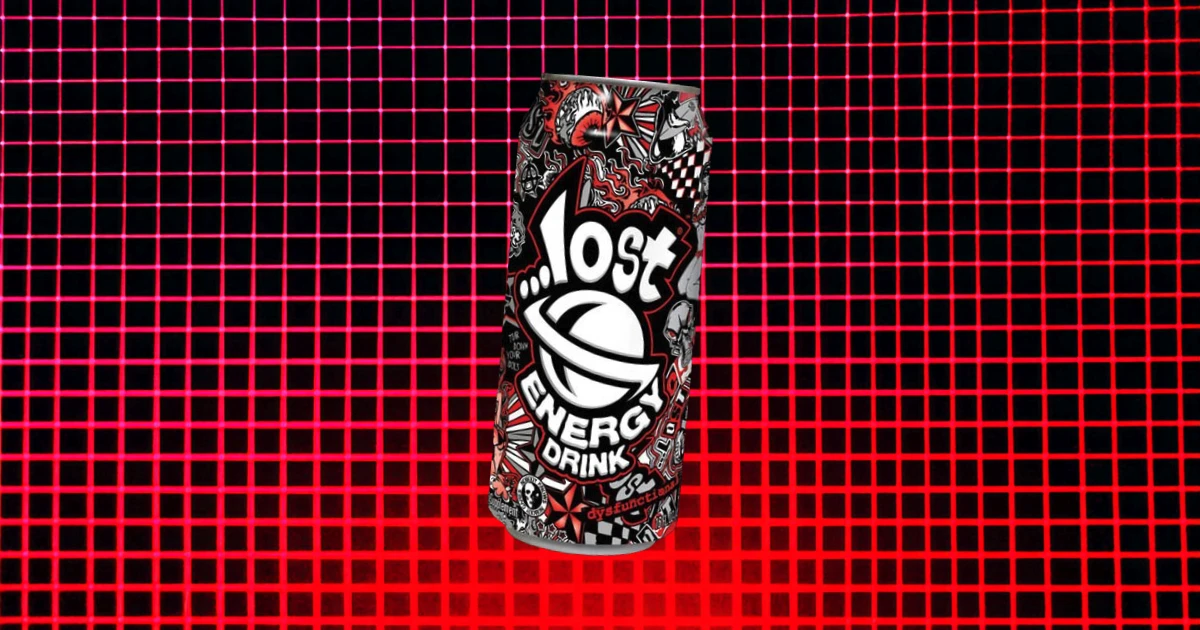
THIS IS WHAT HAPPENED TO LOST ENERGY DRINK—WHY IT WAS AXED
-
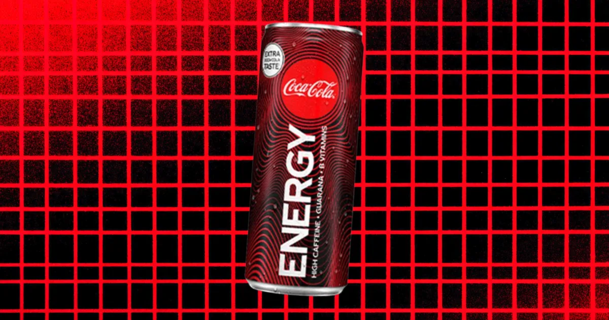
COCA-COLA ENERGY: THE AMBITIOUS GAMBLE THAT FIZZLED OUT
-
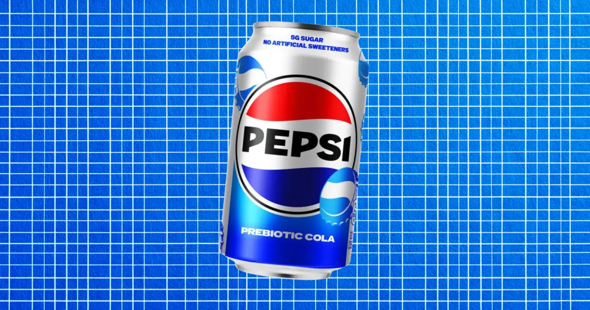
PEPSI’S BOLD MOVE INTO PREBIOTIC COLA
-
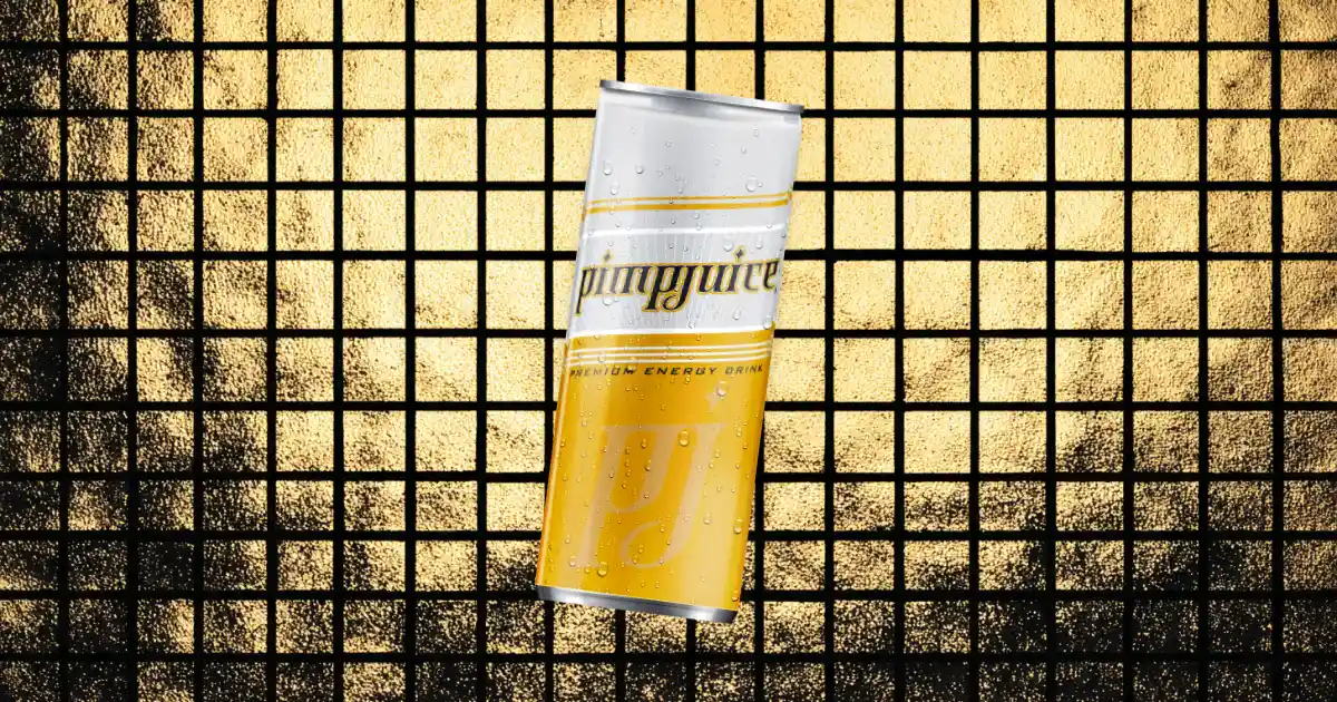
PIMP JUICE: THE ENERGY DRINK THAT SHOOK HIP-HOP CULTURE
-
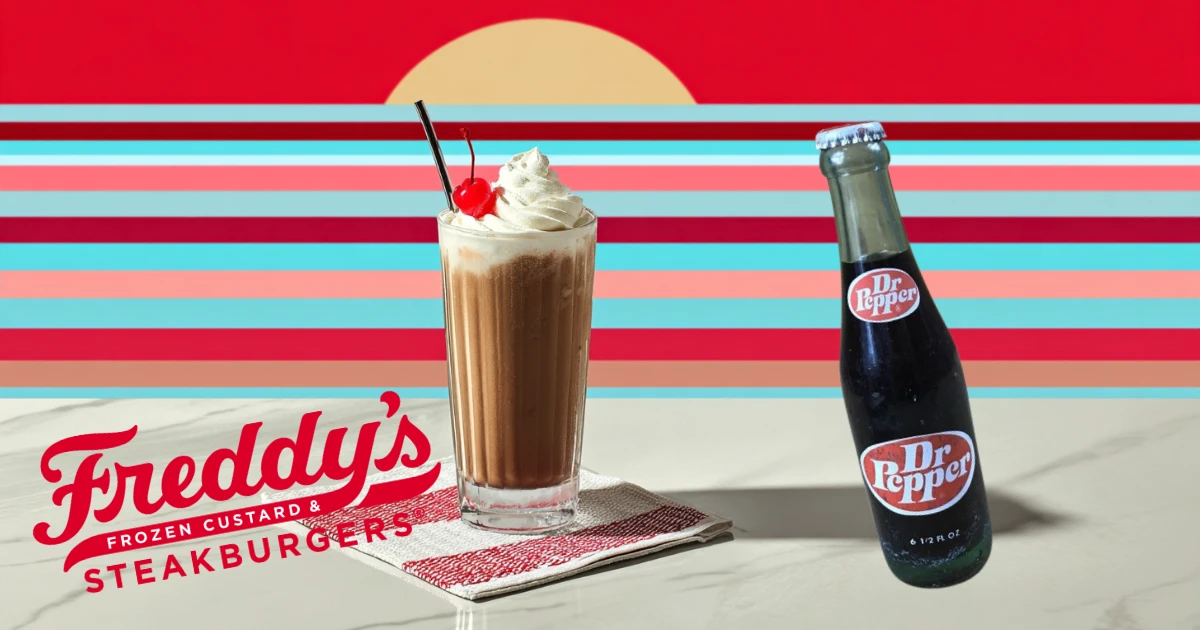
FREDDY'S DROPS THE COOLEST SUMMER COLLAB WITH DR PEPPER FROST
-
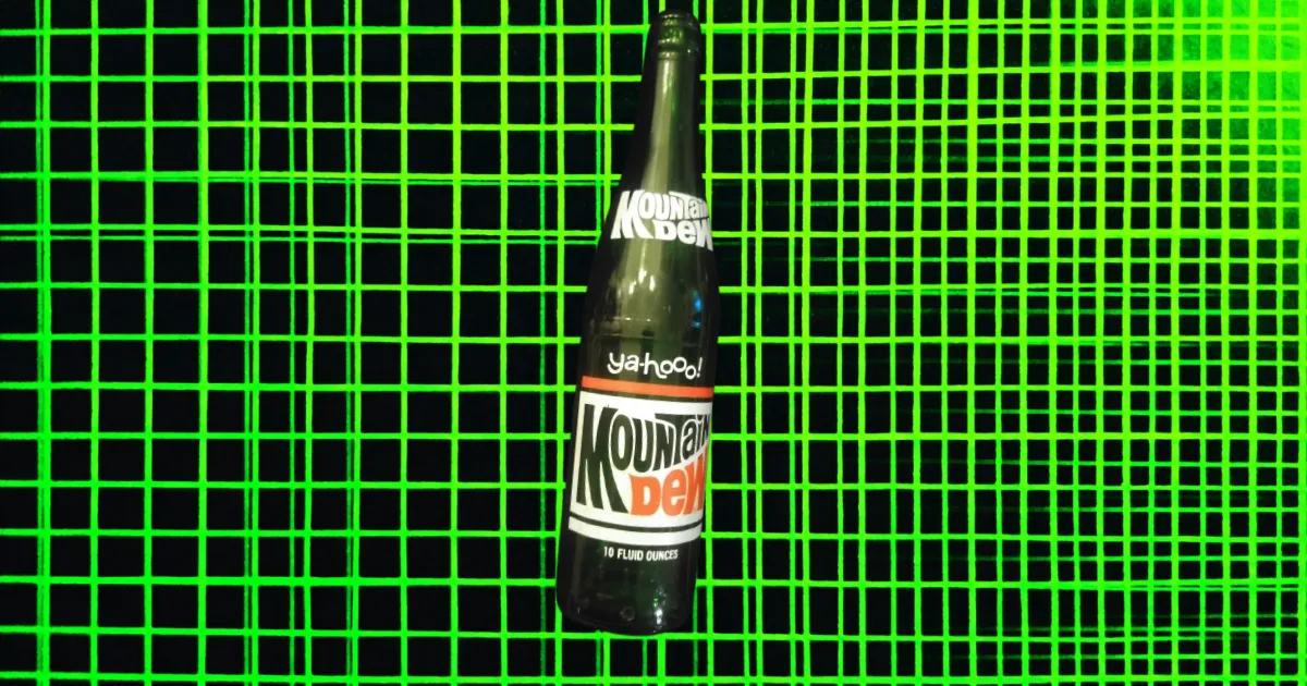
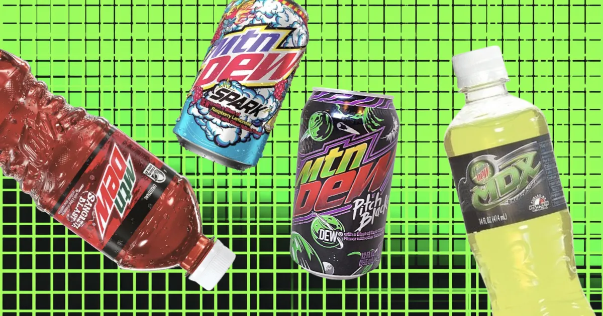
MOUNTAIN DEW SLOGANS OVER THE YEARS
-
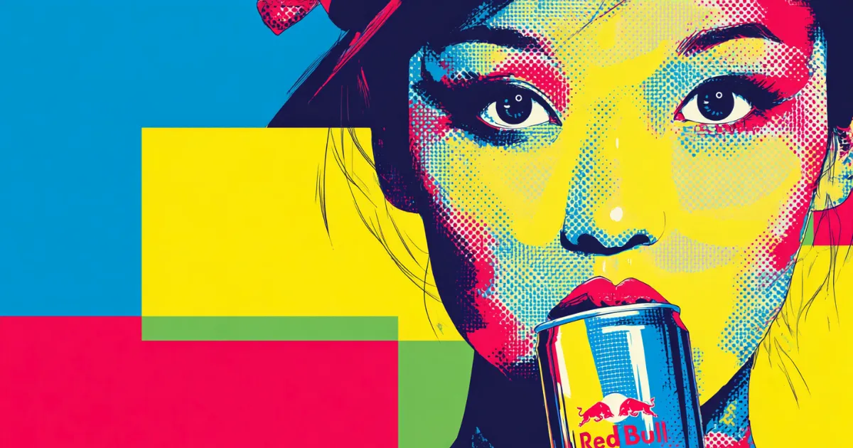
THE UNKNOWN HISTORY OF RED BULL
-
ICONIC SODA SLOGANS OVER THE YEARS
-
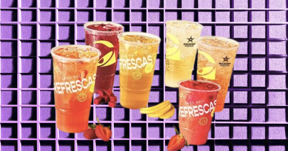
TACO BELL GOES TO SODA WAR WITH AN ALL-NEW REFRESCAS LINEUP
-
DISCONTINUED ARIZONA TEA FLAVORS & BRANDS YOU FORGOT ABOUT
-

THE TIMELINE & HISTORY OF TEA
-
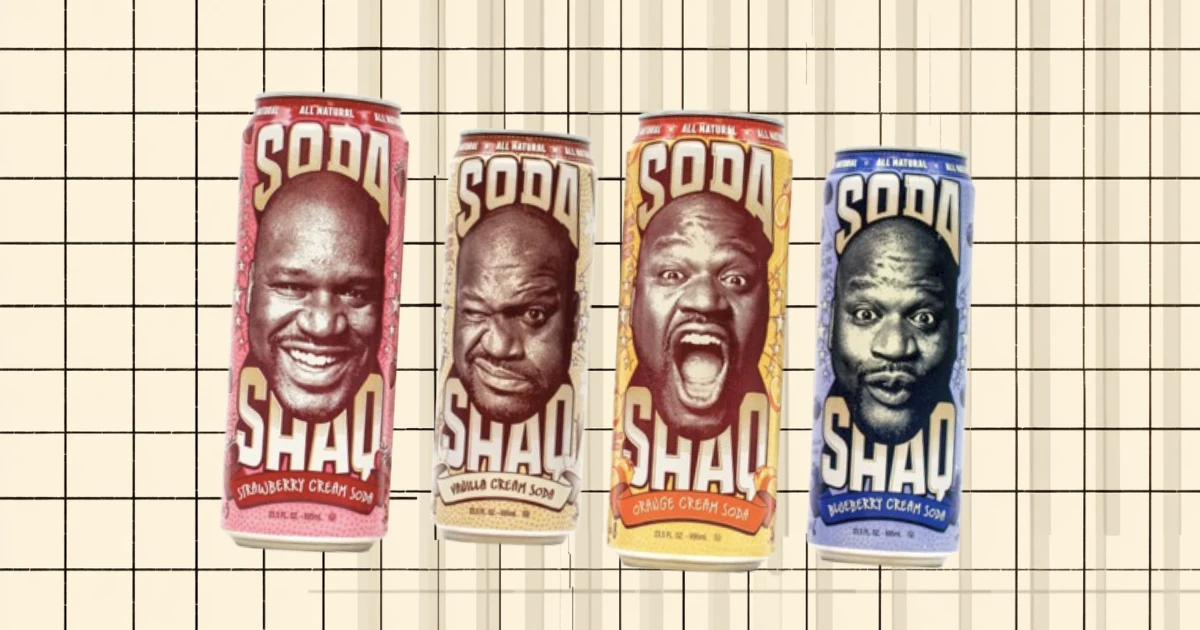
THIS IS WHAT HAPPENED TO SHAQ SODA—WHY IT WAS DISCONTINUED
-
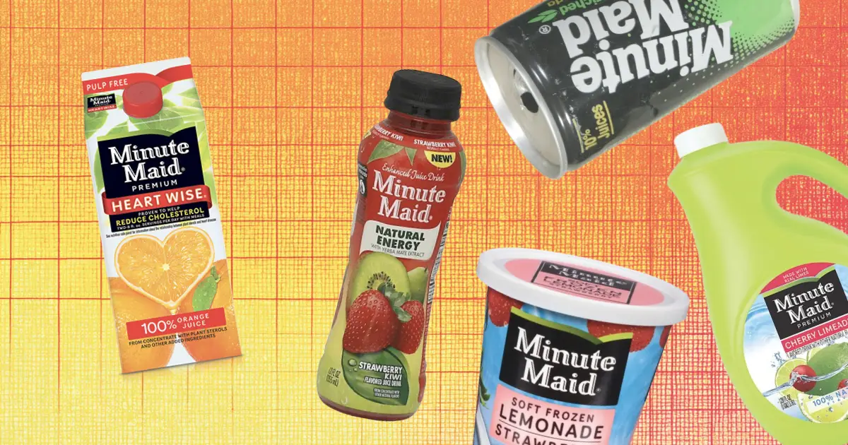
10 DISCONTINUED MINUTE MAID FLAVORS & PRODUCTS YOU FORGOT ABOUT
-

POWERADE SLOGANS OVER THE YEARS
-
13 DISCONTINUED FRUIT DRINK & JUICE BRANDS YOU FORGOT ABOUT
-
14 DISCONTINUED GATORADE FLAVORS YOU FORGOT ABOUT
-
16 DISCONTINUED POWERADE FLAVORS YOUR FORGOT ABOUT
-
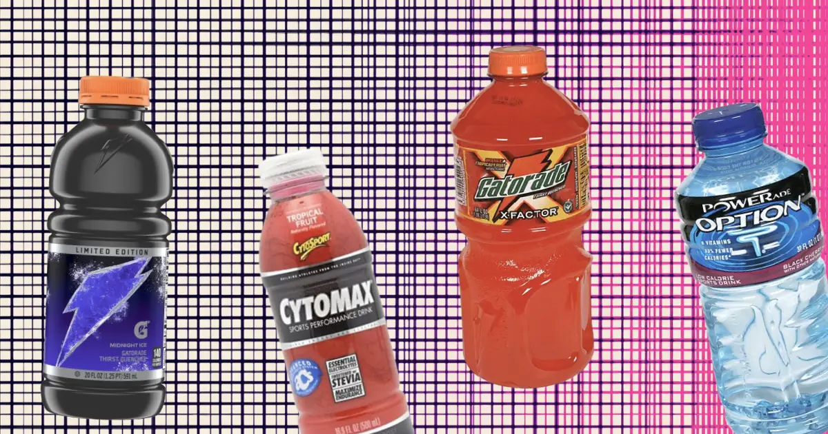
15 DISCONTINUED SPORTS DRINKS YOU FORGOT ABOUT
-
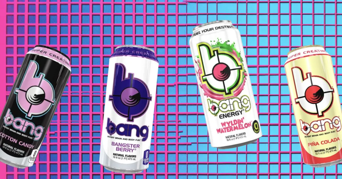
21 DISCONTINUED BANG ENERGY FLAVORS YOU FORGOT ABOUT
-
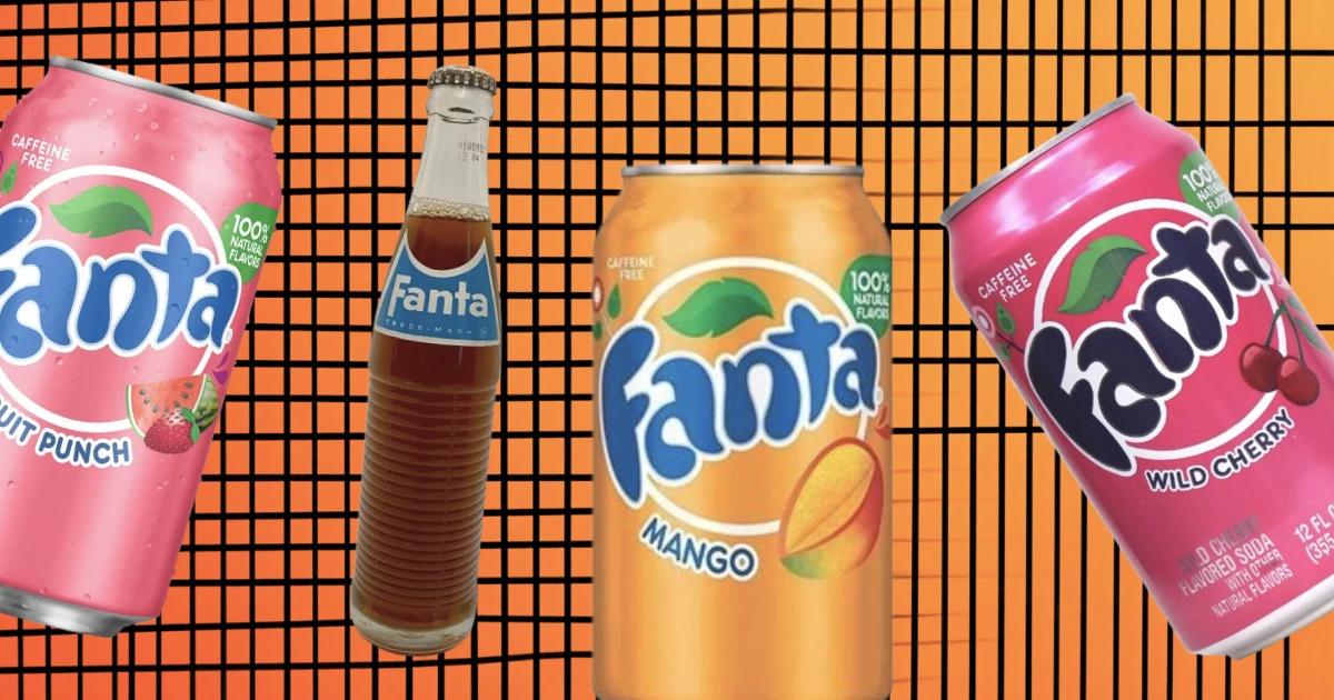
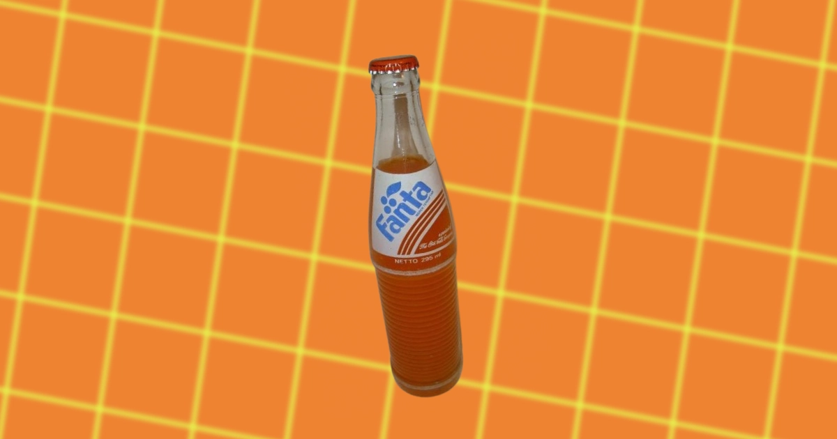
8 DISCONTINUED FANTA FLAVORS YOU FORGOT ABOUT
-
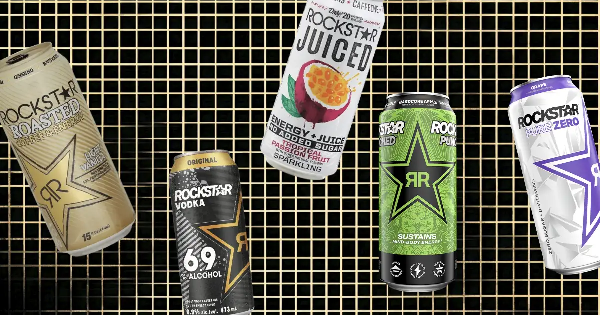
11 DISCONTINUED ROCKSTAR ENERGY DRINK FLAVORS YOU FORGOT ABOUT
-
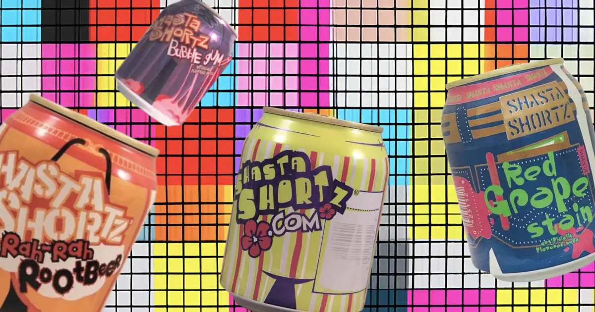
15 ICONIC DISCONTINUED SHASTA FLAVORS YOU FORGOT ABOUT
-

GATORADE SLOGANS OVER THE YEARS
-
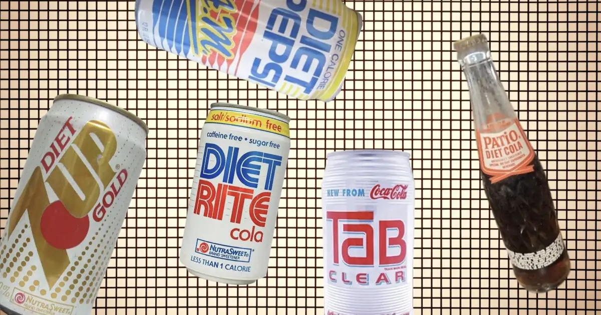
17 DISCONTINUED DIET SODAS YOU FORGOT ABOUT
-
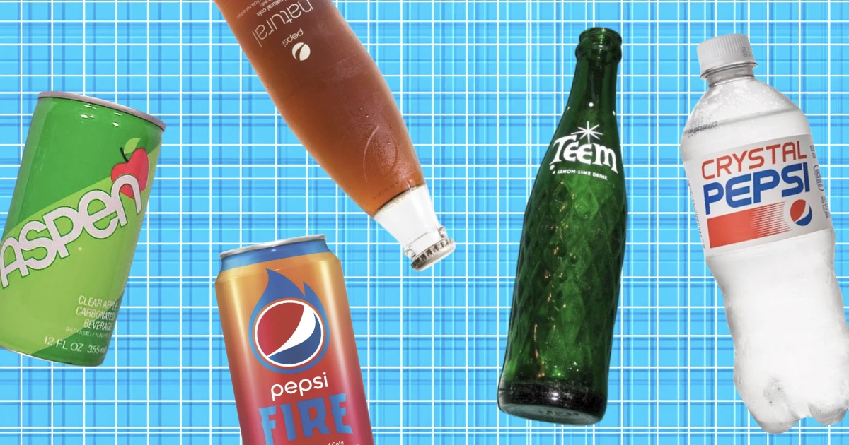
26 DISCONTINUED PEPSI FLAVORS & SODAS BY PEPSICO
-
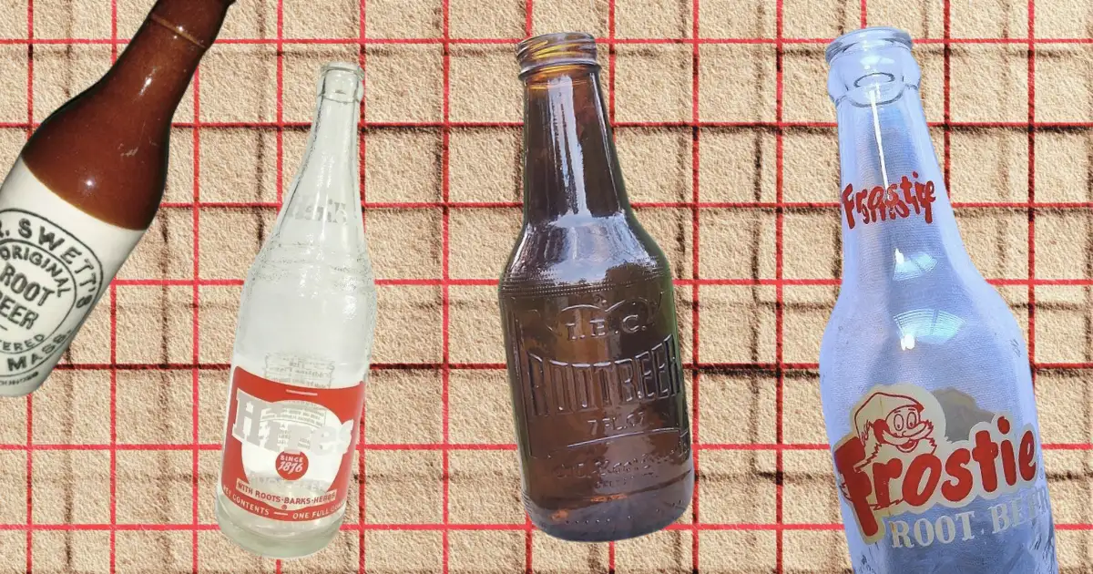
7 DISCONTINUED ROOT BEER BRANDS LOST IN TIME
-

ICONIC SPORTS DRINKS SLOGANS OVER THE YEARS
-
9 DISCONTINUED DR PEPPER FLAVORS & DRINKS YOU FORGOT ABOUT
-
15 DISCONTINUED MOUNTAIN DEW FLAVORS YOU FORGOT ABOUT
-
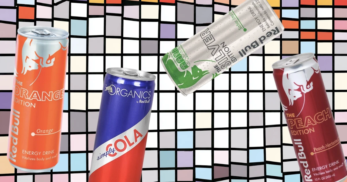
10 DISCONTINUED RED BULL FLAVORS YOU FORGOT ABOUT
-
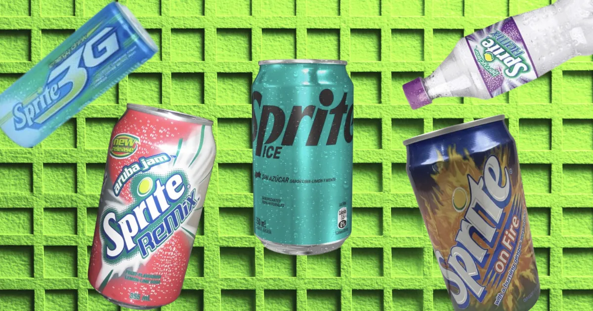
10 DISCONTINUED SPRITE FLAVORS YOU FORGOT ABOUT
-
DISCONTINUED COCA-COLA & COKE FLAVORS YOU FORGOT ABOUT
-
ICONIC DISCONTINUED DRINKS THAT YOU CAN’T DRINK ANYMORE
-
THE UNKNOWN HISTORY OF PEEPS
-
13 DISCONTINUED VITAMINWATER FLAVORS YOU FORGOT ABOUT
-
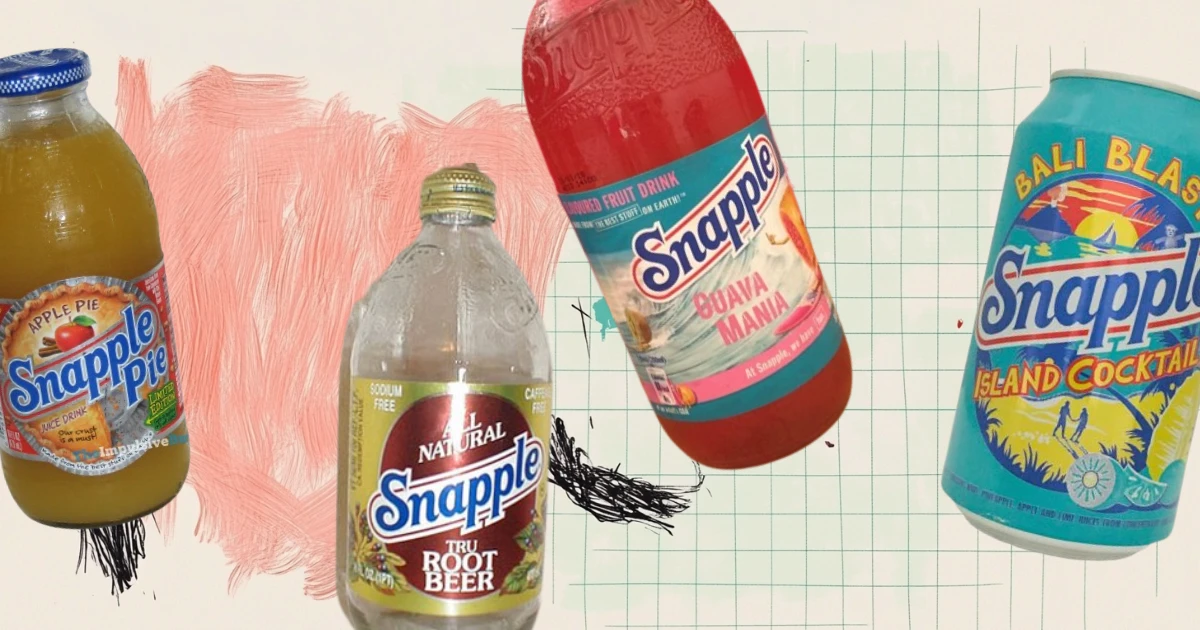
15 DISCONTINUED SNAPPLE FLAVORS YOU FORGOT ABOUT
-
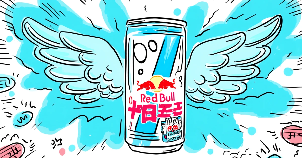
RED BULL SLOGANS OVER THE YEARS
-

14 DISCONTINUED STARBUCKS DRINKS THAT AREN’T COMING BACK
-
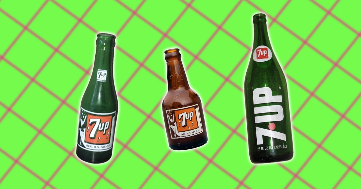
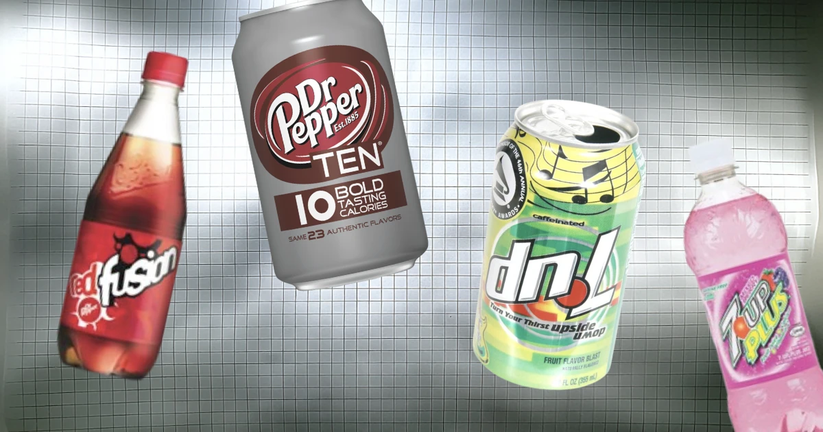
7 UP BOTTLE DESIGN HISTORY & EVOLUTION
-
16 DISCONTINUED ENERGY DRINKS THAT BUZZ NO MORE
-
DISCONTINUED MONSTER ENERGY FLAVORS THAT LOST THEIR BUZZ
-
18 DISCONTINUED FOODS FROM THE 2000S THAT YOU FORGOT ABOUT
-
ICONIC DISCONTINUED FOODS THAT YOU FORGOT ABOUT
-
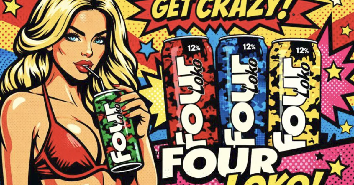
THE DEADLY PARTY DRINK THAT NEARLY DESTROYED A GENERATION (AND WHY IT'S STILL LEGAL)
-
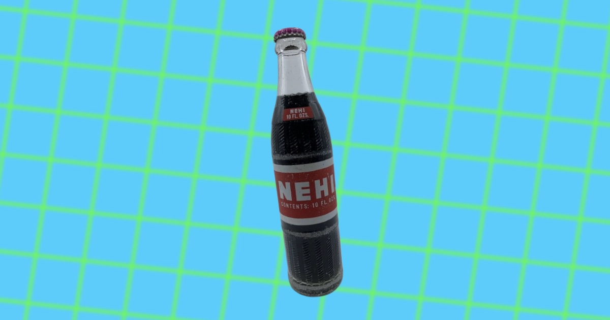
THE UNKNOWN HISTORY OF NEHI SODA: BEYOND THE KNEE-HIGH
-
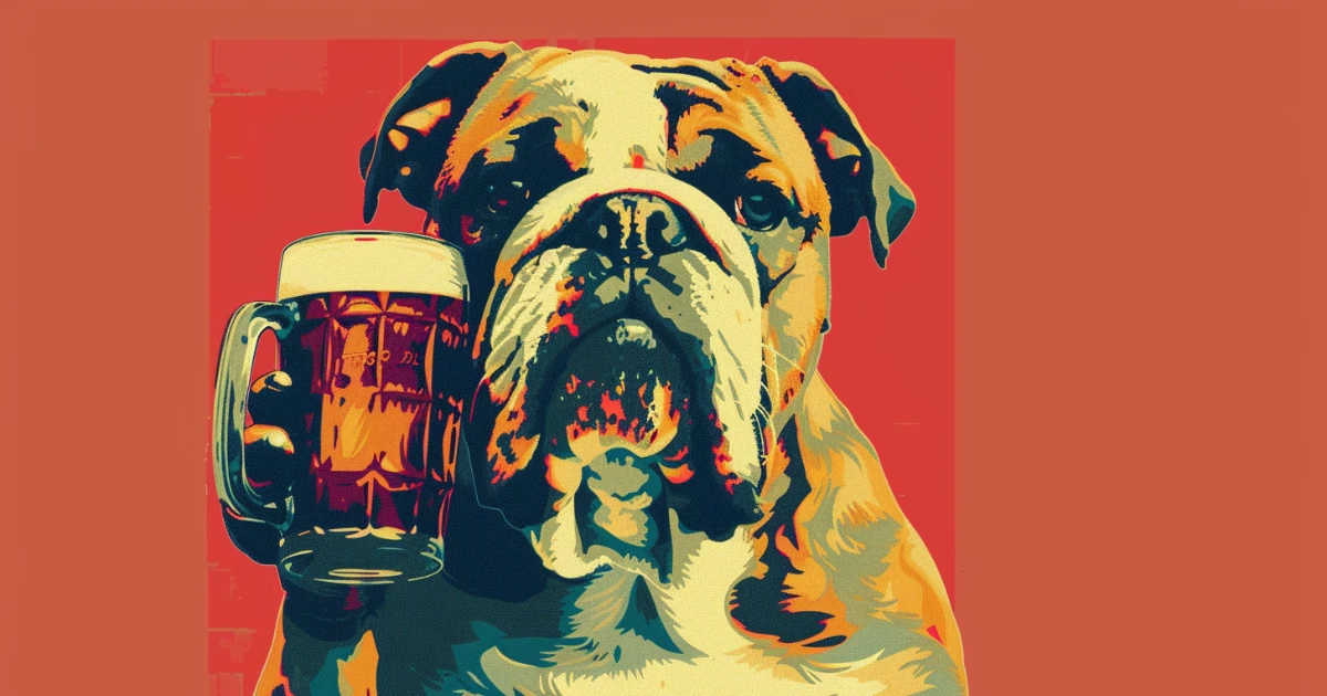
BARREL TO BULLDOG: THE UNKNOWN HISTORY OF MUG ROOT BEER
-
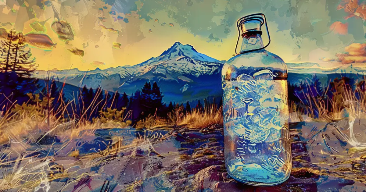
THE UNKNOWN HISTORY OF SHASTA SODA: FROM MOUNTAIN SPRINGS TO POP PIONEER
-
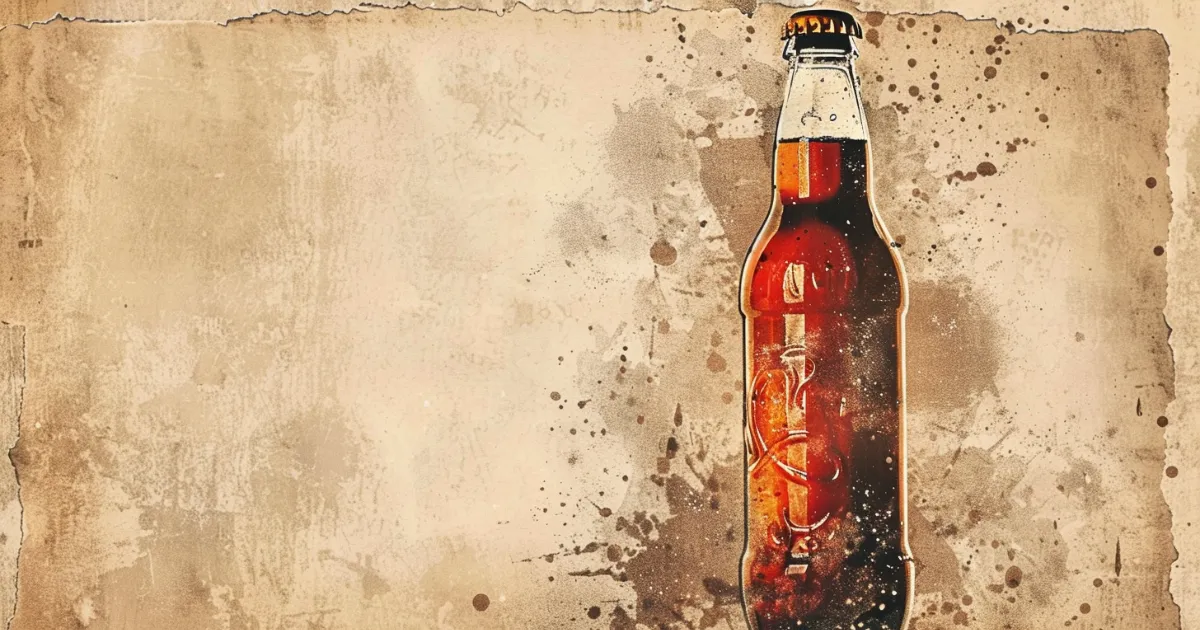
THE UNKNOWN HISTORY OF HIRES ROOT BEER: WHY IT WAS DISCONTINUED
-
ADDICTION, FORTUNES, AND TOTAL DISASTER: THE UNTOLD STORIES OF SODA TYCOONS
-
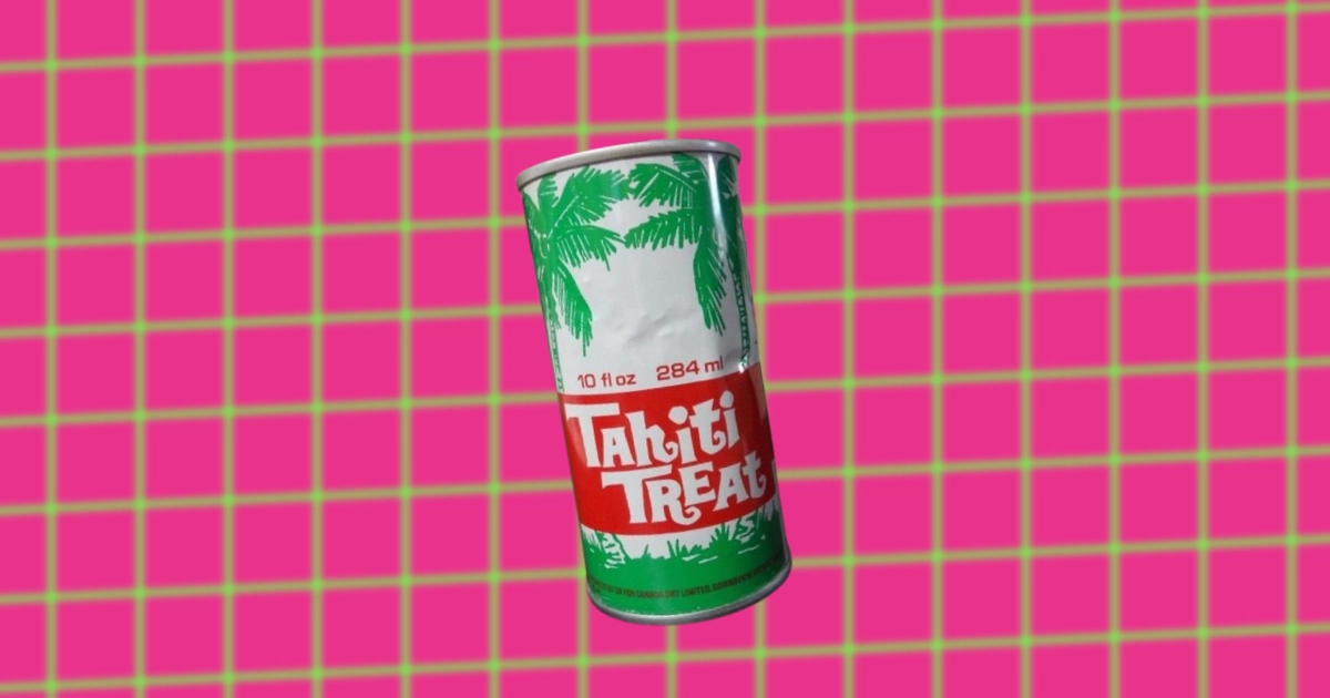
THE UNKNOWN HISTORY OF TAHITIAN TREAT
-
THE UNKNOWN HISTORY OF JONES SODA
-

THE UNKNOWN HISTORY OF CHEERWINE
-
THE UNKNOWN HISTORY OF JARRITOS: FROM SMALL JUG TO GLOBAL FAME
-

THE UNKNOWN HISTORY OF ROOT BEER FLOATS
-
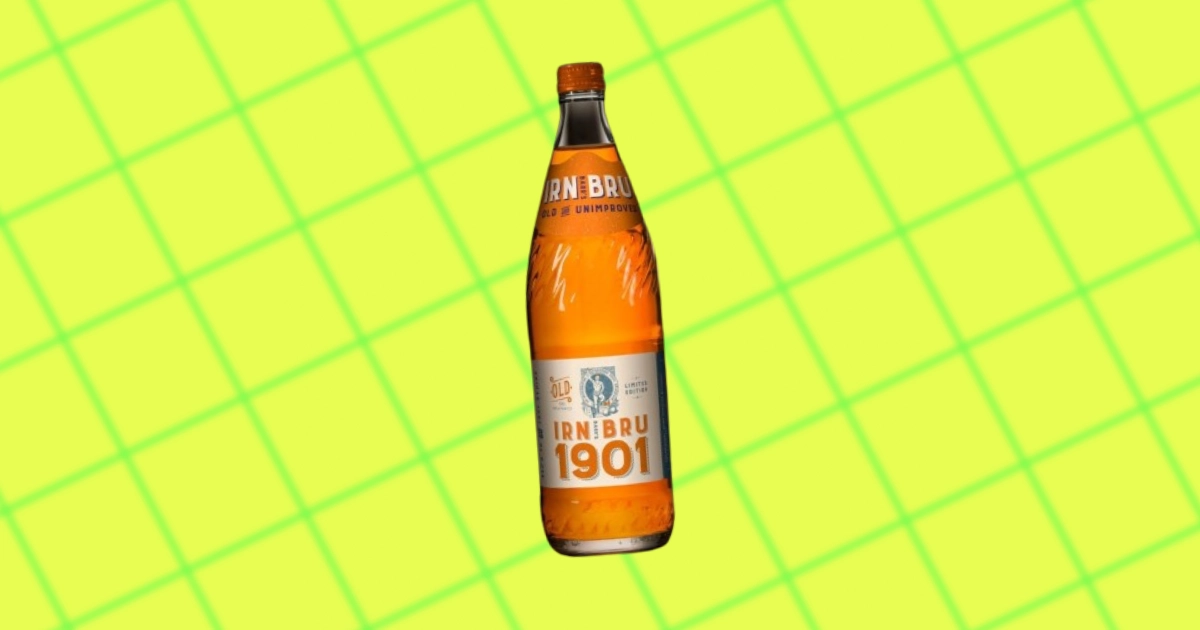
THE UNKNOWN HISTORY OF IRN-BRU
-

THE UNKNOWN HISTORY OF LEMONADE
-
THE UNKNOWN HISTORY OF ROOT BEER
-
THE UNKNOWN HISTORY OF GINGER ALE
-

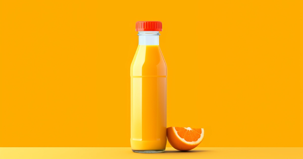
PRESSED FOR TIME: THE UNKNOWN HISTORY OF FRUIT JUICE
-

FROM ORDER CLERK TO SNAPPLE LADY: THE ASCENT OF WENDY KAUFMAN
-

ROOTY: A&W'S LOVABLE GREAT ROOT BEAR
-
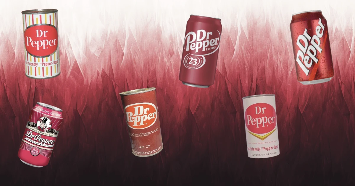
DR PEPPER CAN HISTORY THROUGH TIME
-
DR PEPPER BOTTLE HISTORY
-
THE UNKNOWN HISTORY OF TONIC WATER
-
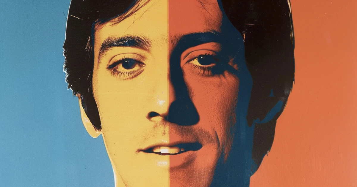
DAVID NAUGHTON: THE DR PEPPER SPOKESPERSON WHO BECAME AN ICON
-
DR PEPPER SLOGANS & ADS OVER THE YEARS
-
THE UNKNOWN HISTORY OF IBC ROOT BEER
-
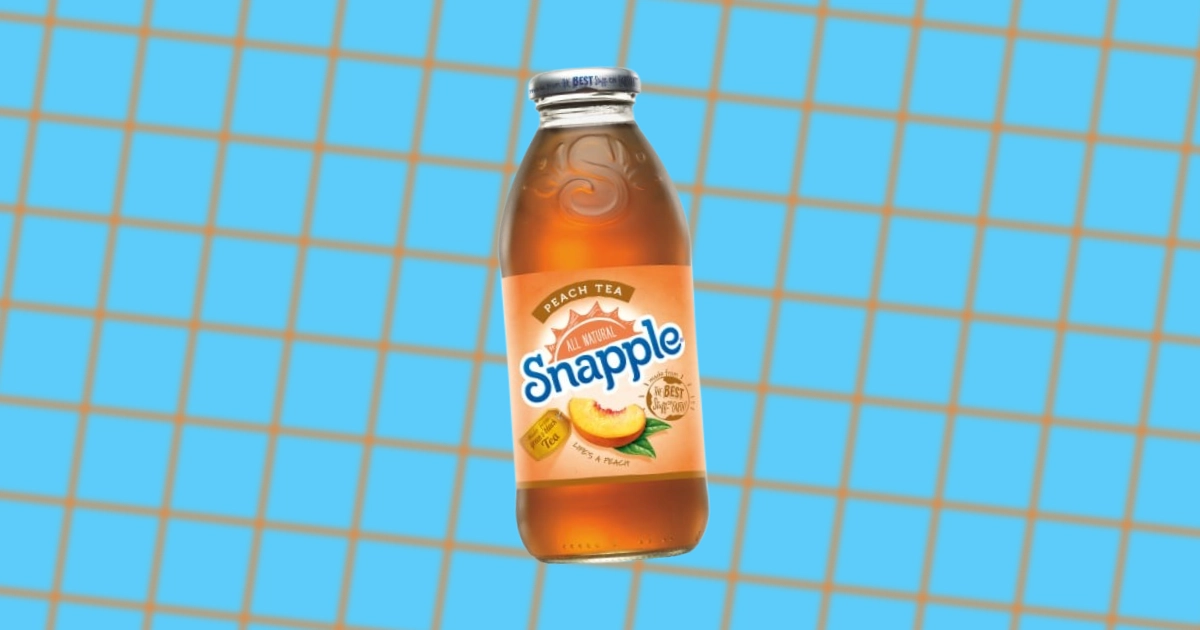
THE UNKNOWN HISTORY OF SNAPPLE
-
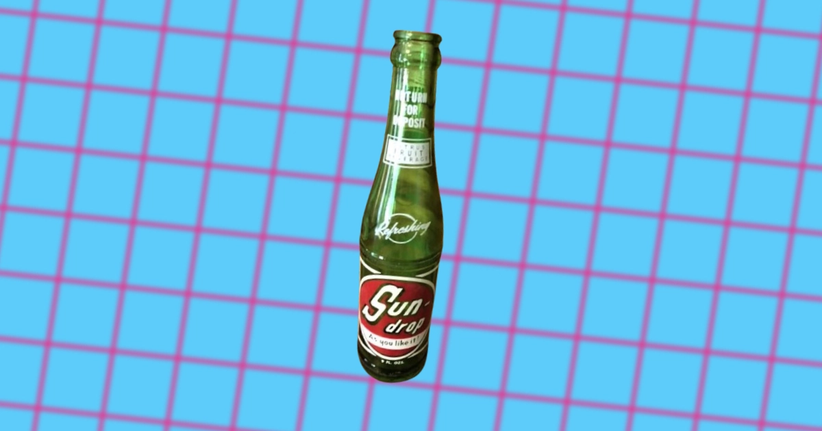
THE UNKNOWN HISTORY OF SUN DROP SODA
-
THE UNKNOWN HISTORY OF YOO-HOO
-
WHAT HAPPENED TO DR PEPPER RED FUSION SODA
-
THE UNKNOWN HISTORY OF STEWART'S SODA
-
THE UNKNOWN HISTORY OF SQUIRT
-
THE UNKNOWN HISTORY OF BIG RED SODA
-

PULP FICTION: THE VERY ORANGE HISTORY OF CRUSH SODA
-
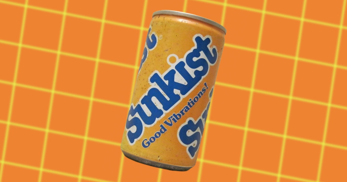
THE UNKNOWN HISTORY OF SUNKIST SODA
-
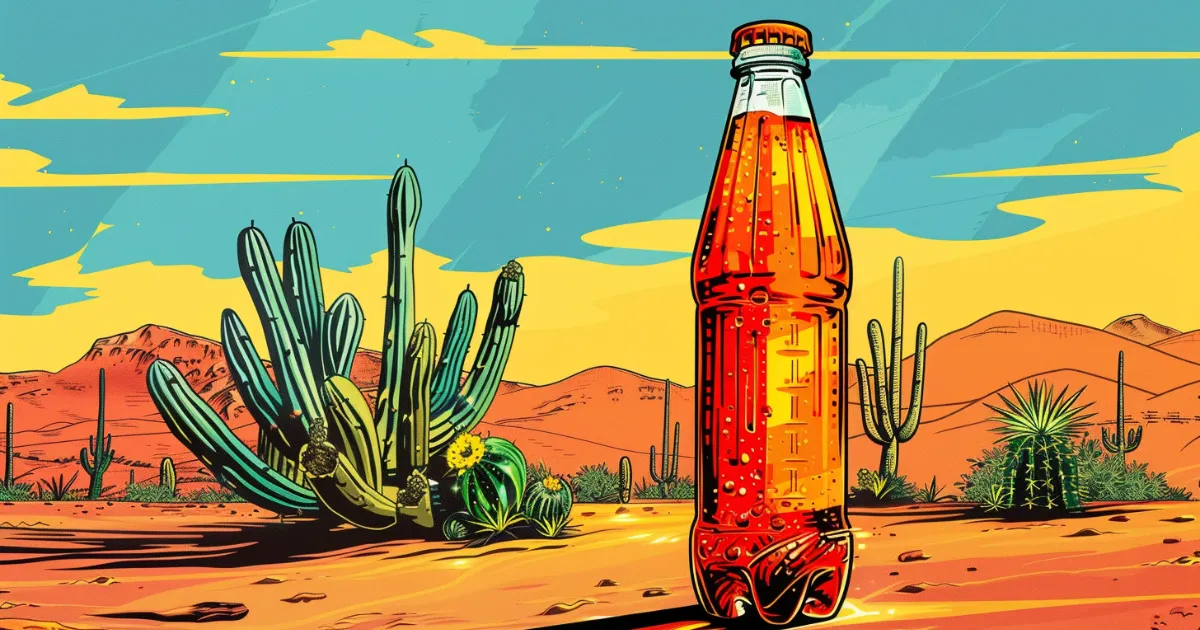
THE UNKNOWN HISTORY OF CACTUS COOLER
-
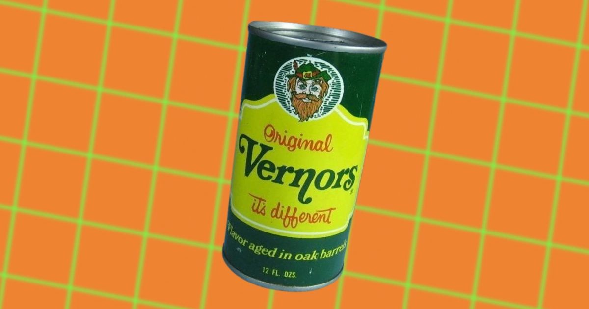
THE UNKNOWN HISTORY OF VERNORS
-
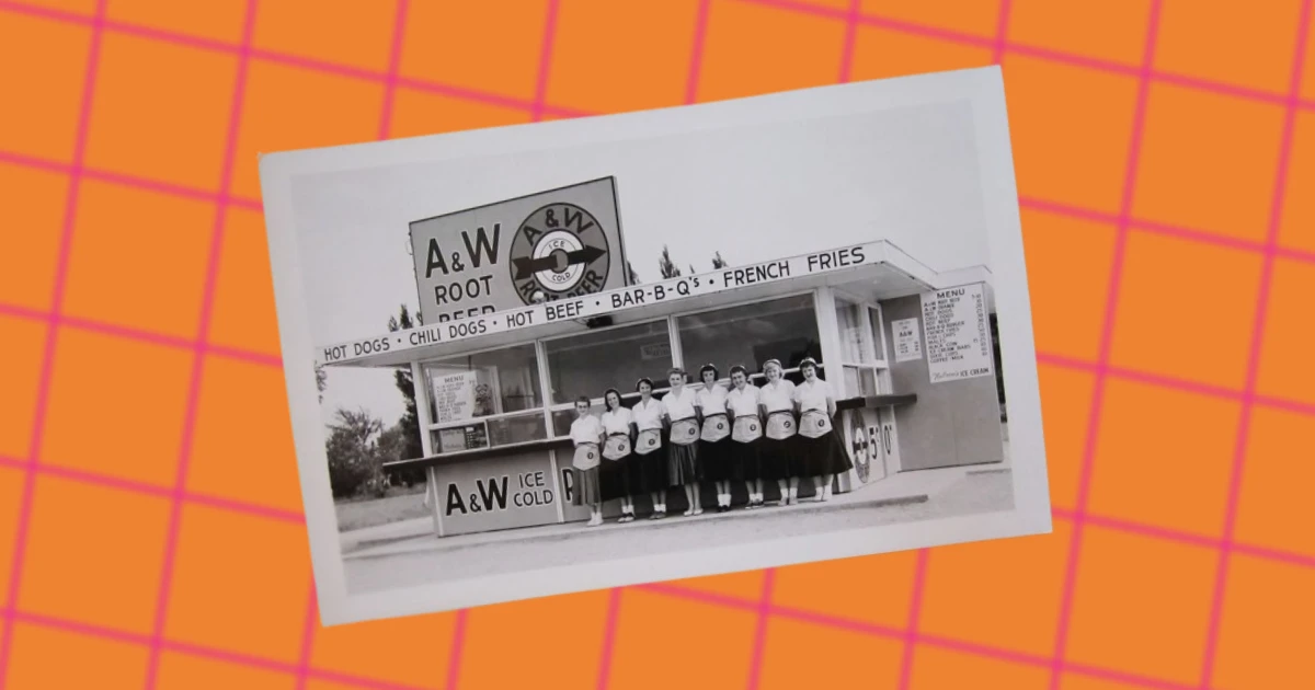
THE UNKNOWN HISTORY OF A&W
-
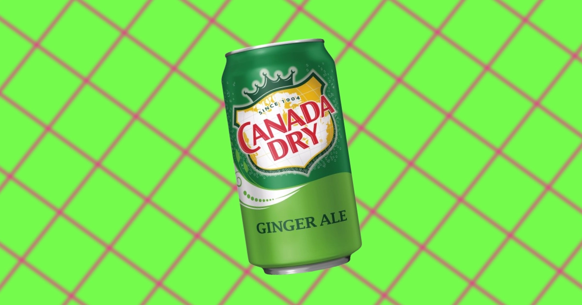
THE UNKNOWN HISTORY OF CANADA DRY
-
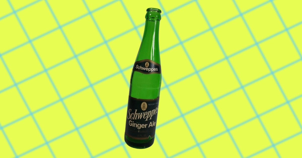
OVER 200 YEARS OF SCHWEPPES HISTORY
-
THE UNKNOWN HISTORY OF STARRY SODA
-
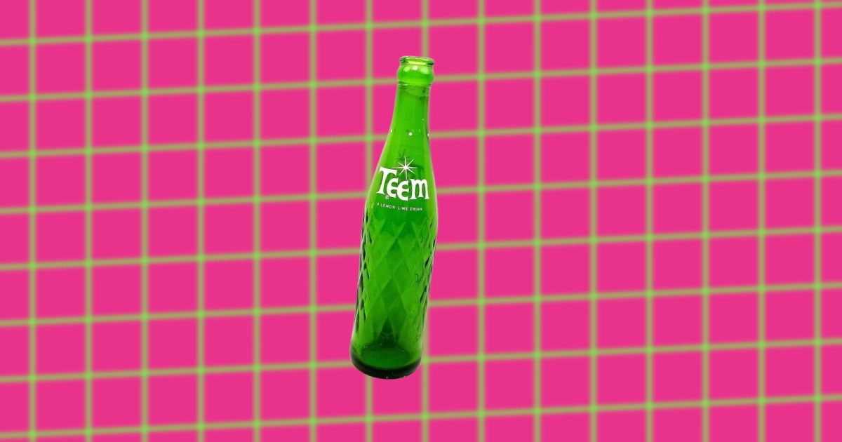
THE RISE AND FALL OF TEEM SODA
-

WHAT HAPPENED TO ASPEN SODA — WHY IT FAILED
-
"GOTTA HAVE IT" — PEPSI, YOUTH CULTURE, & ADVERTISING IN THE 90S
-
THE HISTORY OF THE PEPSI CAN DESIGN OVER THE YEARS
-

THE BRIGHT YET BRIEF LIFE OF "CATCH THAT PEPSI SPIRIT" SLOGAN
-

A LOOK BACK ON THE HISTORY OF PEPSI ADVERTISING
-

HOW THE “TASTE THAT BEATS THE OTHERS COLD” MADE PEPSI # 2 COLA
-
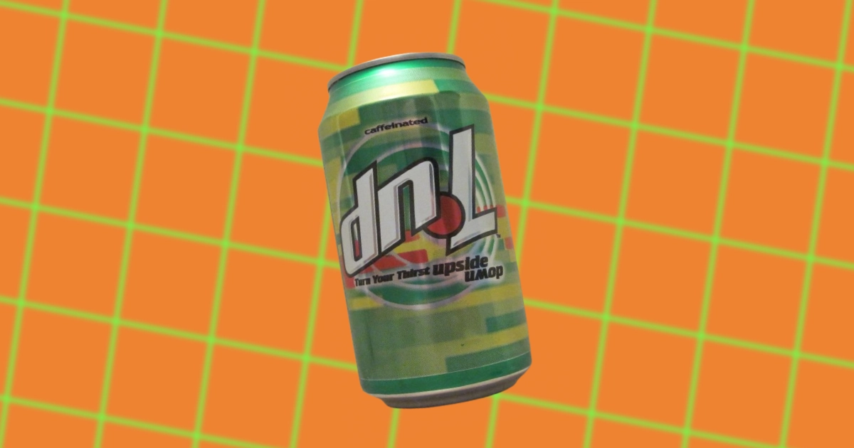
WHAT HAPPENED TO DNL SODA? — A SHORT HISTORY & WHY IT FAILED
-
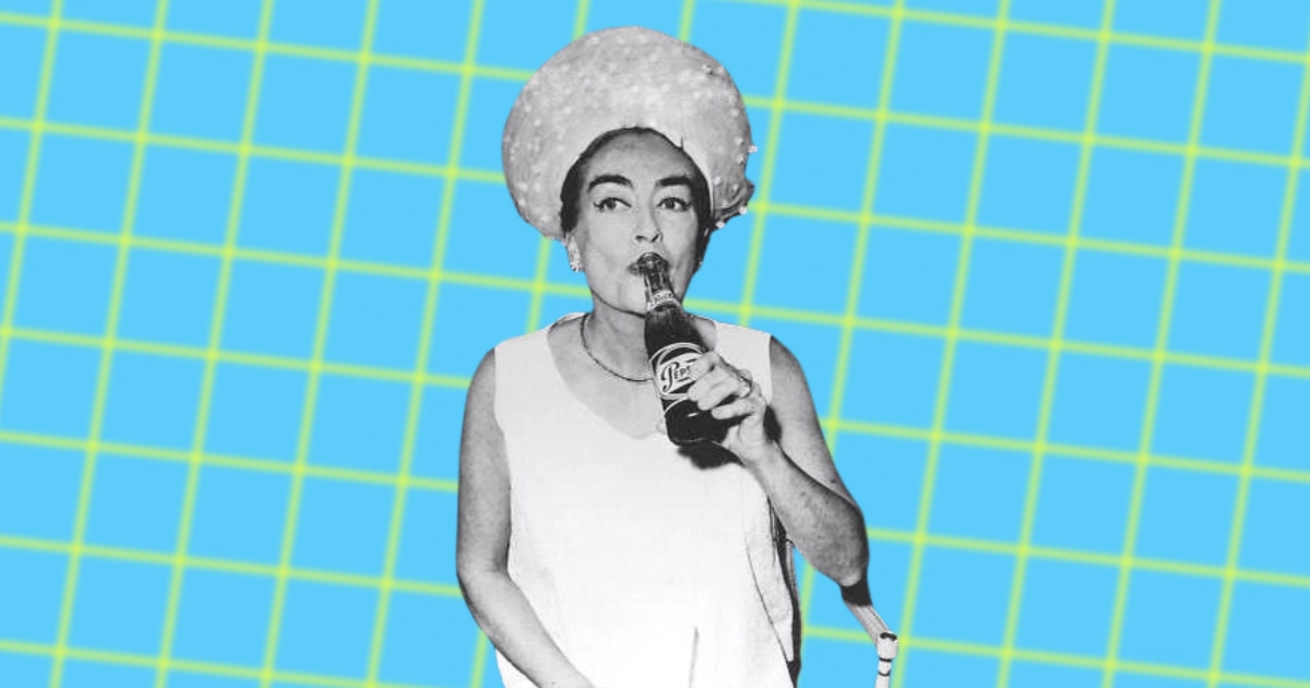
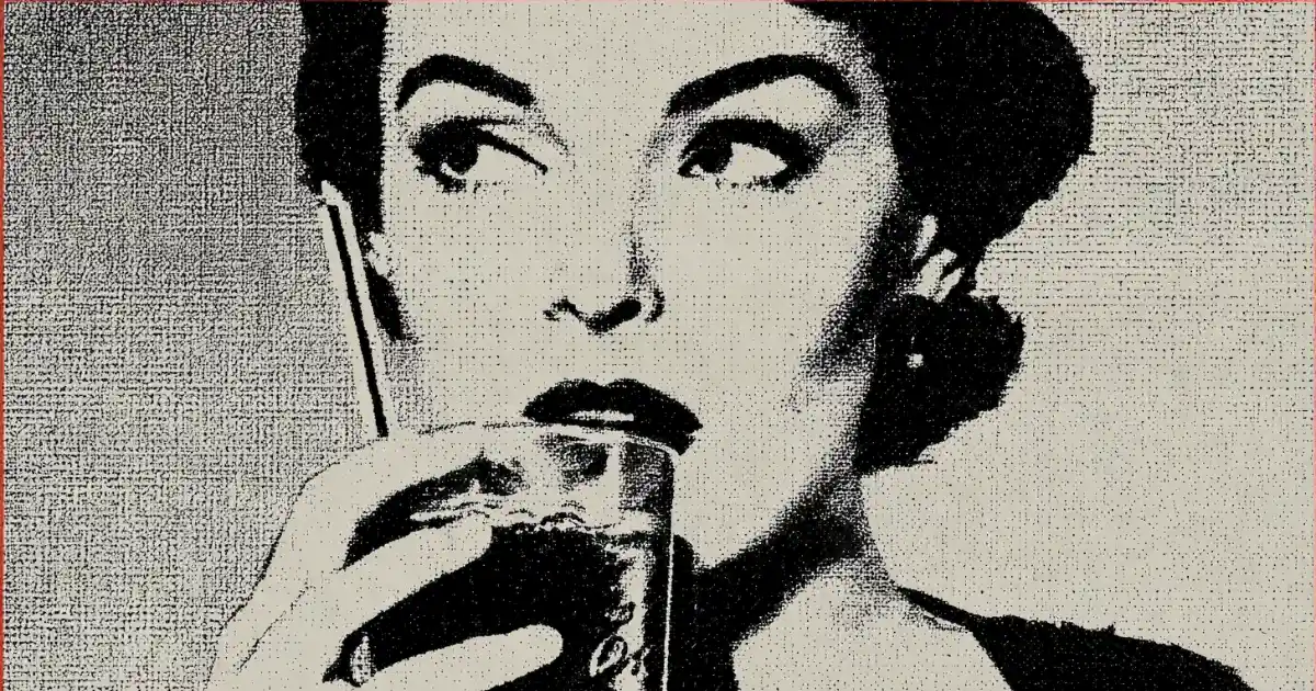
THE MANY LIVES OF JOAN CRAWFORD
-
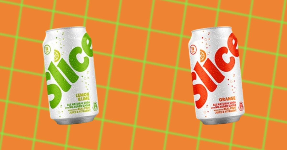
WHAT HAPPENED TO SLICE SODA — WHY IT WAS BROUGHT BACK TO LIFE
-
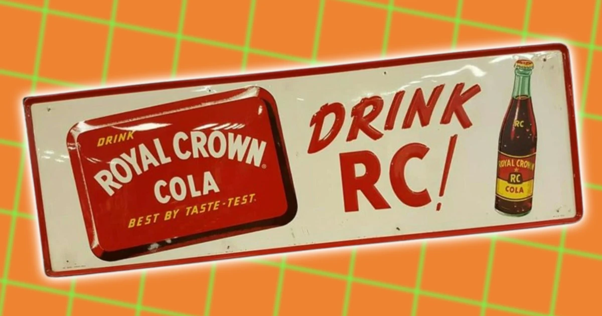
THE UNKNOWN HISTORY OF RC COLA
-
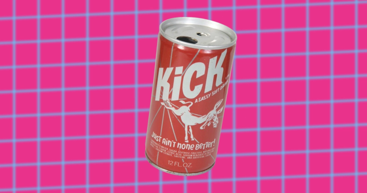
THE UNKNOWN HISTORY OF KICK SODA
-
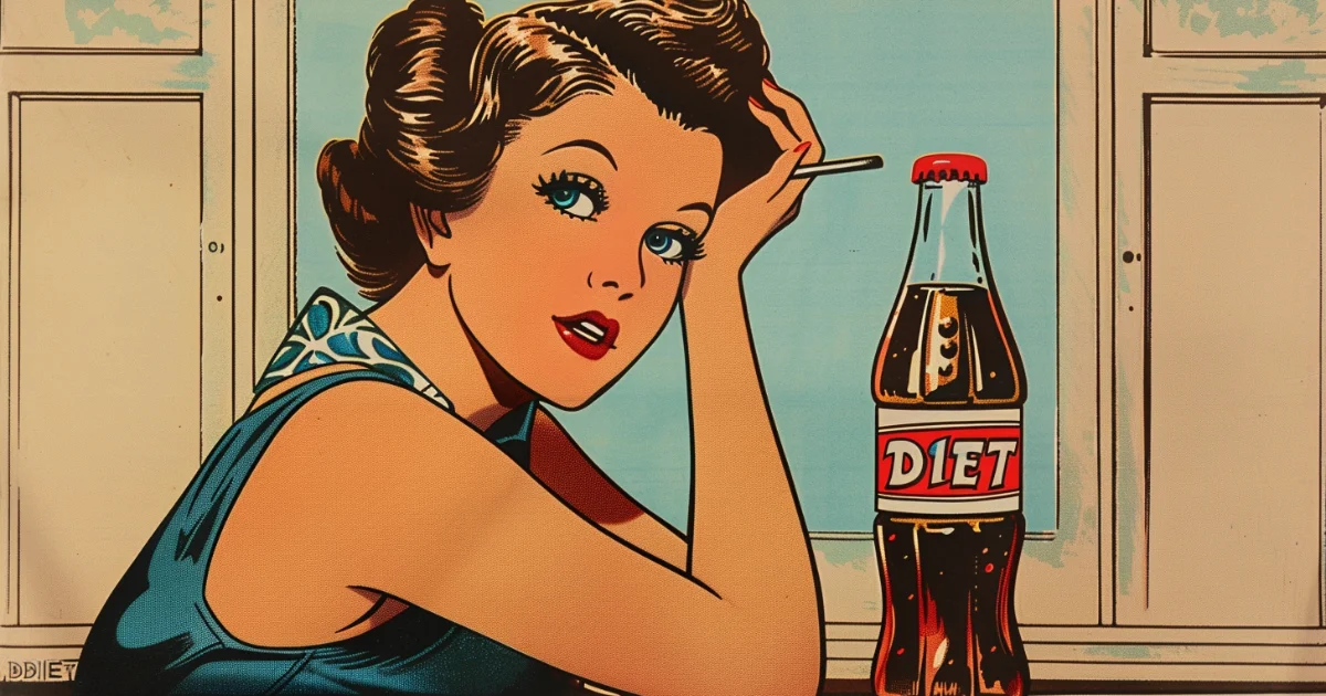
THE UNKNOWN HISTORY OF THE FIRST DIET SODA
-
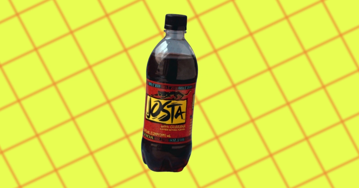
WHAT HAPPENED TO JOSTA SODA?
-

THE UNKNOWN HISTORY OF LIPTON TEA
-
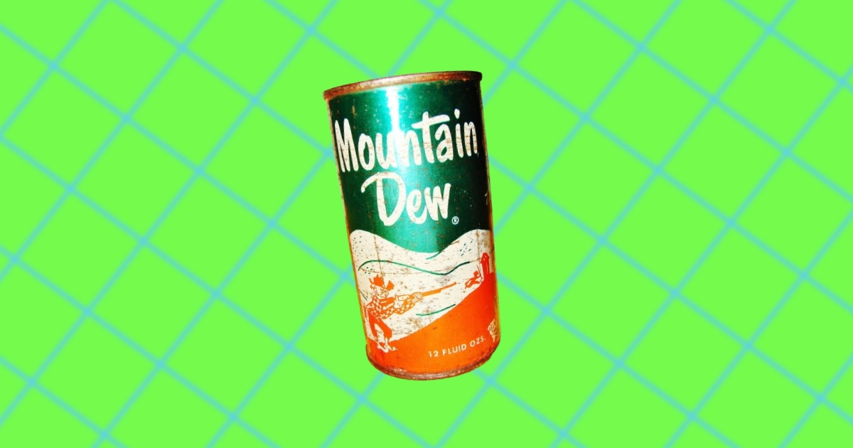
THE UNKNOWN HISTORY OF MOUNTAIN DEW
-
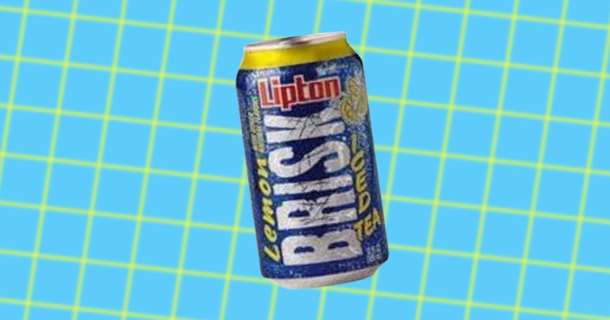
THE UNKNOWN HISTORY OF BRISK ICED TEA
-
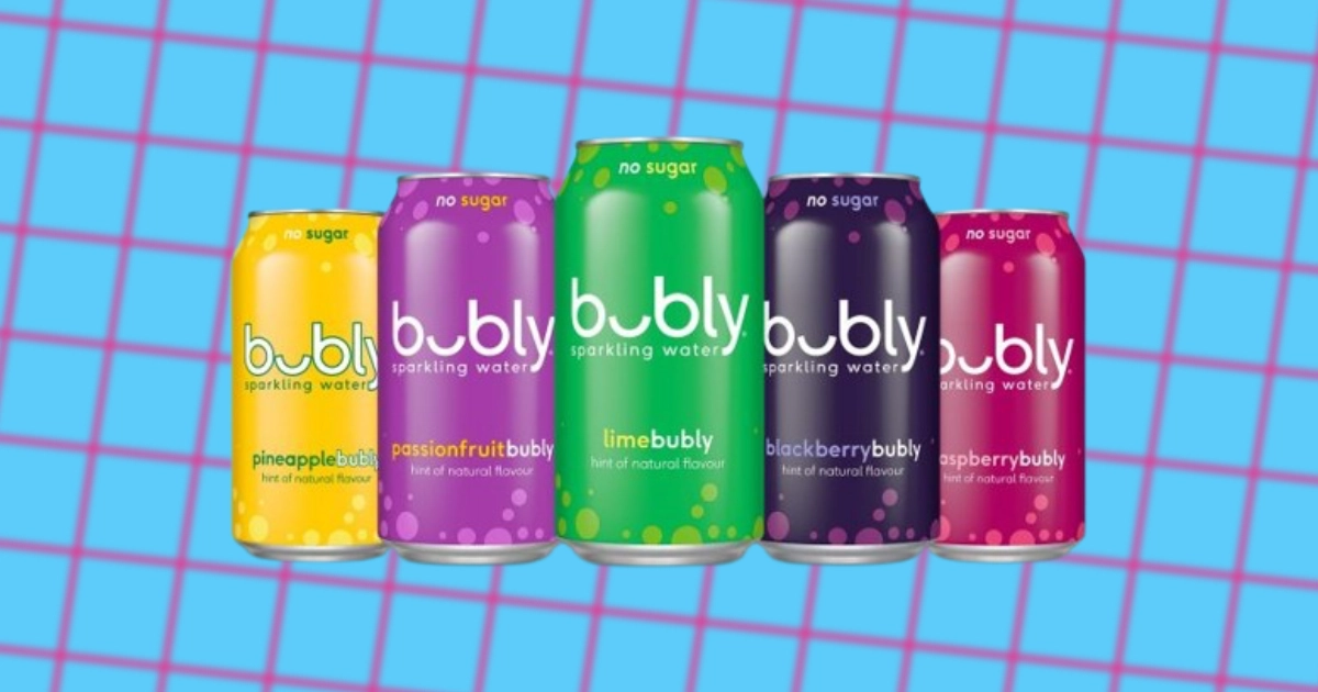
THE UNKNOWN HISTORY OF BUBLY SPARKLING WATER
-
THE UNKNOWN HISTORY OF AQUAFINA BOTTLED WATER
-

THE TIME PEPSI BOUGHT NAVAL SHIPS FROM THE SOVIET UNION
-
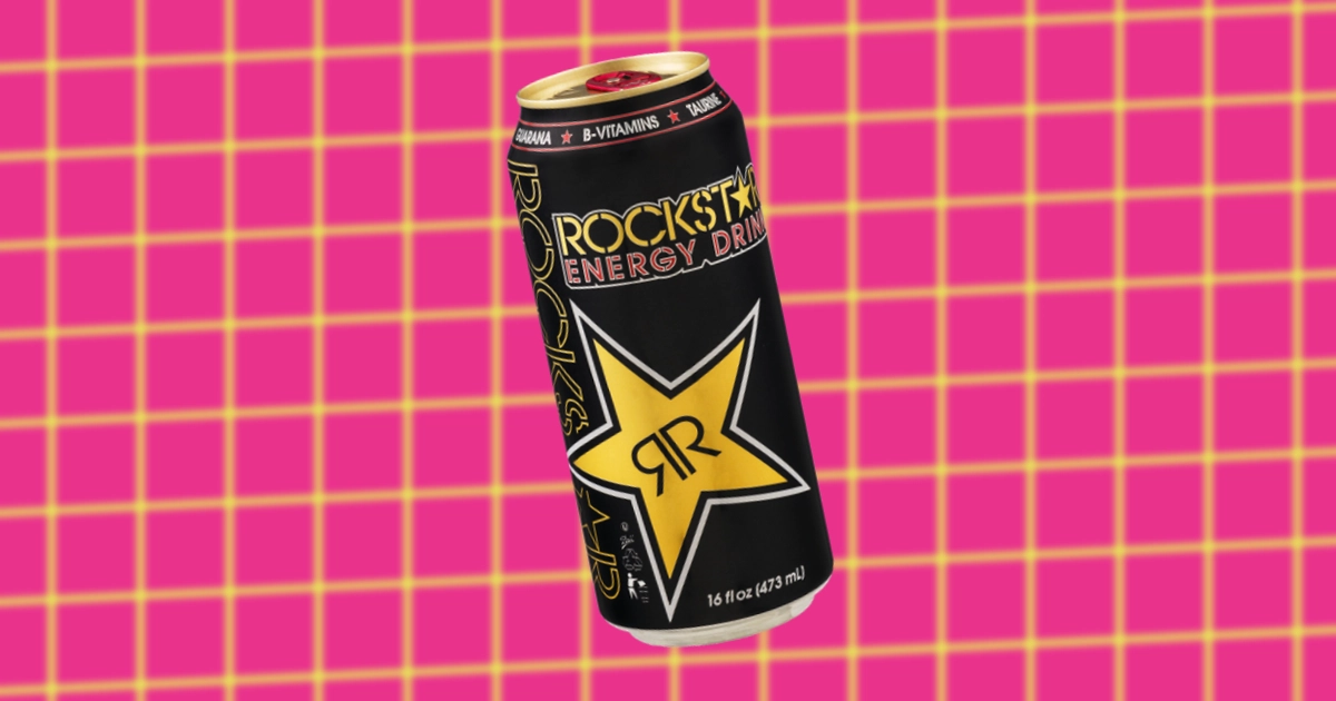
THE UNKNOWN HISTORY OF ROCKSTAR ENERGY DRINKS
-
THE UNKNOWN HISTORY OF NAKED JUICE
-

PEPSI’S KENDALL JENNER AD
-
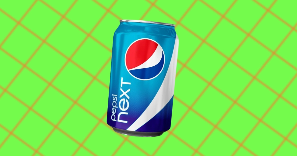
WHAT HAPPENED TO PEPSI NEXT — WHY IT FAILED
-
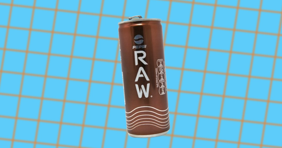
WHAT HAPPENED TO PEPSI RAW — WHY IT FELL FLAT
-
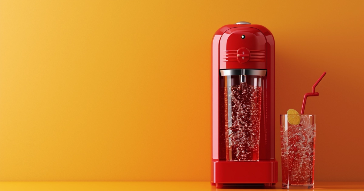
THE UNKNOWN HISTORY OF SODASTREAM
-
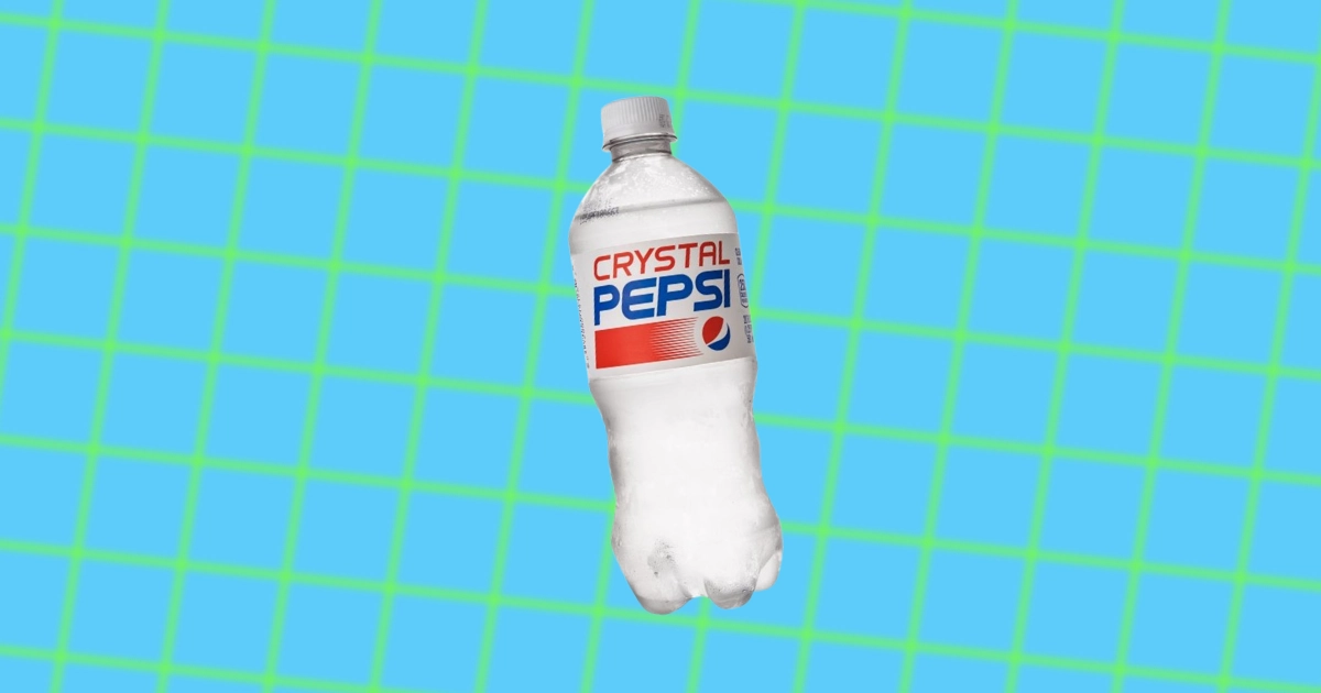
WHAT HAPPENED TO CRYSTAL PEPSI — WHY IT FAILED
-
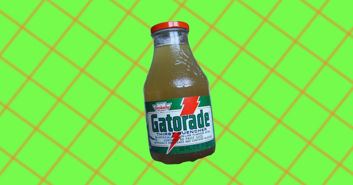
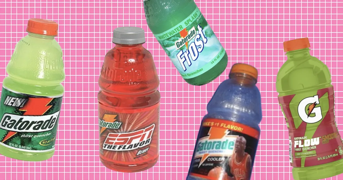
THE UNKNOWN HISTORY OF GATORADE
-
THE MADONNA-PEPSI CLASH OF '89
-
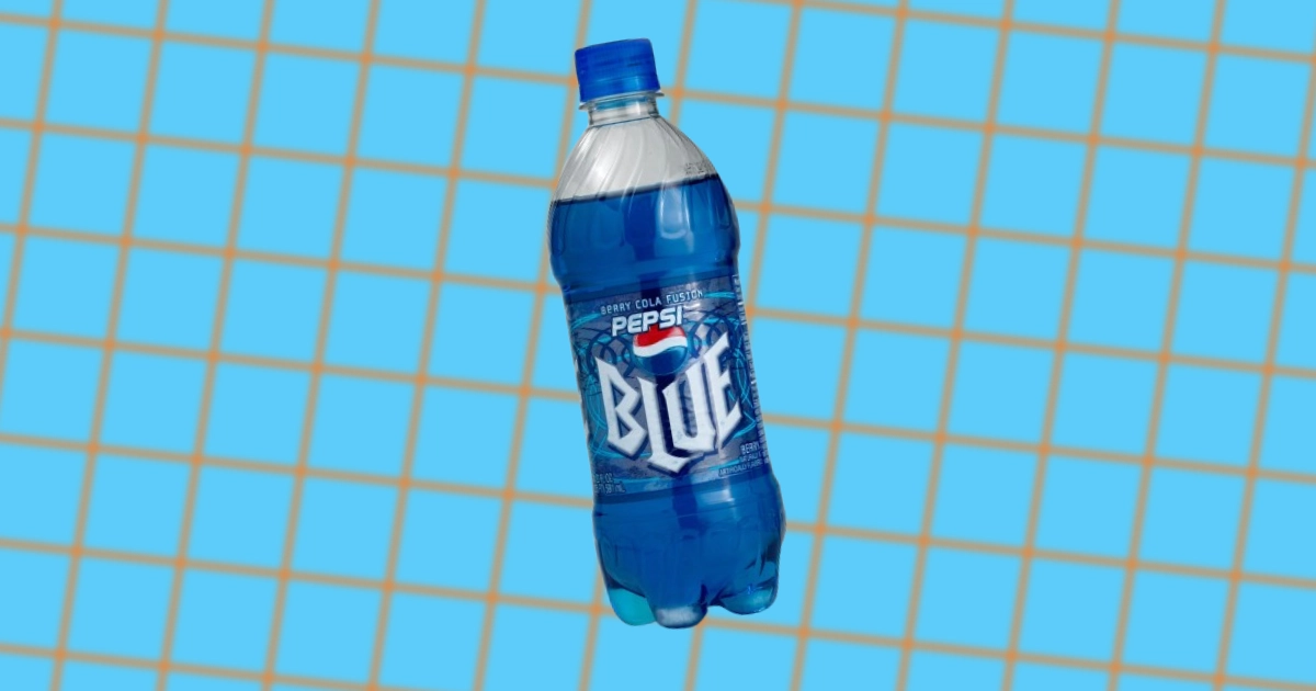
WHAT HAPPENED TO PEPSI BLUE — WHY IT FAILED
-
PEPSI CONTROVERSIES & DARK HISTORY
-
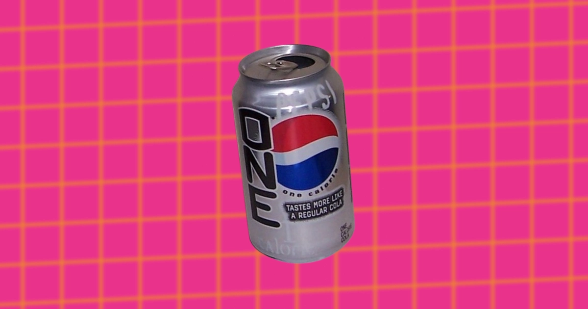
WHAT HAPPENED TO PEPSI ONE — WHY IT FAILED
-
THE UNKNOWN HISTORY OF SOBE
-
THE UNKNOWN HISTORY OF TROPICANA
-
THE UNKNOWN HISTORY OF 7 UP
-
INSIDE MICHAEL JACKSON’S PEPSI BLOCKBUSTER NEW GENERATION AD
-
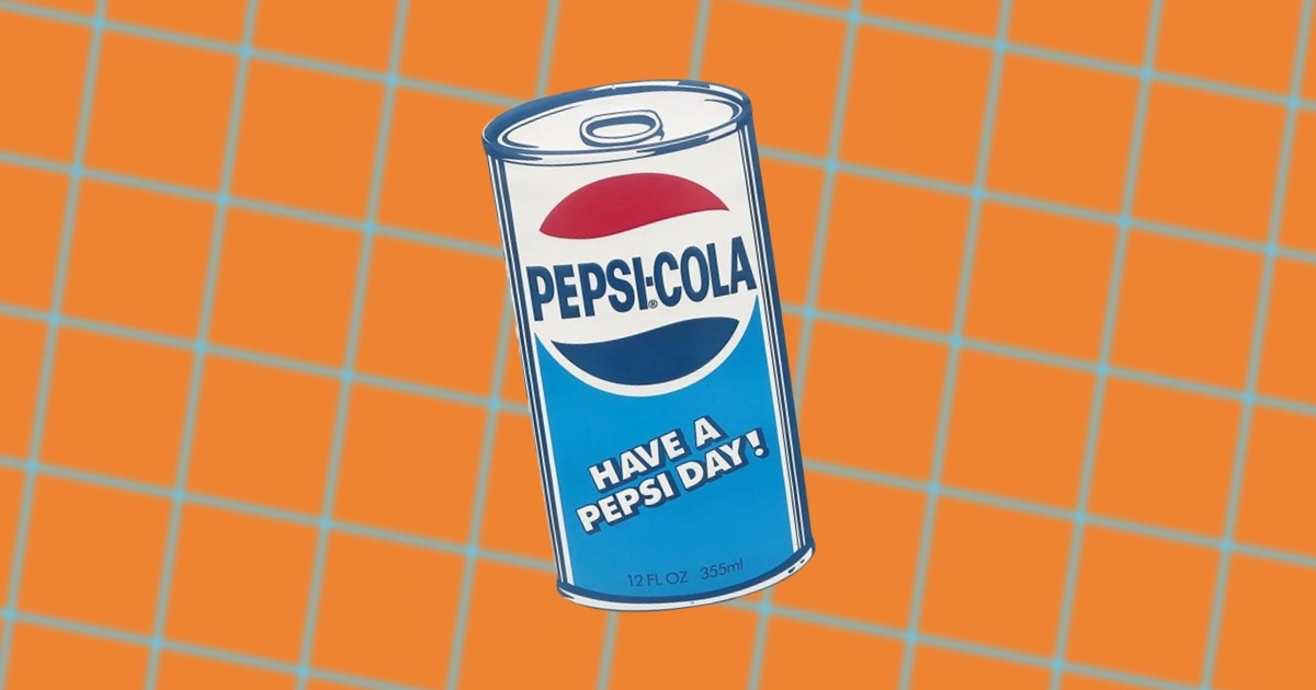
HAVE A PEPSI DAY
-
THE PEPSI CHALLENGE
-
THE UNKNOWN HISTORY OF OCEAN SPRAY
-
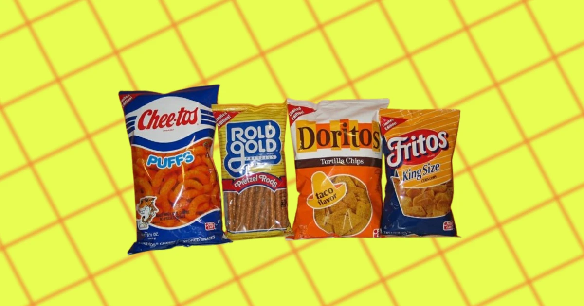
THE UNKNOWN HISTORY OF FRITO-LAY
-
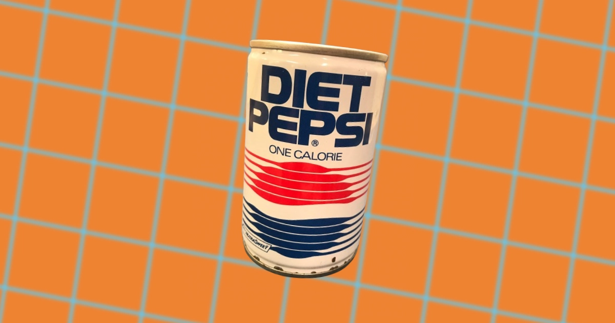
THE UNKNOWN HISTORY OF DIET PEPSI
-
MORE BOUNCE TO THE OUNCE
-

THE PEPSI-COLA PLAYHOUSE
-
THE PEPSI GENERATION
-
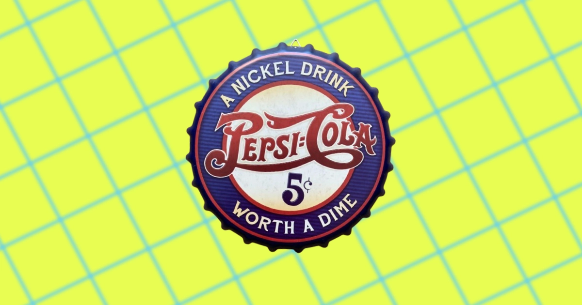
TWICE AS MUCH FOR A NICKEL
-
WALTER MACK THE PEPSI CEO WHO TOOK ON COCA-COLA
-

PEPSI-COLA HITS THE SPOT
-
HISTORY OF PEPSI SLOGANS & TAGLINES
-
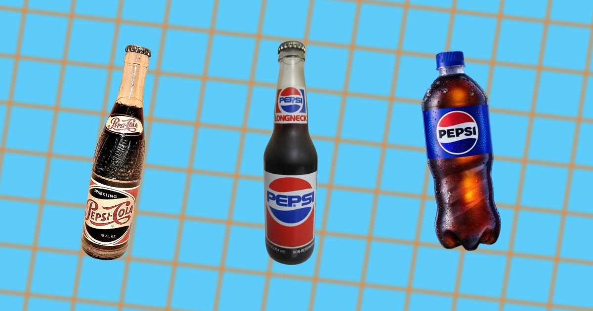
THE HISTORY OF PEPSI’S BOTTLE EVOLUTION
-
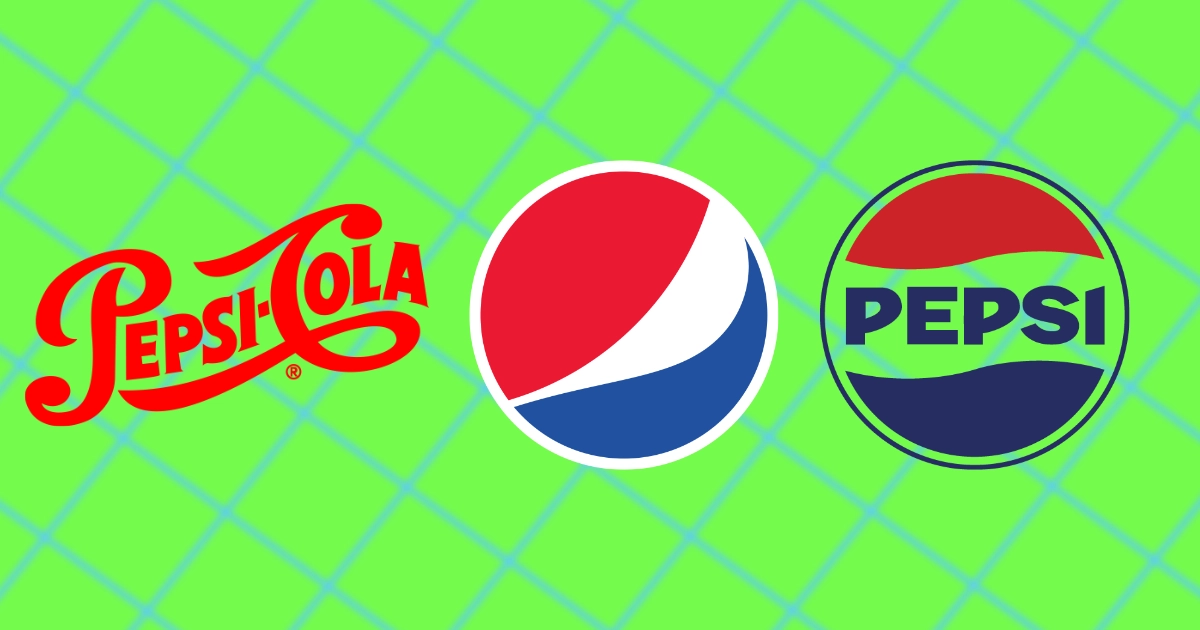
THE HISTORY OF THE PEPSI LOGO
-
THE MAN WHO SAVED PEPSI
-
THE RISE & FALL OF THE LOFT CANDY COMPANY
-
HOW SUGAR CAUSED PEPSI TO GO BANKRUPT
-
9 FACTS ABOUT BARNEY OLDFIELD: THE PEPSI LOVING SPEED KING
-
BRAD’S DRINK & THE INVENTION OF PEPSI-COLA
-

THE LIFE OF CALEB BRADHAM THE FOUNDER OF PEPSI
-
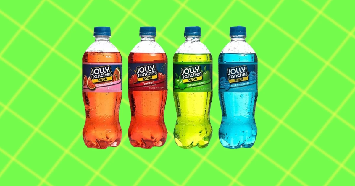
THE BRIEF FIZZY RUN OF JOLLY RANCHER SODA
-
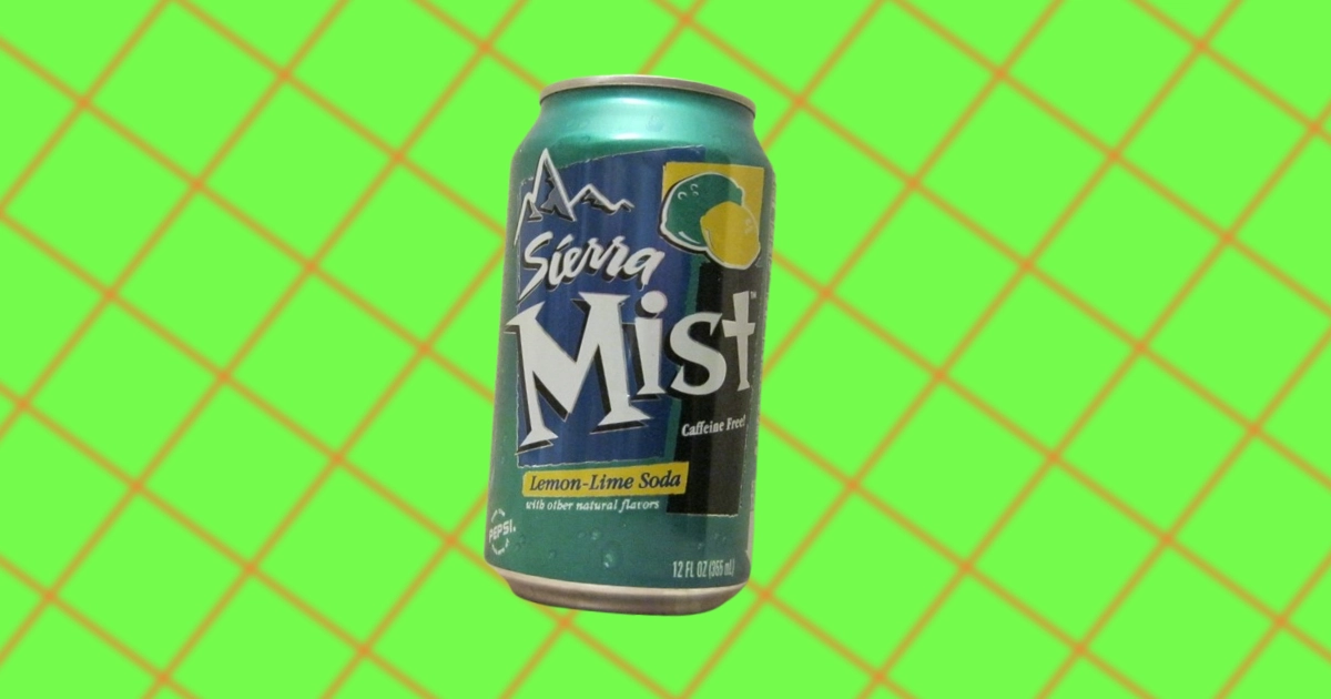
WHAT HAPPENED TO SIERRA MIST?
-
PEPSICO ACQUISITIONS & MERGERS
-
PEPSICO CEO HISTORY
-
DIET COKE BREAK: THE AD CAMPAIGN THAT MADE VIEWERS WEAK-KNEED
-

THE UNKNOWN HISTORY OF GINSENG
-
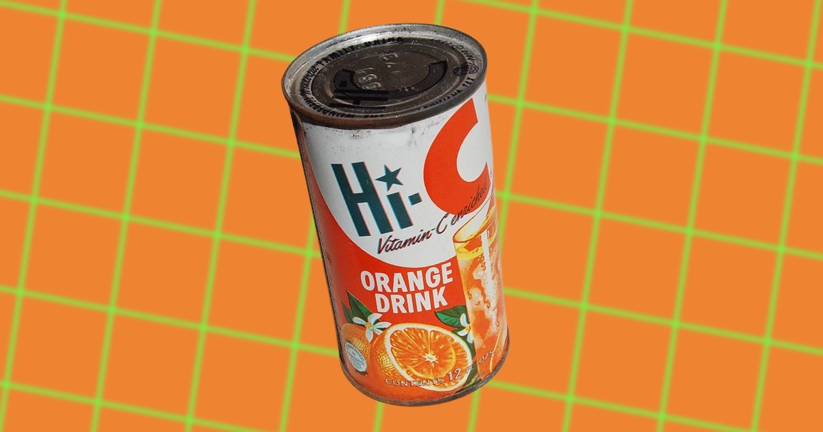
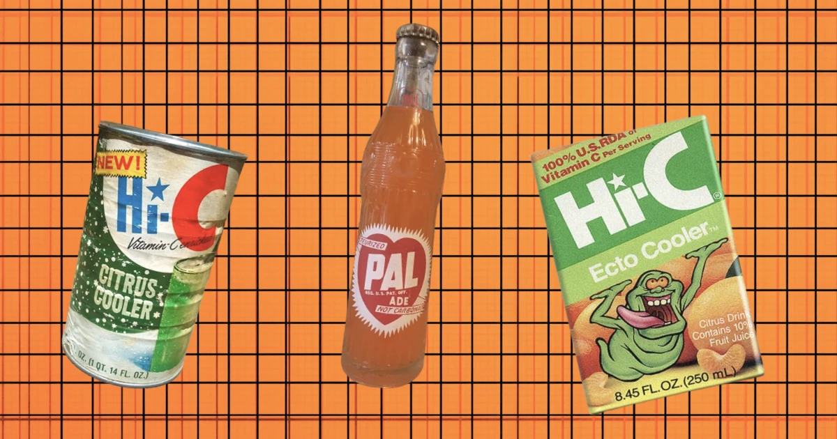
THE UNKNOWN HISTORY OF HI-C
-
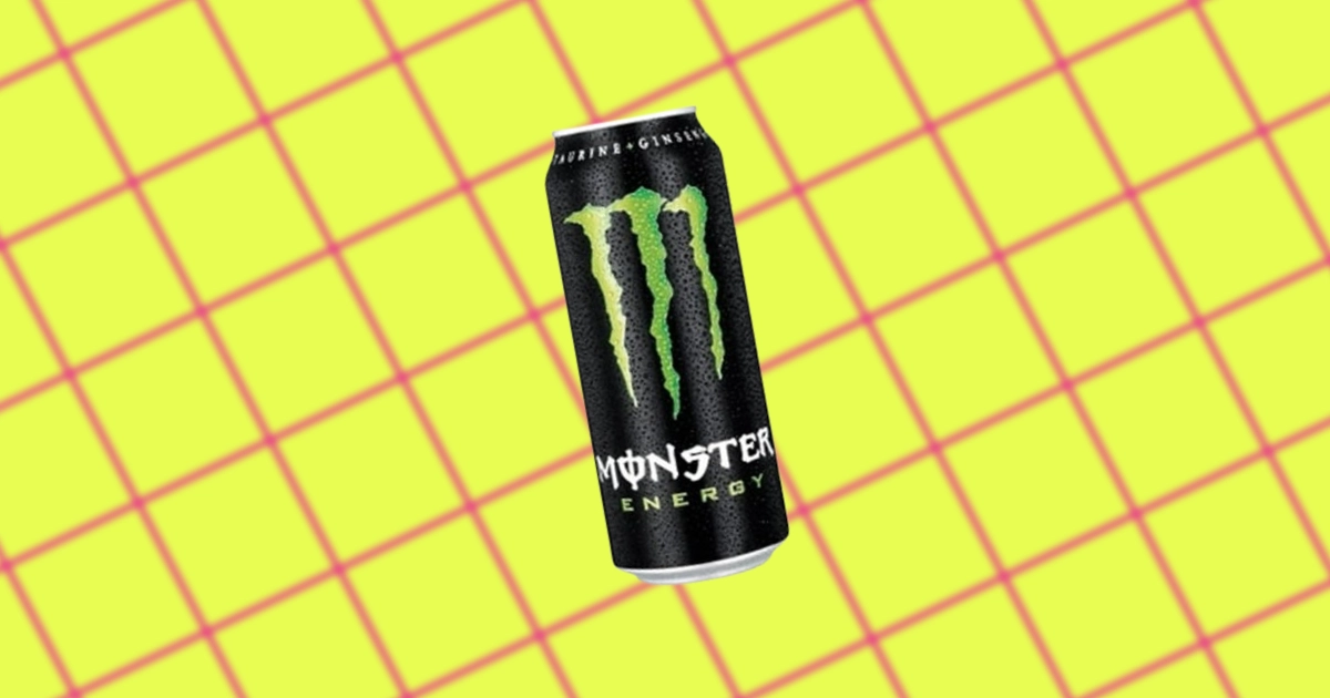
THE UNKNOWN HISTORY OF MONSTER ENERGY DRINKS
-
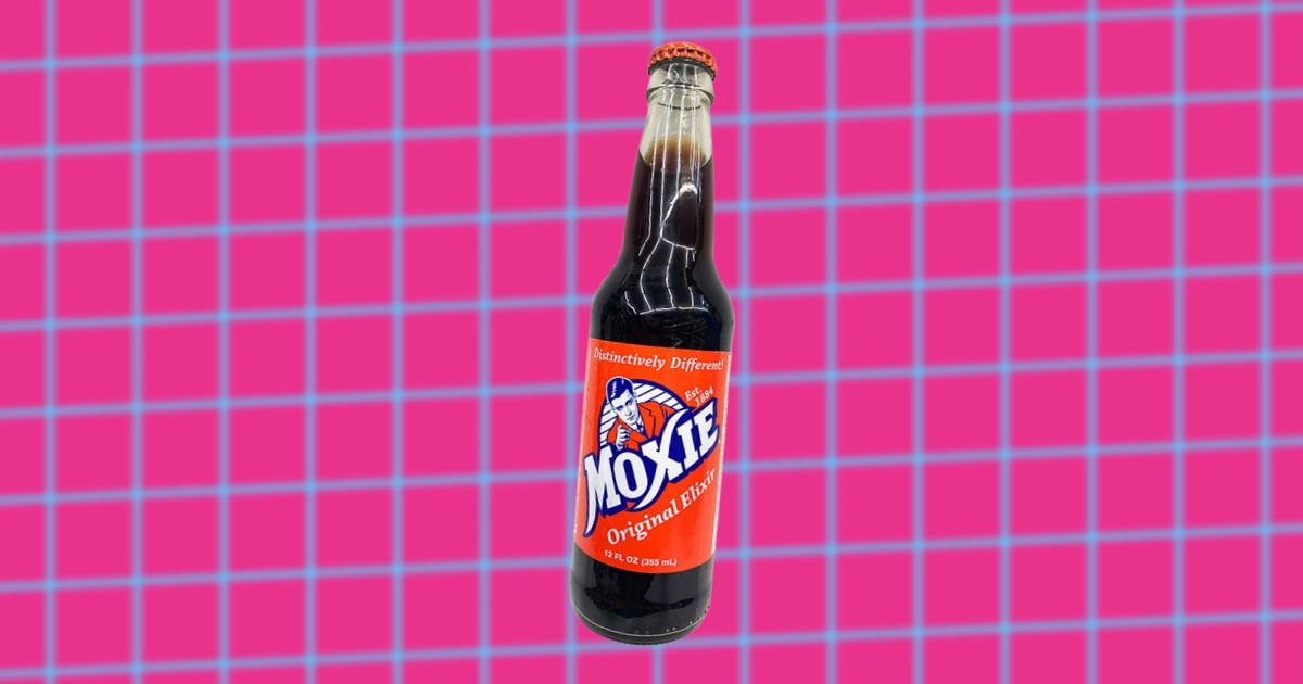
THE UNKNOWN HISTORY OF MOXIE SODA
-

THE UNKNOWN HISTORY OF FUZE BEVERAGE
-
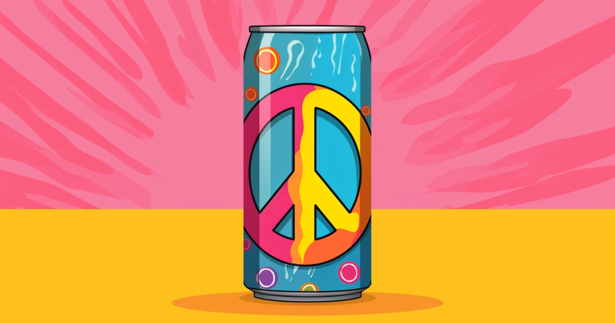
THE UNKNOWN HISTORY OF PEACE TEA
-
THE UNKNOWN SEAGRAM’S HISTORY
-
THE UNKNOWN HISTORY OF HONEST TEA
-

THE UNKNOWN HISTORY OF TOPO CHICO
-
THE UNKNOWN HISTORY OF AHA SPARKLING WATER
-
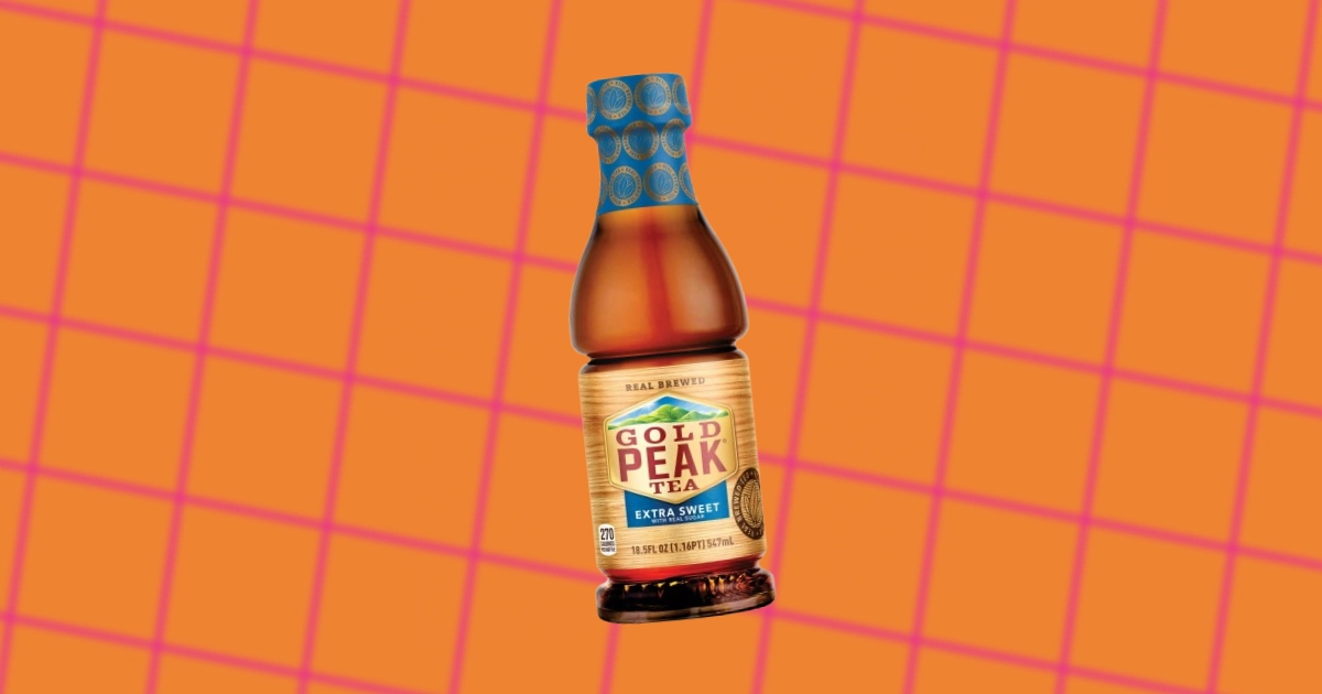
THE UNKNOWN HISTORY OF GOLD PEAK TEA
-
THE UNKNOWN HISTORY OF SIMPLY BEVERAGES
-
A COMPLETE LIST OF VINTAGE DIET COKE ADS & SLOGANS
-
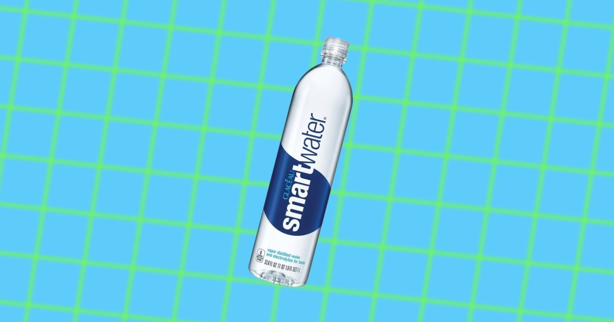
THE UNKNOWN HISTORY OF SMARTWATER
-

THE WILD ORIGIN OF STEVIA
-
THE UNKNOWN HISTORY OF THE GLASS BOTTLE
-
THE UNKNOWN HISTORY OF BOTTLED WATER
-
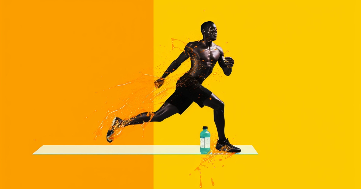
THE UNKNOWN HISTORY OF SPORTS DRINKS
-

THE UNKNOWN HISTORY OF MR. PIBB (PIBB XTRA)
-
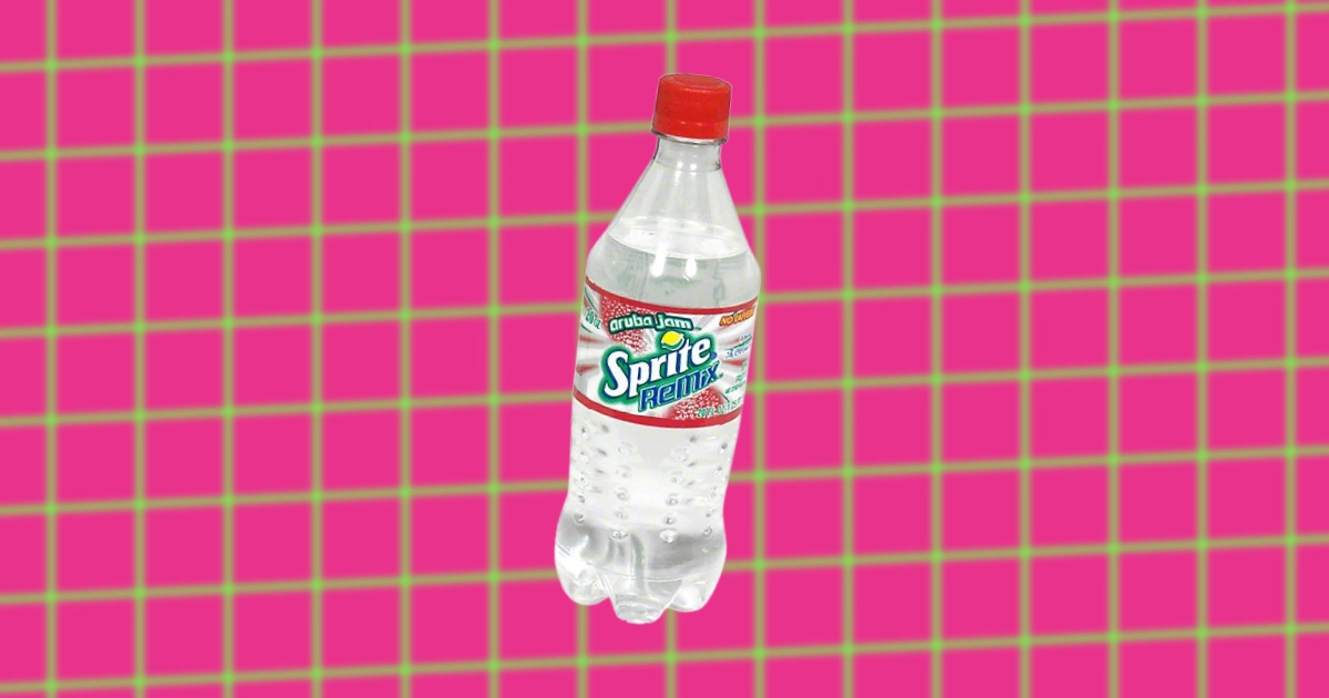
WHY SPRITE REMIX WAS DISCONTINUED & REBIRTHED “KIND-OF”
-
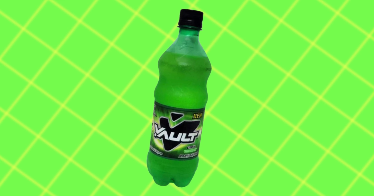
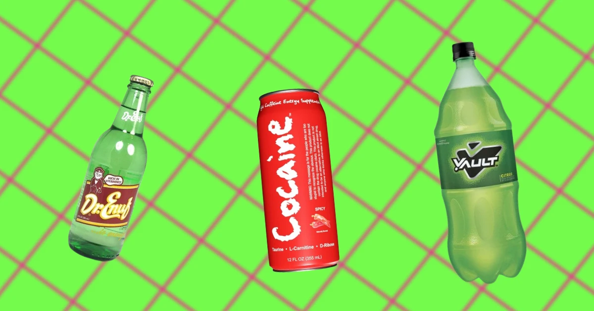
WHAT HAPPENED TO VAULT SODA?
-
THE UNKNOWN HISTORY OF KIST SODA
-

THE UNKNOWN HISTORY OF MINUTE MAID
-
THE UNKNOWN HISTORY OF BARQ’S ROOT BEER
-
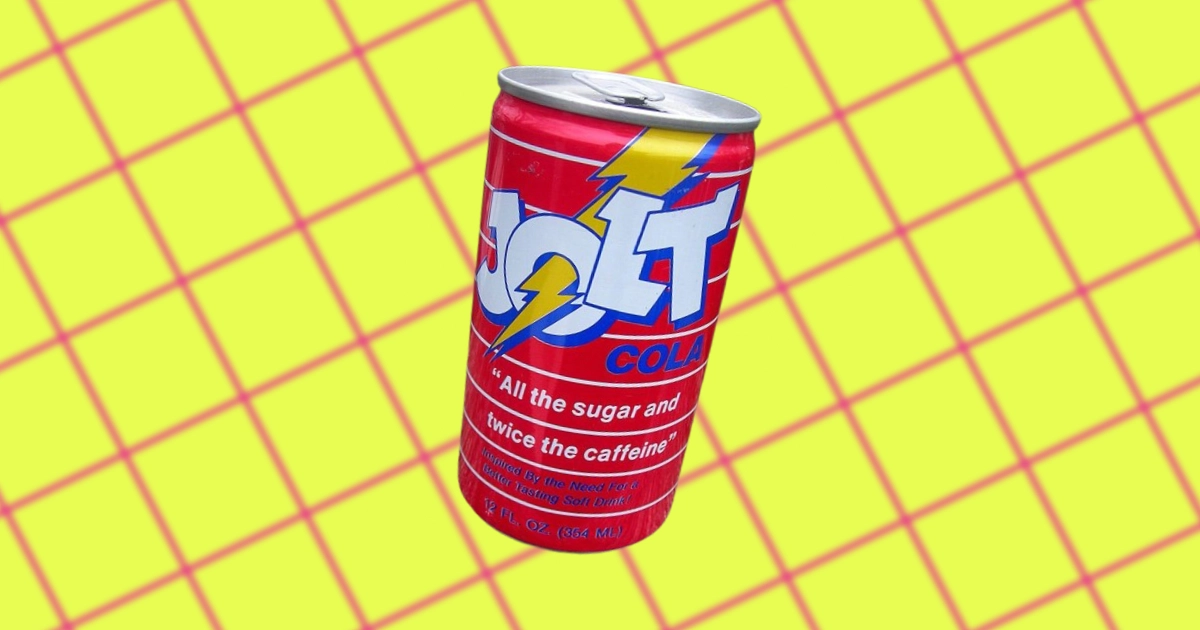
WHY JOLT COLA WAS DISCONTINUED
-
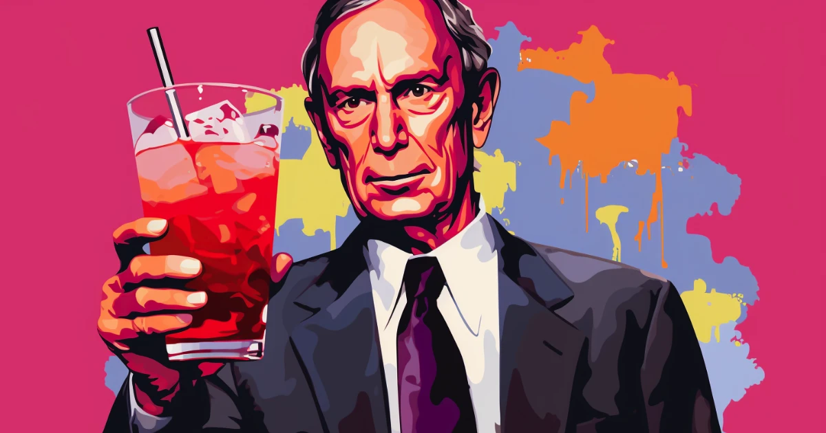
THE RISE & FALL OF THE BLOOMBERG SODA BAN
-
A HISTORY OF COCA COLA CAN DESIGN
-
A HISTORY OF COCA-COLA'S CEOs: THEIR ACCOMPLISHMENTS & FAILURES
-
WHAT WAS COCA-COLA ORIGINALLY MADE FOR?
-
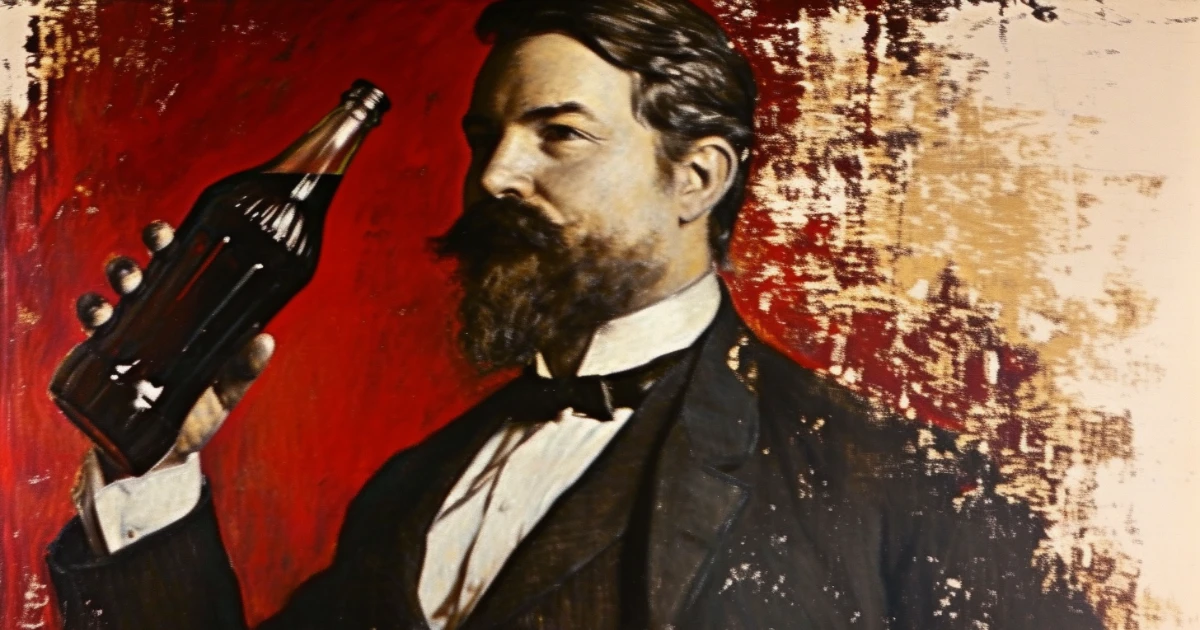
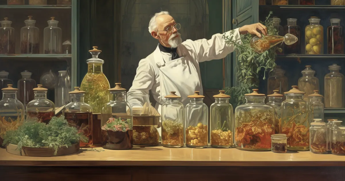
HOW COCA-COLA WAS INVENTED
-

THE DARK HISTORY OF GREENWASHING: FROM COCA-COLA TO VOLKSWAGEN
-
WHY COCA-COLA’S LOGO IS RED
-
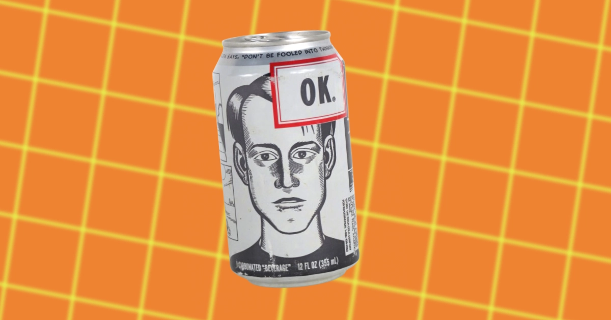
OK SODA: IT’S UNKNOWN HISTORY & WHY IT FAILED
-
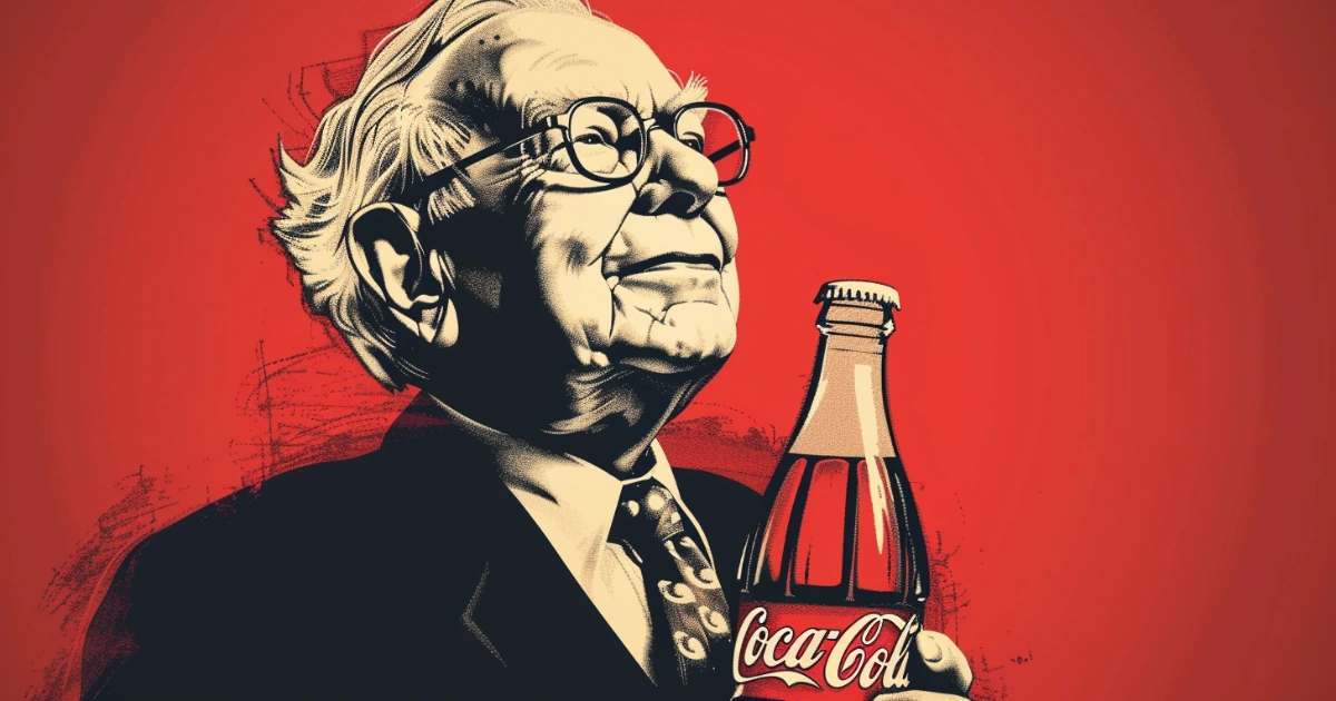
WARREN BUFFETT'S COCA-COLA INVESTMENT EXPLAINED
-
25 DISCONTINUED SODAS YOU FORGOT ABOUT
-
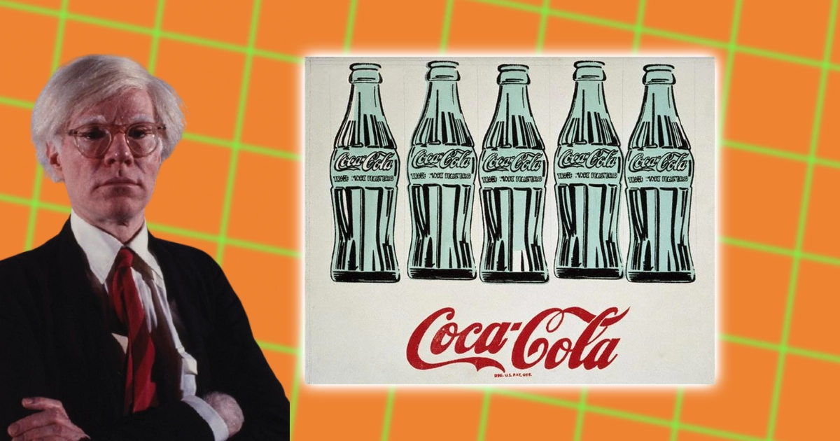
ANDY WARHOL'S COCA-COLA AFFINITY EXPLAINED
-

THE DARK HISTORY OF ASPARTAME
-
FRANK MASON ROBINSON: THE MAN BEHIND THE COCA-COLA LOGO
-

SLOGANS OF SPRITE OVER THE YEARS
-
COCA-COLA'S ‘REAL MAGIC’ CAMPAIGN
-
10 DEAN KAMEN'S INVENTIONS THAT CHANGED THE WORLD
-
FANTA’S NAZI ORIGINS
-
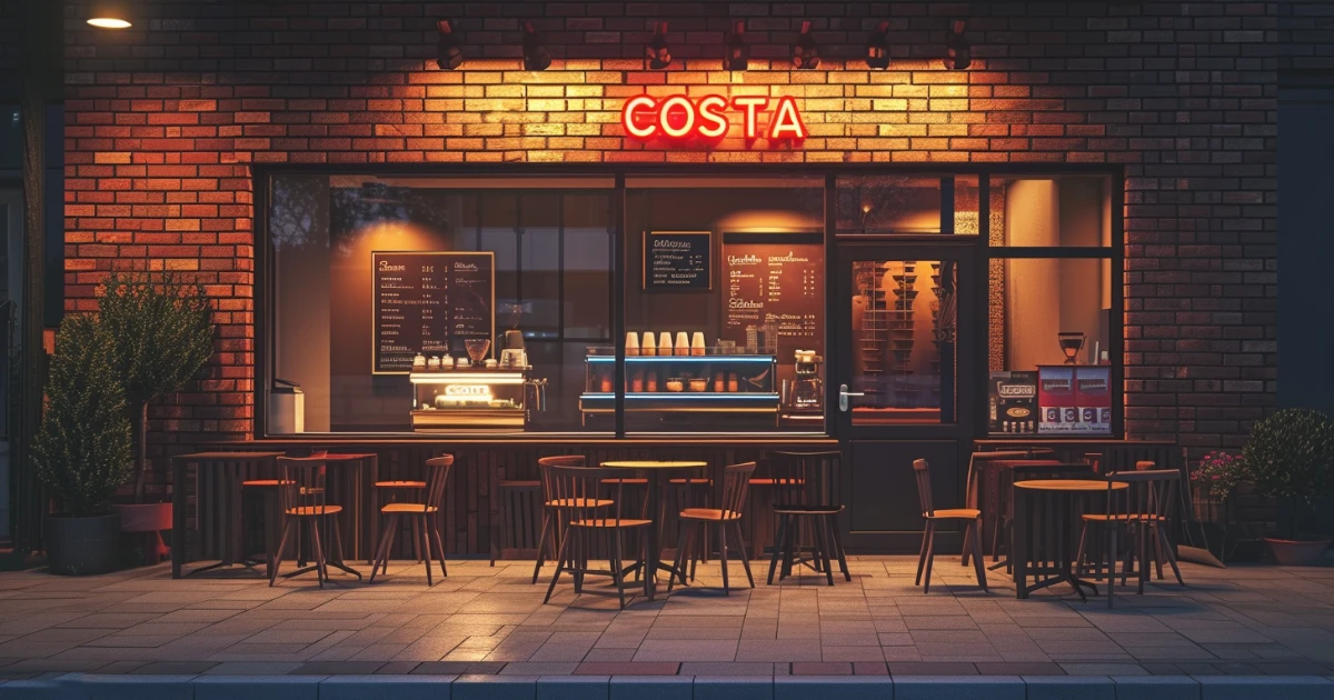
THE UNKNOWN HISTORY OF COSTA COFFEE
-
WHY COCA-COLA LIFE WAS DISCONTINUED & FAILED
-
COCA-COLA'S "TASTE THE FEELING" CAMPAIGN
-
WHY COCA-COLA BLĀK WAS DISCONTINUED & FAILED
-
HOW 'OPEN HAPPINESS' LIT UP A WORLD IN RECESSION
-
HOW THE 'COKE SIDE OF LIFE' DEFINED A GENERATION OF ADVERTISING
-
THE LEGACY OF THE "ENJOY COCA-COLA" SLOGAN
-
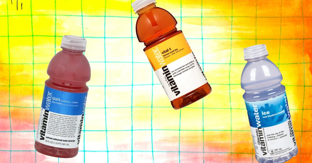
THE UNKNOWN HISTORY OF VITAMINWATER
-
THE STORY BEHIND "ALWAYS COCA-COLA"
-
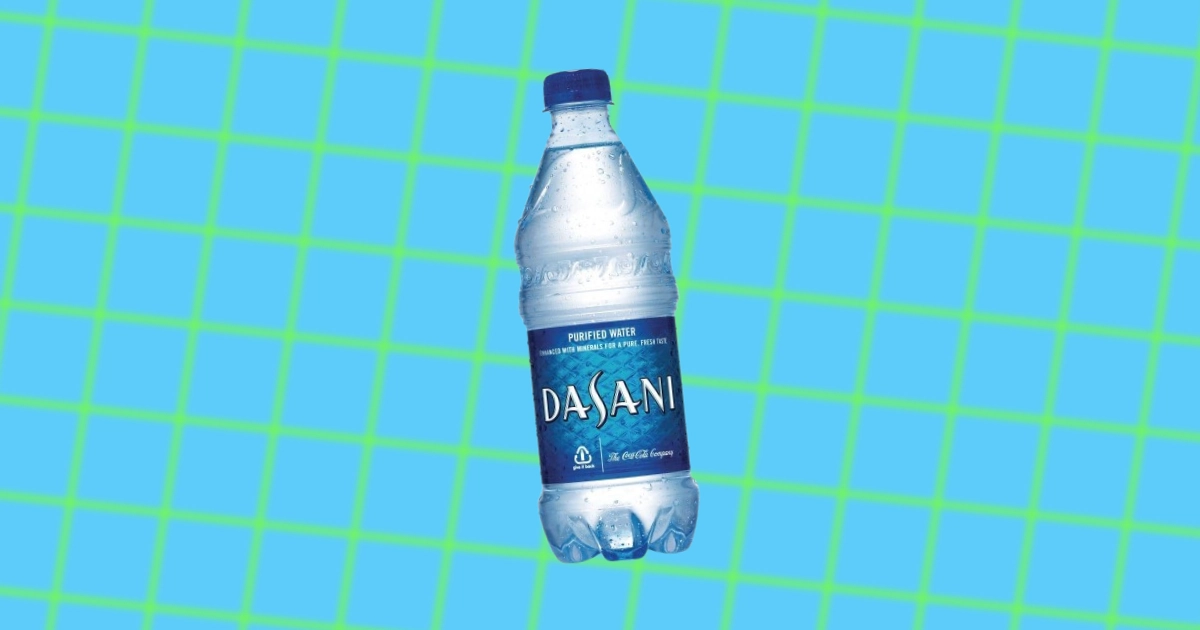
THE UNKNOWN HISTORY OF DASANI WATER
-
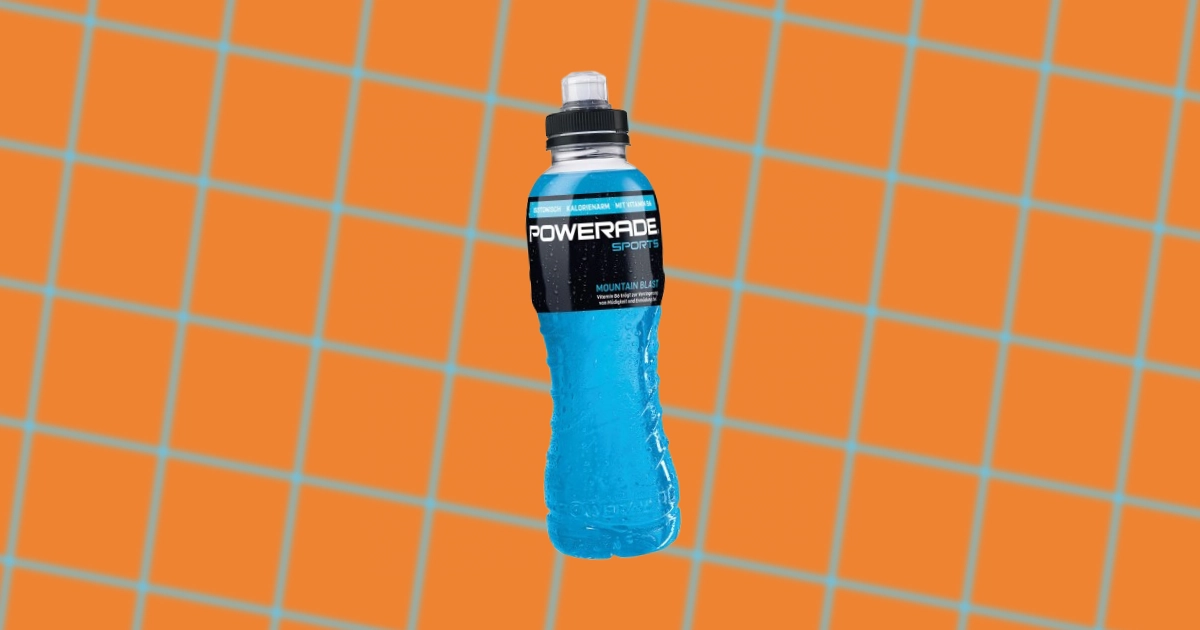
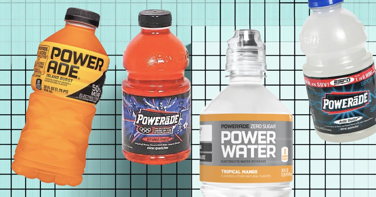
THE UNKNOWN HISTORY OF POWERADE
-
COCA-COLA’S ACQUISITION OF COLUMBIA PICTURES
-
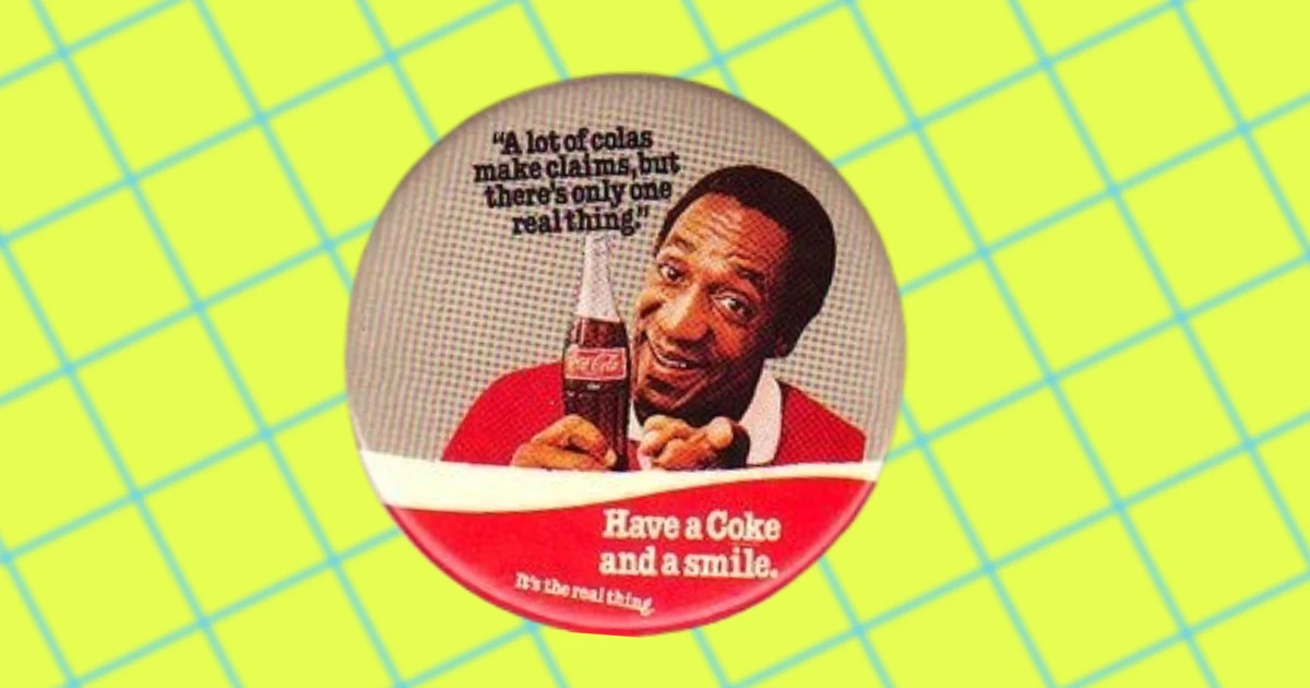
HOW 'HAVE A COKE AND A SMILE' CHANGED COCA-COLA FOREVER
-
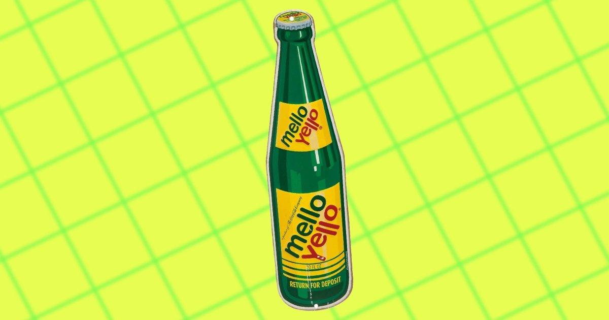
HISTORY OF MELLO YELLO
-
COCA-COLA'S ‘LOOK UP AMERICA’ CAMPAIGN
-
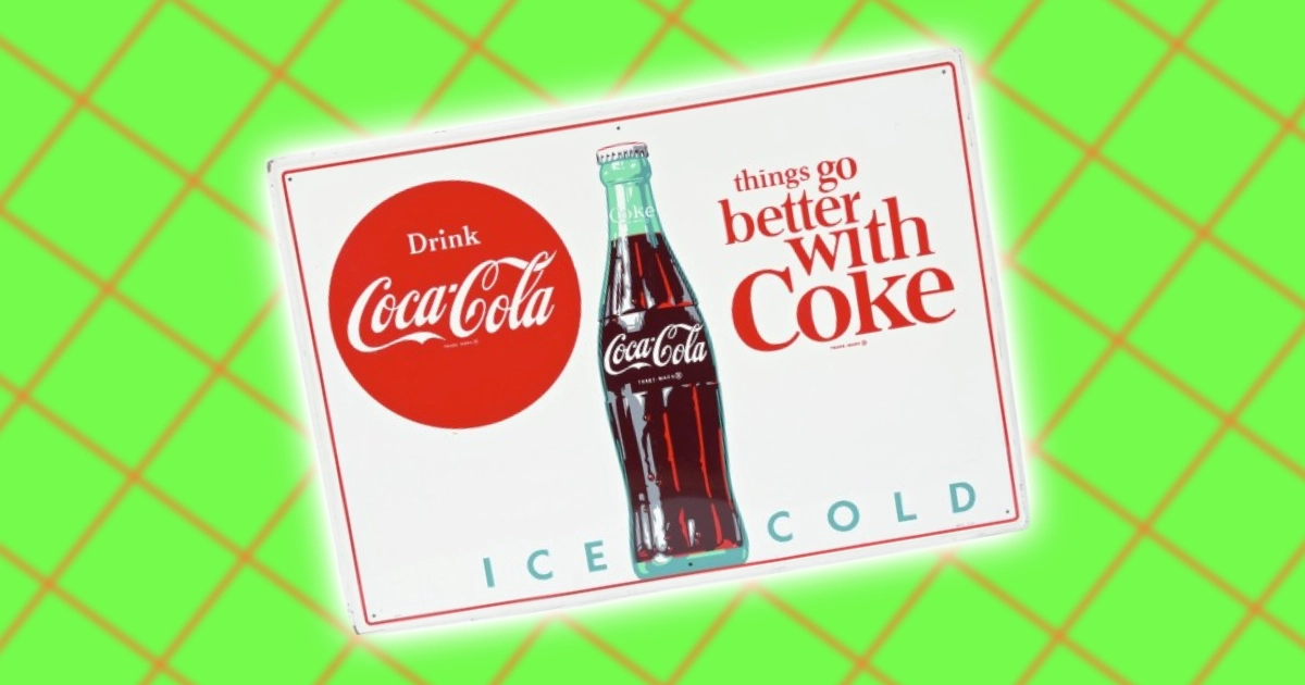
'THINGS GO BETTER WITH COKE' IN A TURBULENT ERA
-
THE "SIGN OF GOOD TASTE" COCA-COLA CAMPAIGN OF THE 1950S
-
ORIGINS OF 'YOU CAN'T BEAT THE FEELING' SLOGAN
-
COCA-COLA'S KING SIZE BOTTLE: THE RISE & FALL
-
IT'S THE REAL THING
-
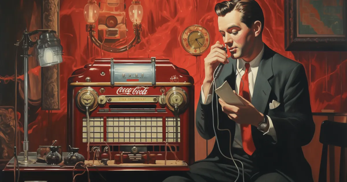
THE COCA-COLA HOUR
-
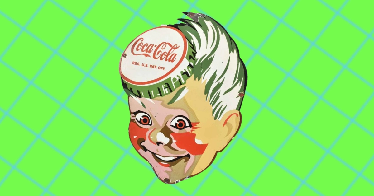
SPRITE BOY: COCA-COLA'S FORGOTTEN MASCOT
-
COCA-COLA'S "THIRST KNOWS NO SEASON" CAMPAIGN
-
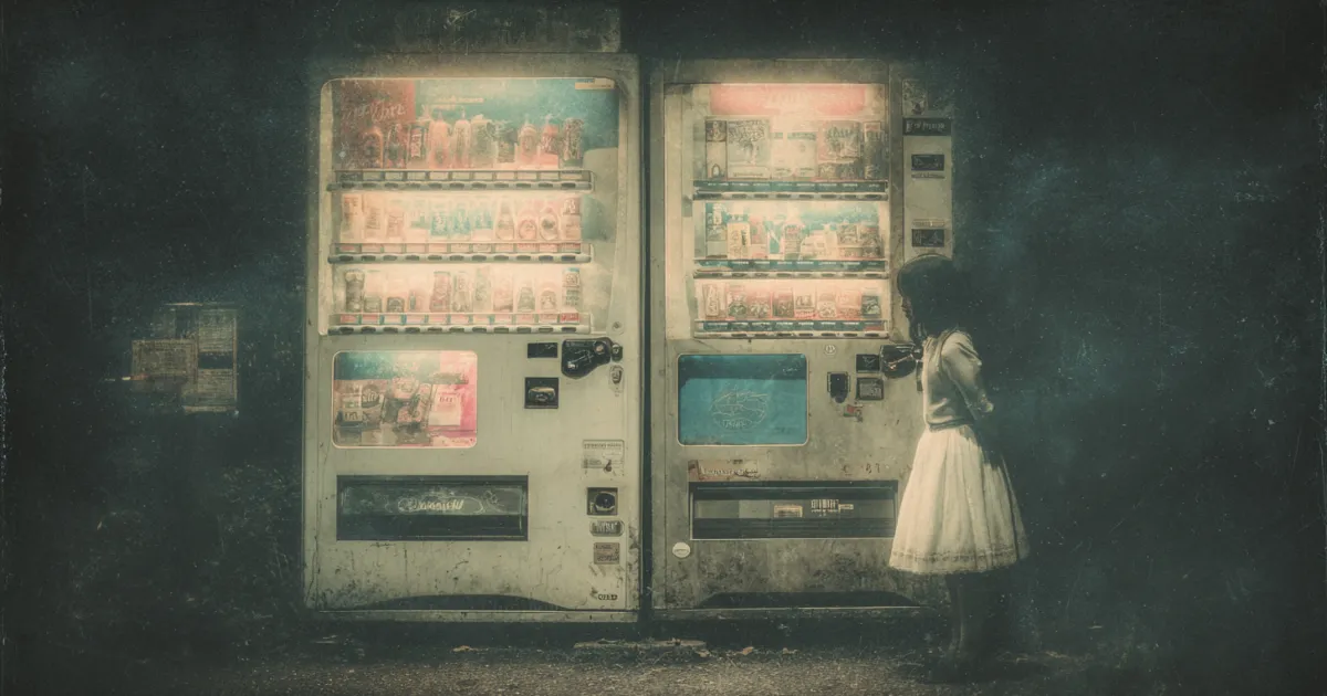
THE QUIRKY HISTORY OF VENDING MACHINES
-
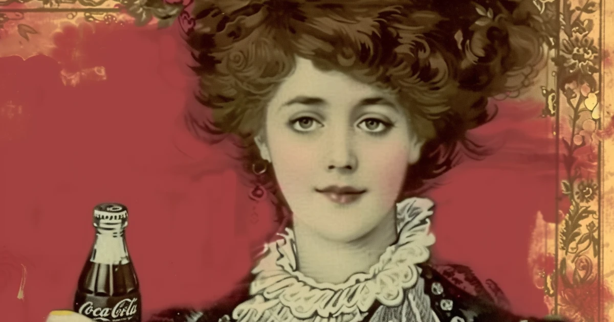
HILDA CLARK: COCA-COLA’S FIRST CELEBRITY ENDORSER
-
WHAT THE PURE FOOD AND DRUG ACT DID
-
THE REMARKABLE SALES HISTORY OF COCA-COLA
-
THE UNEXPECTED ORIGINS OF THE CUBA LIBRE
-
COCA-COLA’S TRADEMARK HISTORY
-
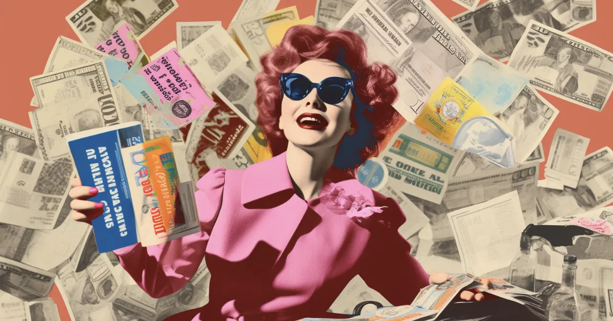
HISTORY OF COUPONS: FROM COCA-COLA TO GROUPON
-
COCA-COLA'S BEATBOX
-
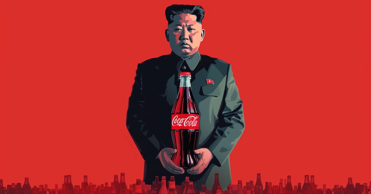
THE SECRET HISTORY OF COCA-COLA IN NORTH KOREA
-
HOW THE PULL-TOP CAN REVOLUTIONIZED BEVERAGE PACKAGING
-
COCA-COLA’S HISTORY IN ATLANTA: ODDITIES & CONTROVERSIES
-
THE TIME BIG SODA PUT A SWEETENER IN THEIR PRODUCTS LINKED TO BLADDER CANCER
-

THE ROOT GLASS COMPANY & ITS ICONIC CREATION
-
THE STORY OF COCA-COLA'S HUG MACHINE
-
VIN MARIANI: THE COCAINE-INFUSED WINE OF THE PAST
-
COCA-COLA’S SECRET FORMULA: THE STORY OF MERCHANDISE 7X
-
EXPLORING COCA-COLA'S LAWSUITS THROUGH HISTORY
-
THE UNTOLD TALE OF KOCA NOLA
-

ALL 14 OF COCA-COLA'S ACQUISITIONS
-
THE CURIOUS HISTORY OF COCA-COLA IN MEXICO
-
SINALTRAINAL VS COCA-COLA DEATH-SQUADS
-
HADDON SUNDBLOM’S ART: INVENTING MODERN ART MARKETING
-
COCA-COLA BOYCOTTS THROUGHOUT HISTORY
-
COCA-COLA’S HISTORY IN CHINA
-
WHEN COCA-COLA SECRETLY SOLD CLEAR COKE TO THE SOVIET UNION
-
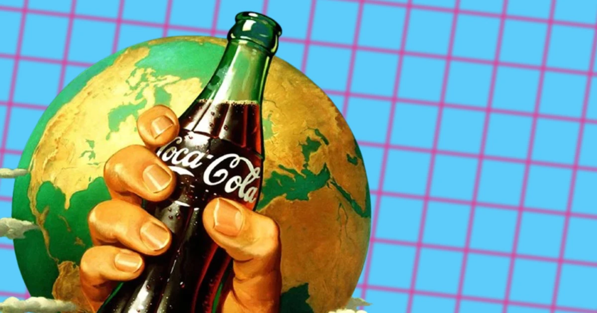
COCA-COLONIZATION: THE RED DAWN OF GLOBALIZATION
-
A GLIMPSE INTO COCA-COLA'S POLITICAL LOBBYING HISTORY
-
COCA-COLA POLITICS HISTORY
-
A LIST OF COCA-COLA SONGS & JINGLES OVER TIME
-
COCA-COLA IN SPORTS
-
THE LEGACY OF THE "HOLIDAYS ARE COMING!" COCA-COLA CAMPAIGN
-
HOW COCA-COLA’S 5 CENT BOTTLE LASTED FOR DECADES
-
"SHARE A COKE" A LOOK BACK AT COCA-COLA'S ICONIC CAMPAIGN
-
THE COCA-COLA CARDS OF THE '90S: FIZZ, TRADING & POP CULTURE
-
COKE IS IT! THE SIP THAT SHOOK THE WORLD
-
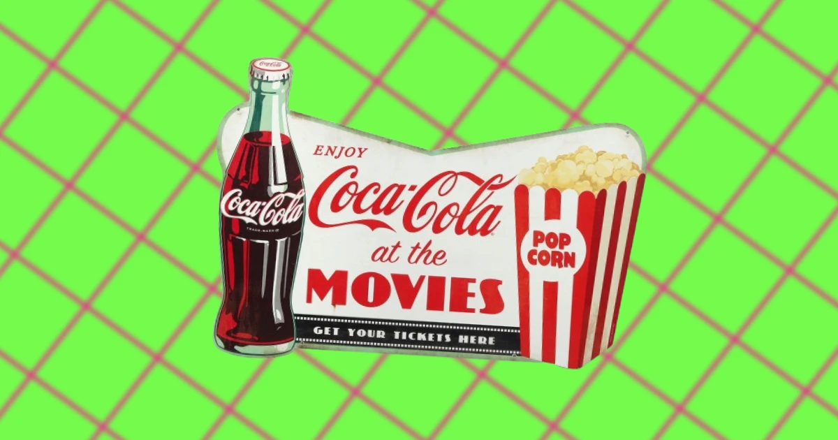
COCA-COLA IN THE MOVIES
-
THE BIRTH OF "I'D LIKE TO TEACH THE WORLD TO SING"
-
THE HISTORY OF ‘THE PAUSE THAT REFRESHES' CAMPAIGN
-
THE SURPRISING HISTORY OF DIET COKE
-
WHEN COKE STARTED USING CORN SYRUP
-
COCA-COLA’S CONTROVERSIAL HISTORY IN MYANMAR (BURMA)
-

COCA-COLA'S FIRST ADVERTISEMENTS
-
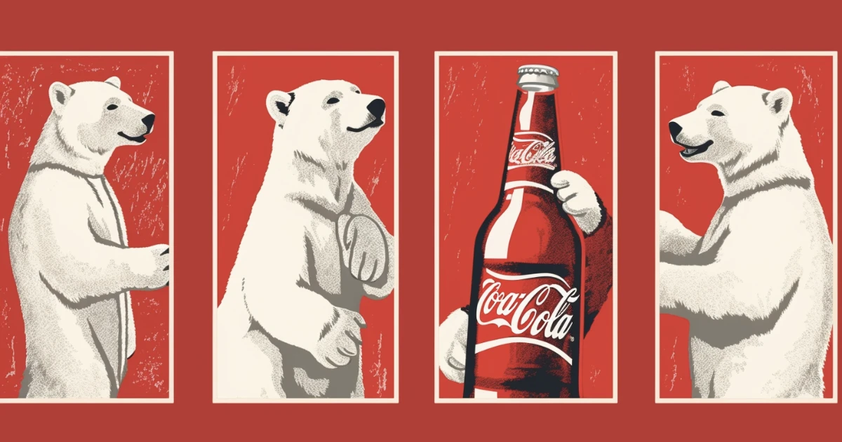
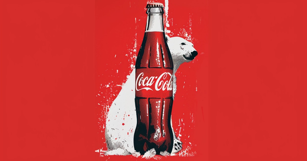
A LOOK AT COCA-COLA'S POLAR BEAR HISTORY
-
ROBERT WOODRUFF OF COCA-COLA
-
ASA CANDLER THE COCA-COLA KING
-
JOSEPH BIEDENHARN'S COCA-COLA BOTTLING REVOLUTION
-
THE STORY BEHIND PEMBERTON'S FRENCH WINE COCA
-
COCA-COLA’S DARK HISTORY
-
HISTORY OF THE KOLA NUT
-
COCA-COLA’S TWISTED HISTORY IN INDIA
-
A LOOK INTO COCA-COLA'S MOST FAMOUS SLOGANS
-
THE COCA-COLA BOTTLE DESIGN HISTORY
-
A JOURNEY THROUGH THE HISTORY OF THE COCA-COLA LOGO
-
THE STORY BEHIND COCA-COLA'S ICONIC HILLTOP COMMERCIAL
-
COCA-COLA’S HISTORY WITH THE OLYMPIC GAMES
-
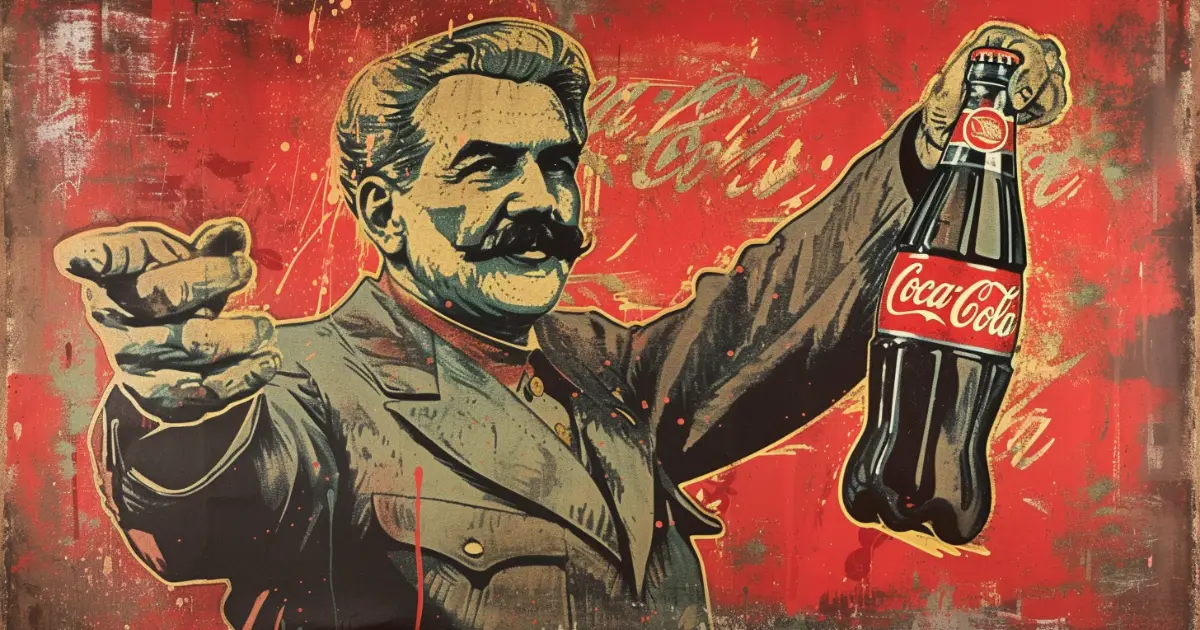
COCA-COLA'S COLD WAR SAGA WITH THE SOVIET UNION
-
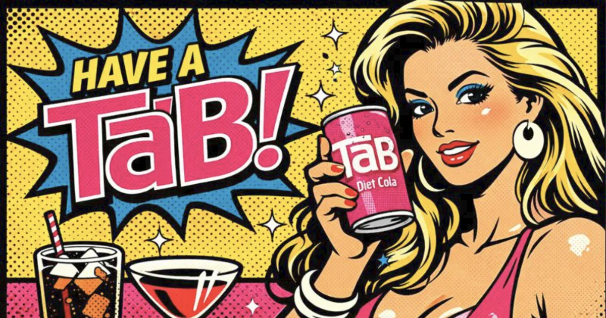
BEFORE DIET COKE, THERE WAS TAB—AND IT WAS BETTER
-
THE HISTORY OF THE COCA-COLA BOTTLE OF 1915
-
HOW COCA-COLA CAPITALIZED ON PROHIBITION
-
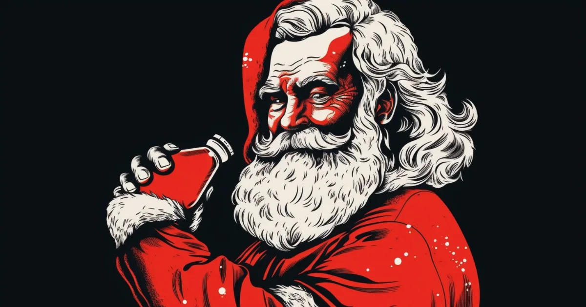
HOW COCA-COLA HIJACKED SANTA — AND TURNED CHRISTMAS RED
-
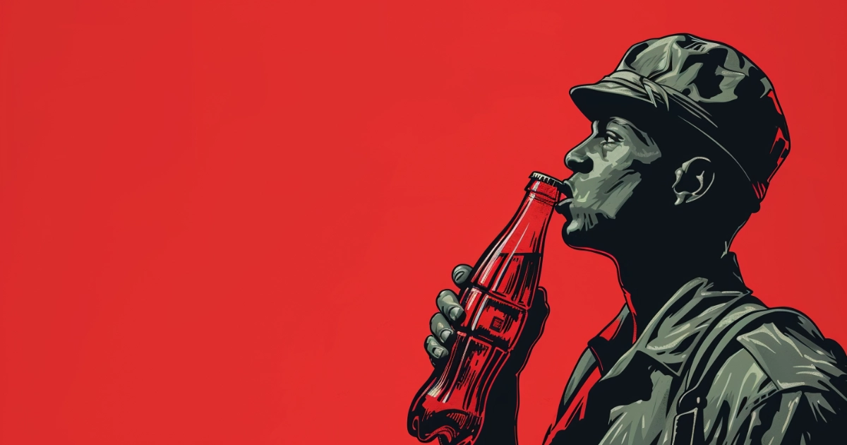
HOW COCA-COLA WENT TO WAR — AND CAME BACK A GLOBAL EMPIRE
-
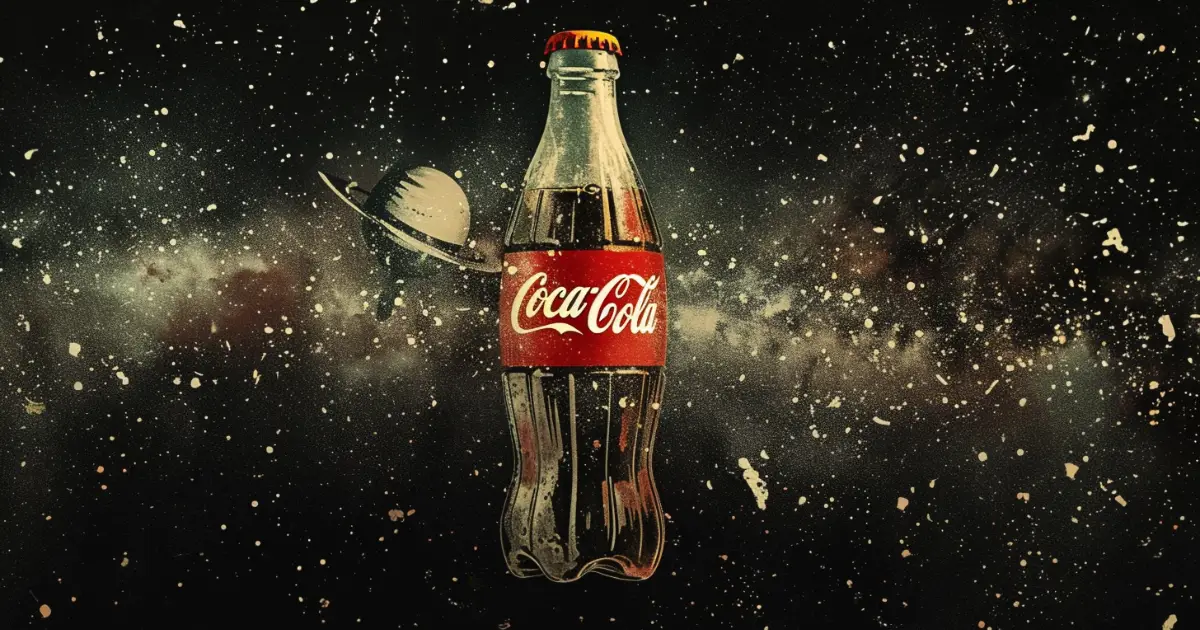
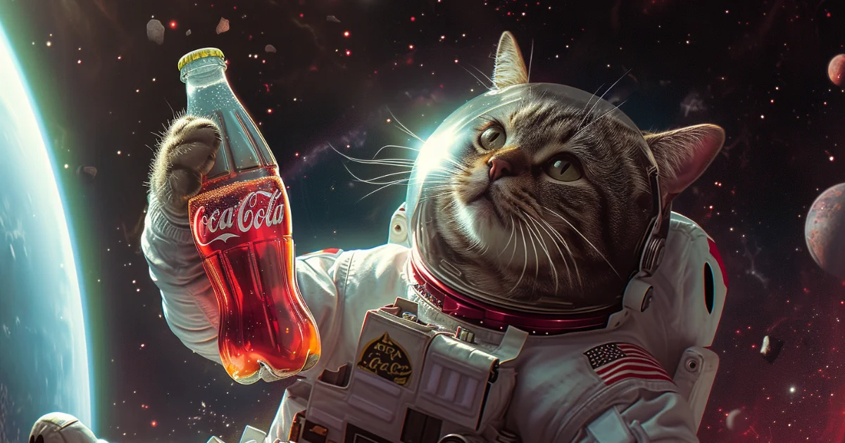
THE CARBONATED ODYSSEY OF COCA-COLA IN SPACE
-
UNRAVELING COCA-COLA’S MARKETING HISTORY
-
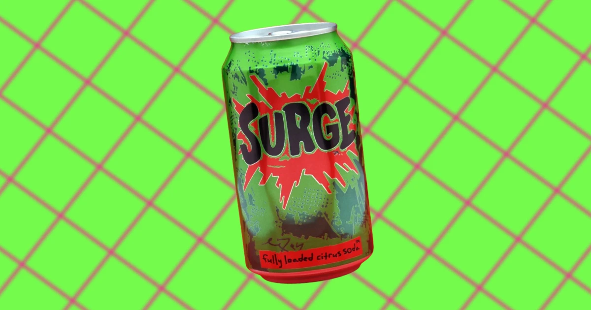
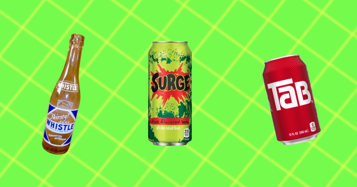
HISTORY OF SURGE SODA
-
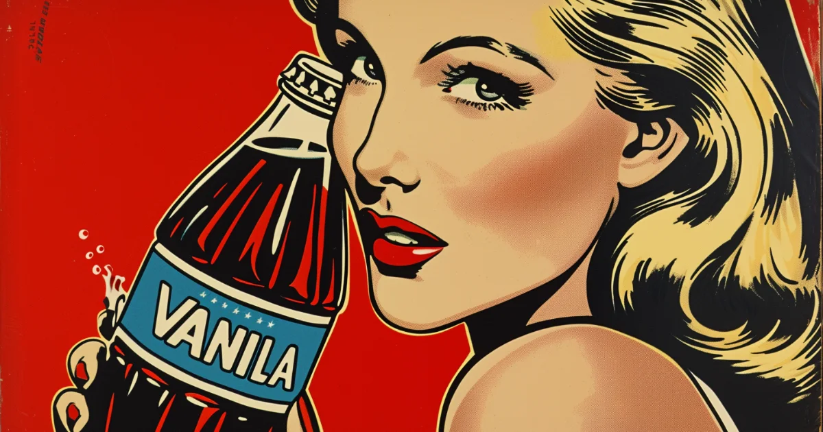
THE CURIOUS HISTORY OF VANILLA COKE
-
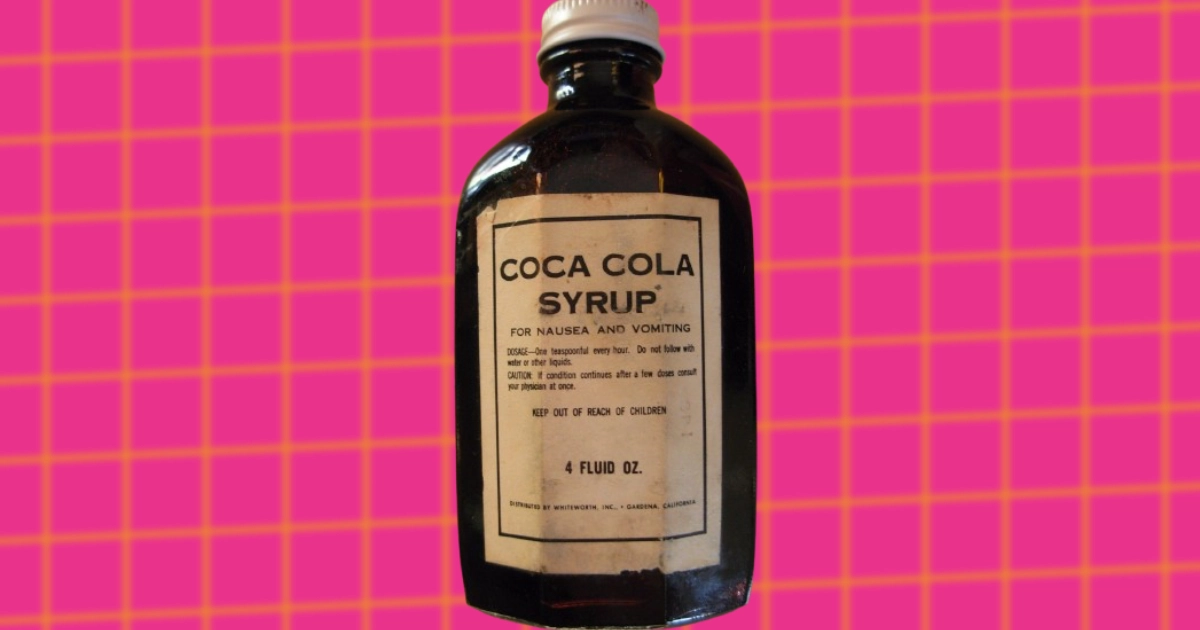
THE TIME THAT COCA-COLA WAS USED AS MEDICINE
-
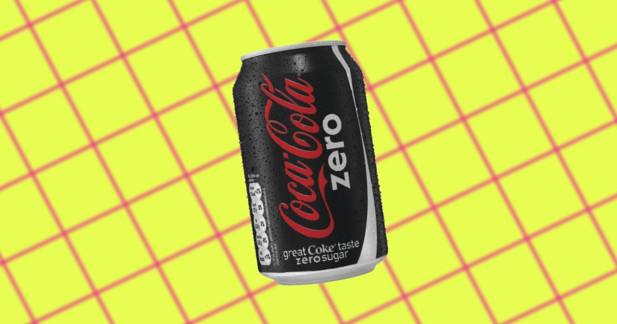
HISTORY OF COKE ZERO
-
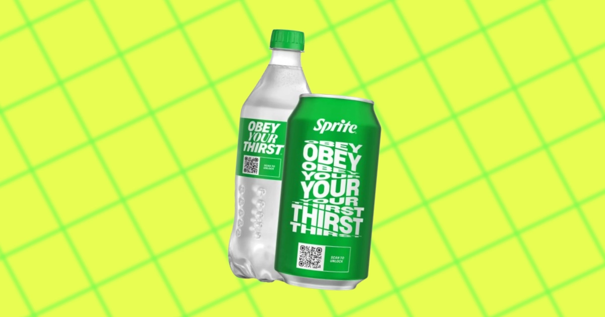
THE UNTOLD STORY OF SPRITE'S "OBEY YOUR THIRST" SLOGAN
-
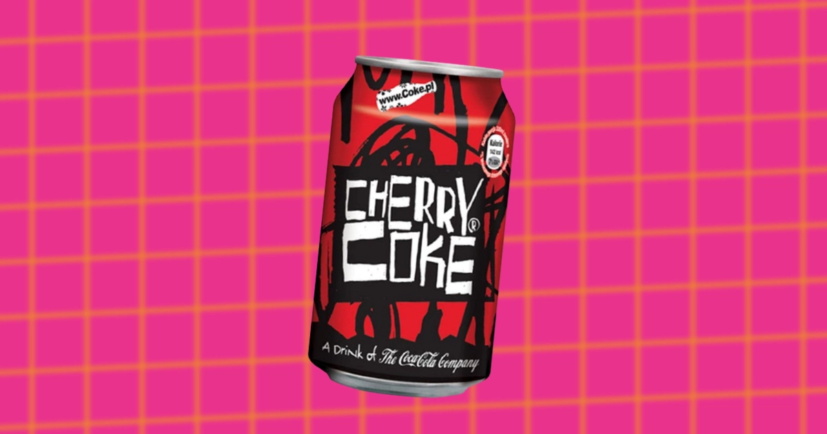
A LOOK INTO THE INTRIGUING HISTORY OF CHERRY COKE
-
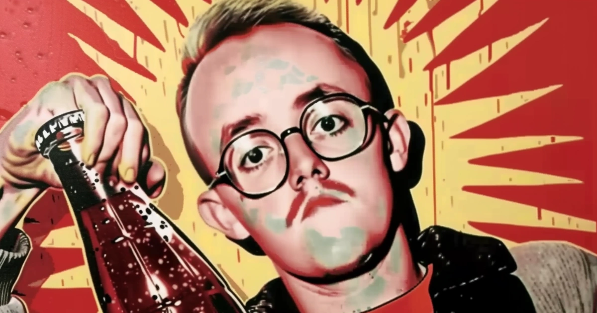
KEITH HARING'S UNDERGROUND COLLABORATION WITH COCA-COLA
-
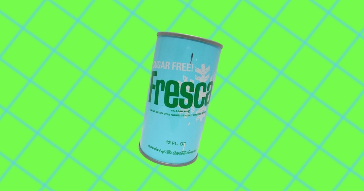
THE UNKNOWN HISTORY OF FRESCA
-
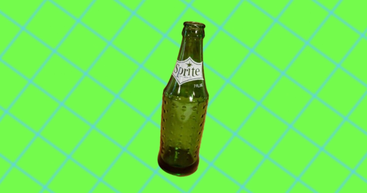
THE UNKNOWN HISTORY OF SPRITE
-
CHARLES ALDERTON & THE ORIGINS OF DR PEPPER
-
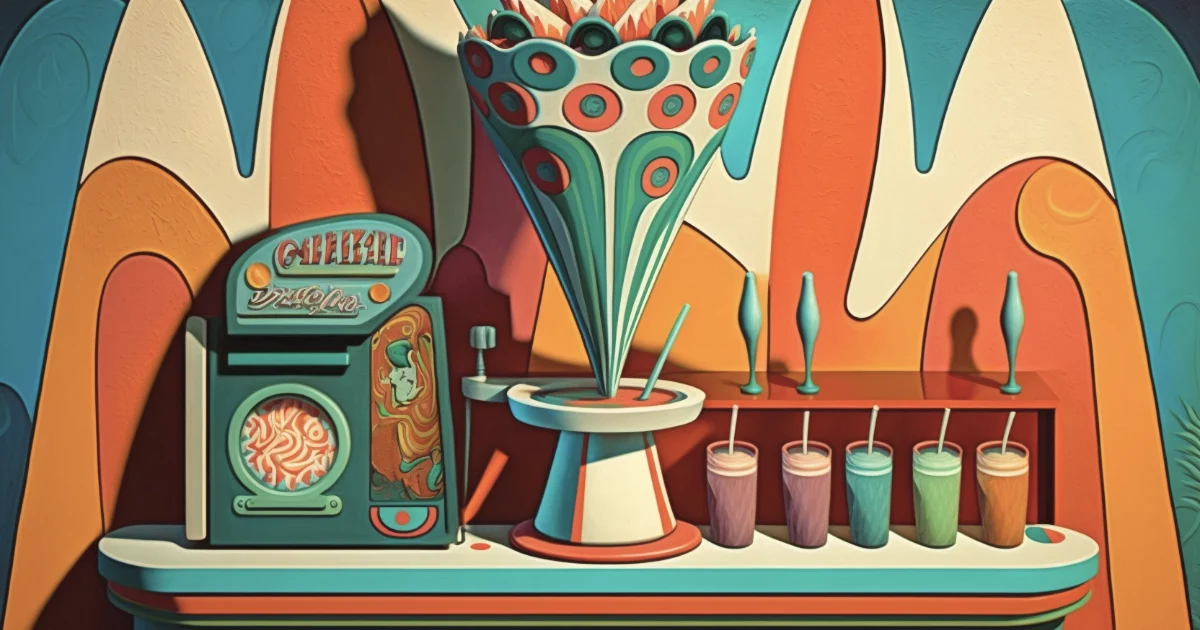
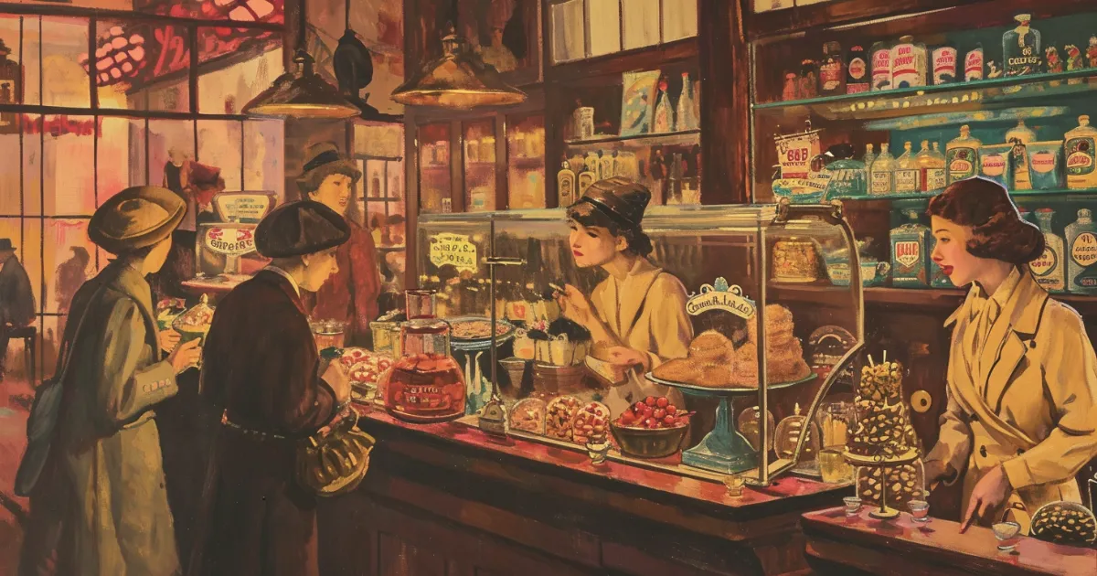
THE CULTURAL SIGNIFICANCE OF SODA FOUNTAINS
-
THE HISTORY OF DIET SODAS
-
THE UNKNOWN HISTORY OF THE ALUMINUM CAN
-
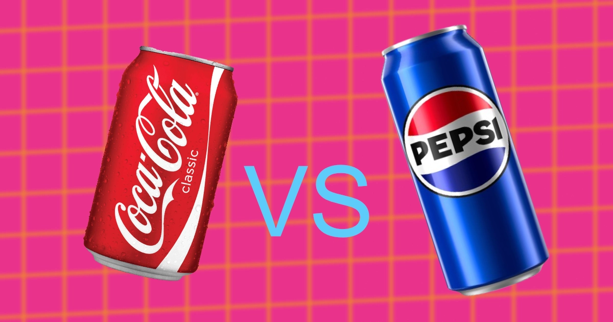
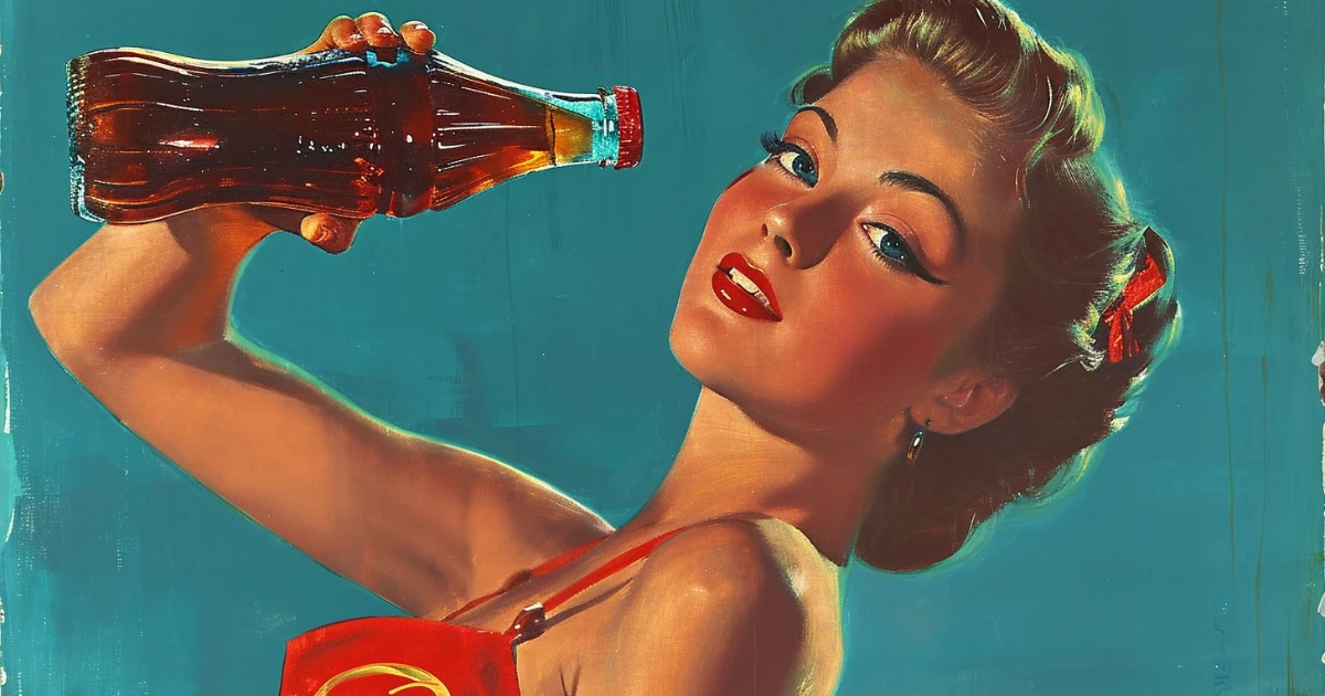
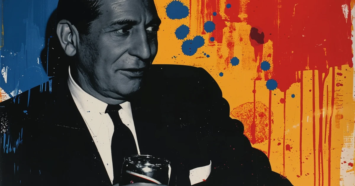
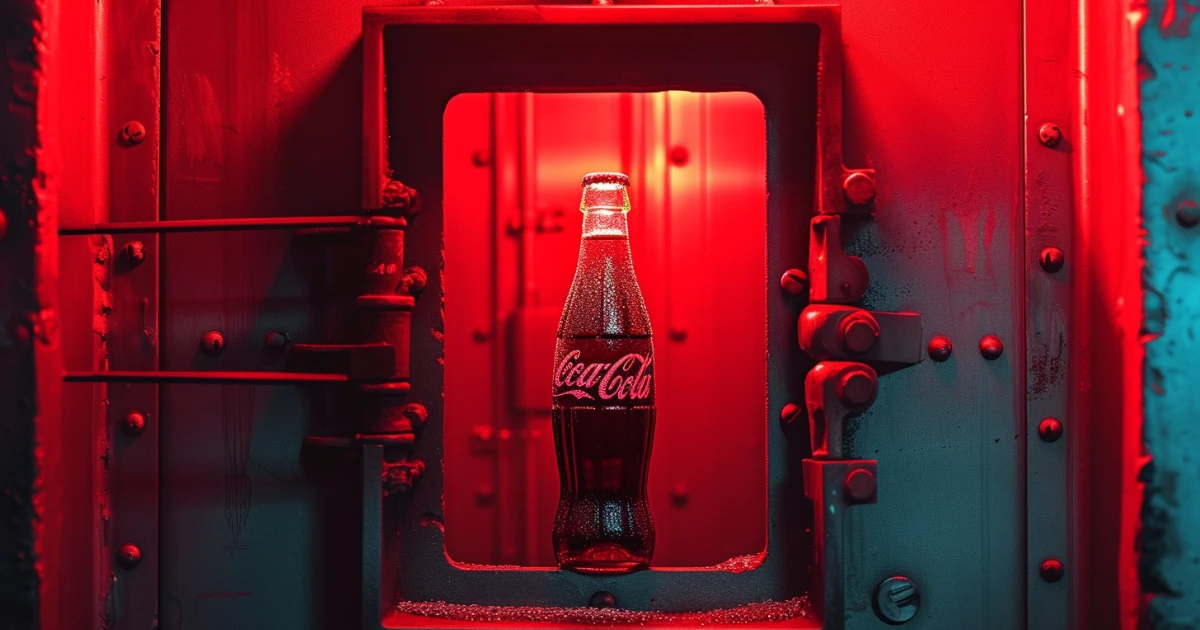
HISTORY OF THE COLA WARS BETWEEN COCA-COLA & PEPSI-COLA
-
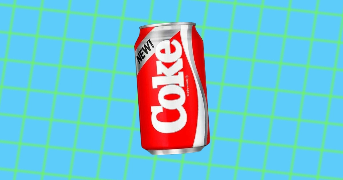
THE NEW COKE FAILURE
-

JOHN MATTHEWS & THE BIRTH OF THE SODA FOUNTAIN
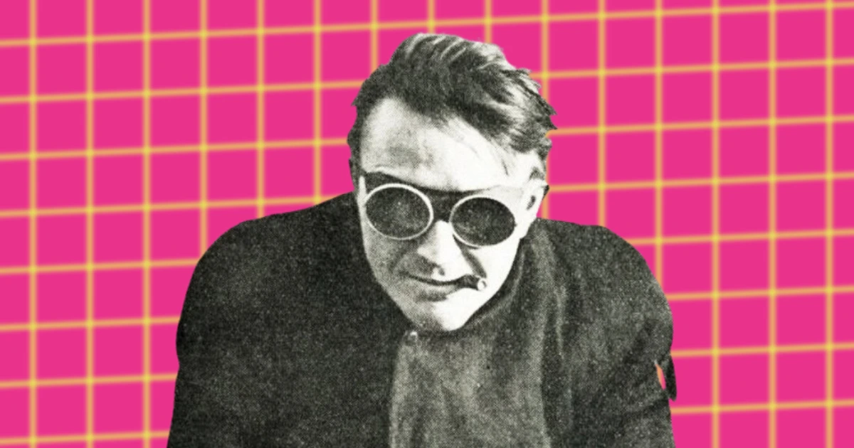
-
JOSEPH PRIESTLEY THE MAN WHO INVENTED CARBONATED WATER